Norsk Etikett
Into the fold
__
Norsk Etikett is a leading supplier of self-adhesive labels with headquarters and production in Sandnes, Norway. They are a family-owned company with a long, proud history.
Norsk Etikett wanted a new visual identity and a website that reflected their position as a specialist printer with an ambition to remain at the top of their business. They needed a visual expression that underscored their shared dedication to their craft and customers.
Norsk Etikett wanted a new visual identity and a website that reflected their position as a specialist printer with an ambition to remain at the top of their business. They needed a visual expression that underscored their shared dedication to their craft and customers.
Credits:
Børge Myrnes, Moxey, Funbit, Nils Erga
Year:
2021
Deliverables:
Design strategy, Visual identity, Art direction, Digital design, Motion design


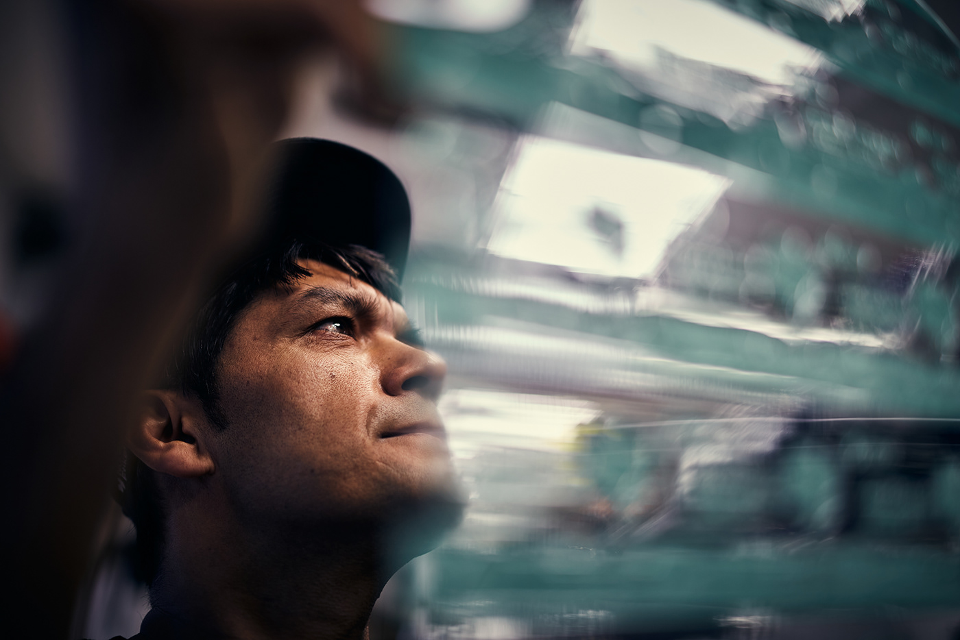

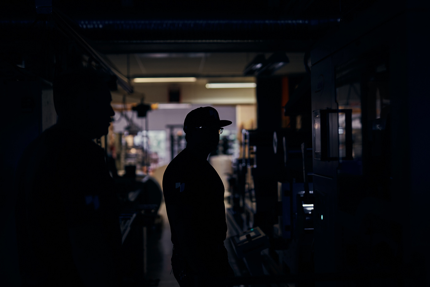
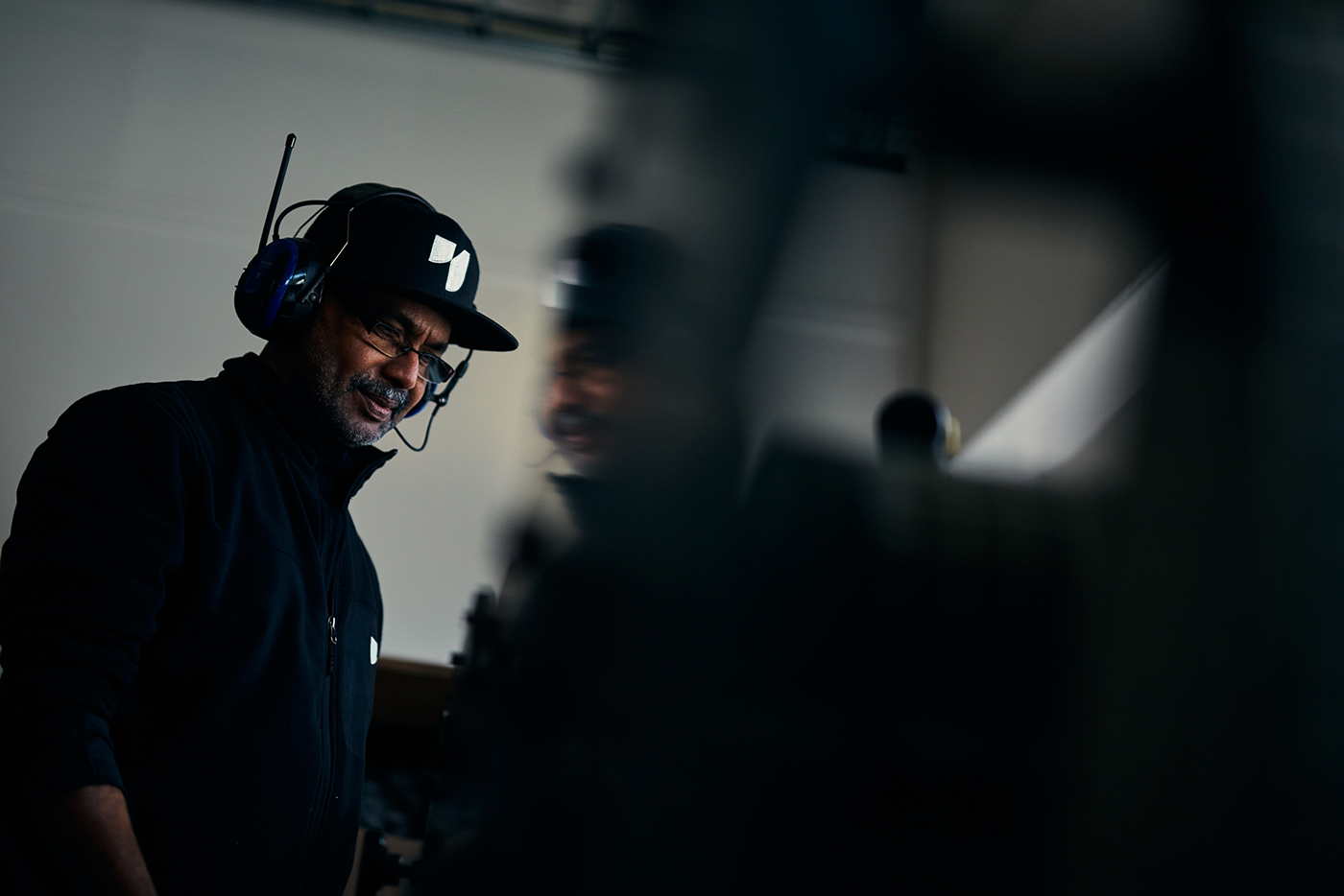
To visualise the craftmanship of making hight-quality labels, we documented the intricate production process closely through a series of snippets and images.


The visual identity has a timeless expression that draws inspiration from labels in motion – being printed, cut, or pasted on a product. Both the logo symbol and the selected font, Bw Gradual, show contrasting soft and hard elements, giving the visual identity its distinctive character.