


Inspiration, sketches and moodboards for the look and feel of the organization
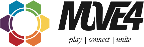
Final look of the logo. Symbol represents the continents and countries coming together, except Antartica. Each color also represents a continent. The word "move" was chosen because we have to do something to make a difference, it's an action work. The number "4" was chosen to replace the word "for" because we all should move for something. Play, connect and unite are the keywords of the organization and are the key focuses.
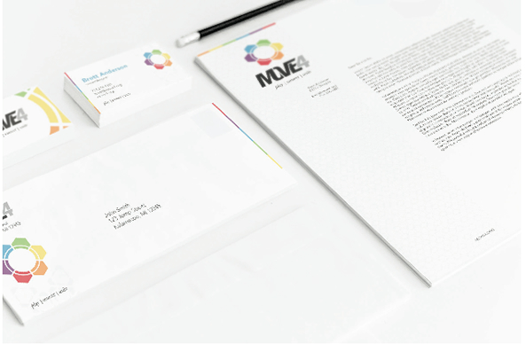
Brand identity applied to collateral.

Special Move4 uniforms and other soccer gear designed for teams to purchase and help another person in need.

Fully functional web community build by myself on the Drupal CMS. Custom profiles, teams and team line ups were created for more interactivity with the Move4 community. The site is also responsive, mean it will adjust the content depending on the with and size of the device.
Check out and sign up on the website


