


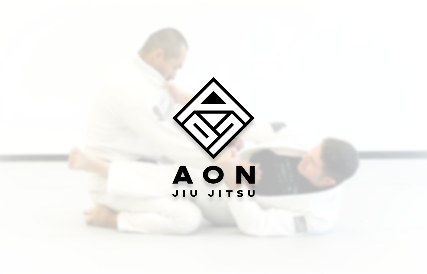
Case Study: AON Jiu Jitsu
Industry: Martial Arts / MMA


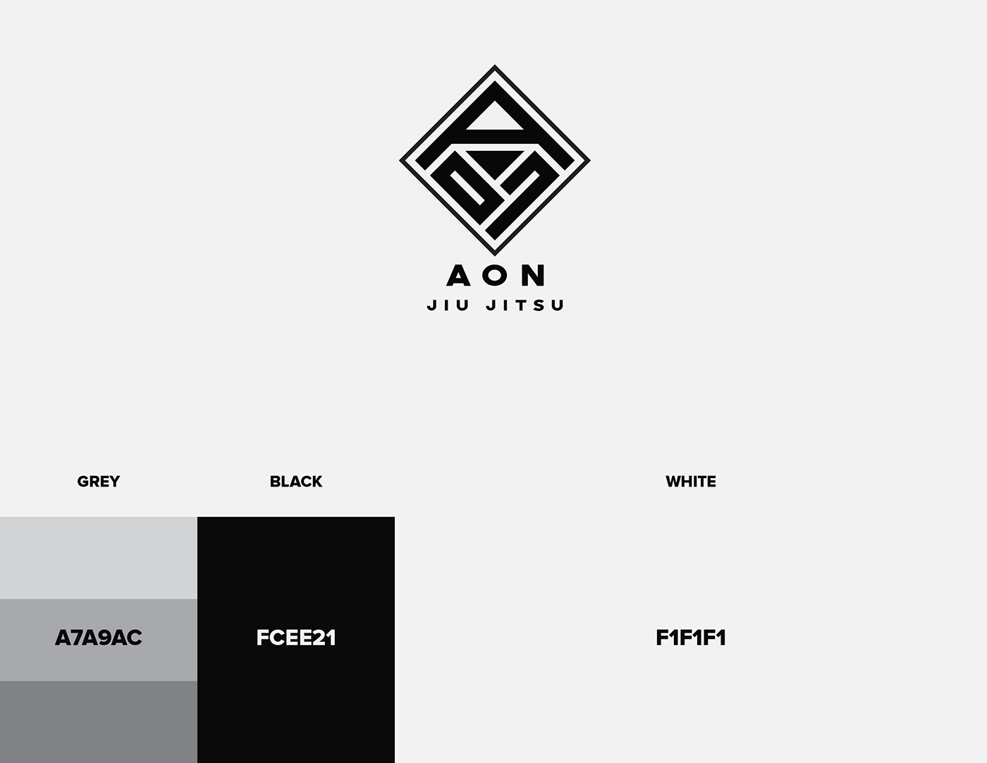
The Logomark breakdown:


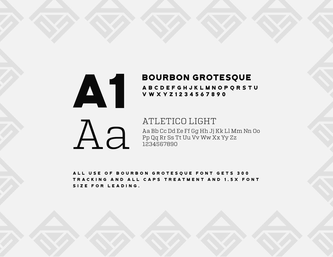
A few iterations before choosing the perfect mark:


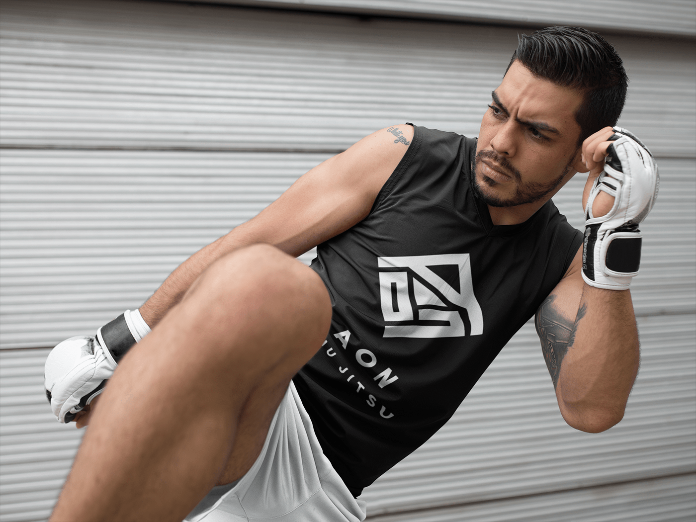
The GI, Patterns and Flyer:


Case Study: AON Jiu Jitsu
As a fan of MMA myself, I have to say this was a trip working with the team over at AON. Absolute professionals with a vision for a different positioning than the average. They wanted a clean, ultra modern look to their Gym / Dojo and color was a non existent factor in the branding.
The color needed to come from the client shots and videos. Making it tricky to brand the colors and concepts for print. Luckily Pantone has some interesting whites and blacks in their wheelhouse we were able to utilize.
The Process?
We went by our user persona created between the KREDO & AON team. It lead all of our choices quite well. These details of branding are key to success. He has since then branded his website, dojo and GI lineup with our mark.
The Results?
Cliff the owner of the business was ecstatic and happy to work with us as we are on a ongoing relationship to see a Texas based Jiu Jitsu gym grow!
Remember, the question is always; what will they say about YOUR Brand?


