Branding & Logotype Update 2013 - 2014
The last few years I've really set ground as a freelance designer. With Behance, I was able to present my works to a broad audience, land some awesome projects and to find new inspiration everyday. In this project I would like to show you a couple new works and some exclusive insights about my working process.
Like every project, I begin by sketching concepts. This process is very freeform. The drawings are quick and loose, and all over the page. I try to generate a lot of ideas quickly, exploring as many different visual concepts as I can. I will play with shapes and forms in multiple configurations until something interesting takes place, or another idea emerges. It’s a difficult process to describe, but I think this may be my favorite part of logo development.
After I create sketches, I evaluate the ideas and then start exploring more refined versions that integrate type and color. Sometimes I even do some more sketching and experimenting in Illustrator. It's a fun way on creating new shapes and work on the latest techniques i've been experimenting with.

_
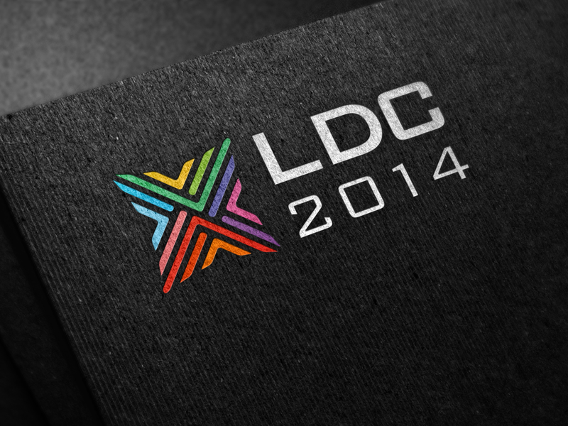
LDC LOGO DEVELOPMENT
Leader Development Consultation™ (LDC) is a leadership consultation organized by LeaderSource SGA.
LeaderSource SGA's mission is to strengthen and expand the church worldwide by building healthy leaders.
The goal of this consultation is to catalyze advances in thinking and practice in Christian leader development around the world. This will not be a one-way theoretical presentation, but rather an engaging and dynamic collaboration – a shared learning in the main areas of concern to participants.
_
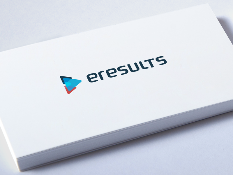
E-RESULTS LOGO DEVELOPMENT 1/2
eResults is a Dutch web developing company aiming for code, web and three disciplines. It’s also a very dynamic, just like the internet; it never stands still. My goal was to create a clean mark made out of three different layers. Also, there needed to be a visual progress/result included. The type is also a custom design. This is currently a unused concept proposal.
_
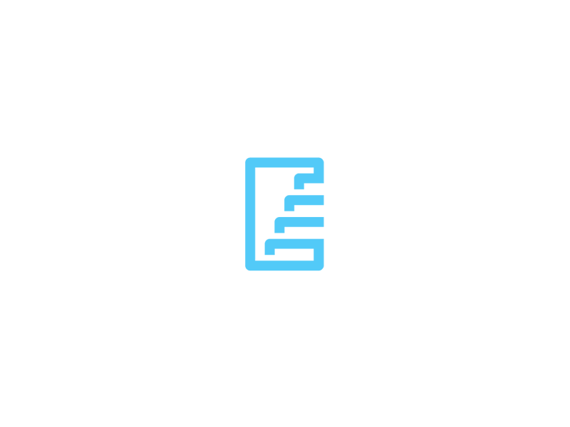
STAIRS ICON DEVELOPMENT
This icon was made pure out of experimenting. I was working on a project where I need to do a lot with lineworks. Thought this was a unique shape and hadn't seen this one before. This mark is still a unused concept. Interest in using this mark for you business? Feel free to contact me!
_
SPOTLIGHT
Made for a stage entertainment business. Tried to set a simple mark out of many different influinces trough color. This mark is still a unused concept. Interest in using this mark for you business? Feel free to contact me!

_
COLOR LOADER
I've always been very moved by beautiful color combinations in logo design. It really has something strongs about it. This is a color loader made for fun. This mark is still a unused concept. Interest in using this mark for you business? Feel free to contact me!
_
NACHTCAFE WARHOL 2/4
A 'W' made out of lines and gave the mark a more complex but also clean vibe.
_
NACHTCAFE WARHOL 3/4
Also a 'W' made out of a sunglasses in negative space. This glasses is also used by Andy Warhol.
_
NACHTCAFE WARHOL 4/4
Here I also used a 'W' but was more aiming at the 'night' part. So a 'W' and in the middle a dot that suppose to be a moon.

_
T MONOGRAM
A letter T monogram for a fellow designer. This monogram stayed as a unused concept.
Interest in using this mark for you business? Feel free to contact me!
_
SS MONOGRAM
Logo concept for a Dutch politic organization. In the logo I tried to connect the two primary elements of the organization. Students+City (In dutch: Student en Stad). So its a S made out of two parts and are connected.
This monogram stayed as a unused concept. Interest in using this mark for you business?
Feel free to contact me!

_
Logo concept for a Dutch boutique company. I used elements like; floral, heart, romance, and cuts.
This monogram stayed as a unused concept. Interest in using this mark for you business?
Feel free to contact me!
_
Logo concept for a scouting organization. I used elements like; trees, tents, forest, nature, team, survival and outfits. This icon stayed as a unused concept. Interest in using this mark for you business?
Feel free to contact me!
__
THANKS FOR TAKING THE TIME
TO CHECK OUT MY WORKS!
WOULD LOVE TO HEAR YOUR THOUGHTS AND/OR SOME
LOVE BY PUSHING ON THE 'APPRECIATE' BUTTON!
WANT TO WORK WITH ME? WOULD LOVE TO HEAR YOUR STORY!
www.jeroenvaneerden.nl info@jeroenvaneerden.nl
