Wayfinding system
at The Warsaw Breweries (Browary Warszawskie)
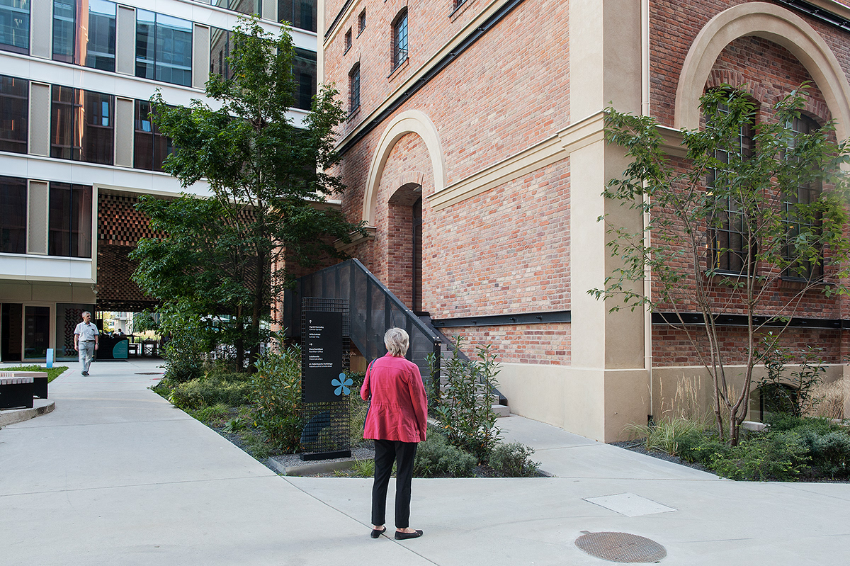
In 2021 the Warsaw district Wola has gained a splendid, friendly and everyone’s place – the Warsaw Breweries (Browary Warszawskie). The quarter is now filled with residential buildings, office buildings, city squares, and new streets. It is important to remember that even in times of industrial prosperity, this was a closely guarded district, closed to non-employees. Several buildings from the former brewery, including the historic Malthouse, the Laboratory, Villa Schiele and the 170-year-old cellars of Leżakownia - now restored - remind us of the former excellence of this place.
When designing the wayfinding systemfor this space, a fundamental objective was to integrate all signage elements into the surrounding architecture and maintain a unified identity. We wanted all the elements, such as typefaces, pictograms, specific signs, and signage to harmonize with the spirit of the buildings and each other. Our aim was to show lightness and harmony with urban greenery while fitting into the existing historical context.
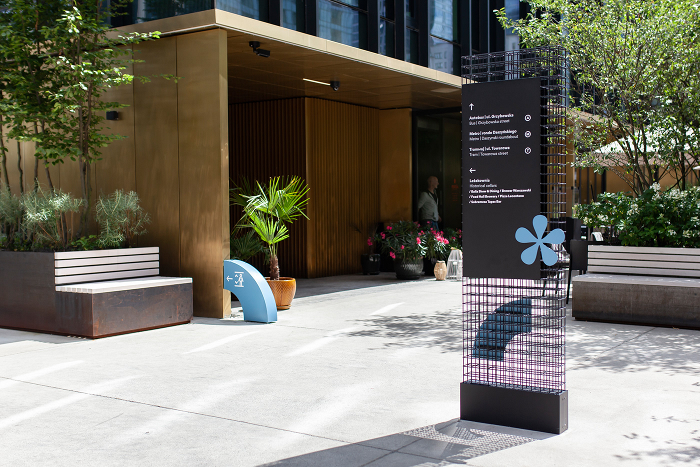
Signs are displayed inside and outside the facilities. The information carriers needed to remain coherent despite the differing construction determined by the space in which they were placed. At first glance, we wanted to give the impression that they are part of the same system. We had a real challenge to face.
In order to emphasize the character of the space, the signage design was based on several key elements:
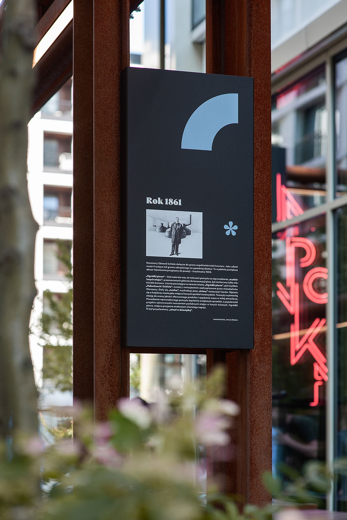
1. Typography: For use within the visual identification system, two complementary typefaces were selected: Gordita, a geometric sans-serif typeface that is built on modern details that create an optically balanced, friendly typeface, and Vesterbro, a high-contrast, attractive and modern serif. Due to their distinctive characters, these fonts create a perfect duet that emphasizes the feel of the place (Warsaw Breweries' revitalization represents the perfect blend of history and modernity). Typeface selection was also a good foundation for creating the abstract patterns.
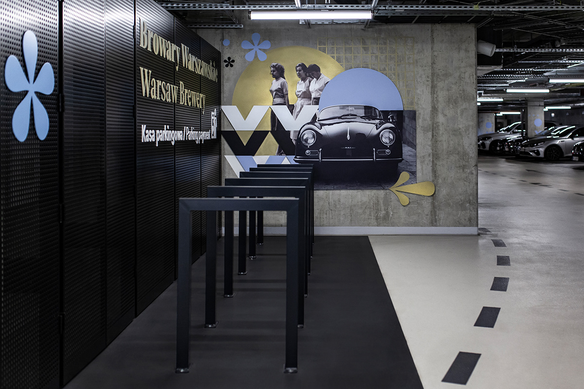
2. The original set of pictograms: pictograms were inspired by Gordita typeface - they were designed on its basis. These pictograms were constructed by combining fragments of glyphs - specific letter shapes of a particular typeface. Therefore, the visual identification system is coherent and distinctive for this particular building.
Designed on the basis of font elements, pictograms have similar proportions. It gives the impression that they are extensions of texts, merging harmoniously with them.
3. Unique illustrative elements and original collages were made using authentic historical materials related to Breweries.
4. Information carriers - they are characterized by the use of a visually light metal frame (thanks to this, even large pylons maintain an industrial character, yet do not overwhelm the surrounding space. They can also be covered by nearby greenery).
____________________________
Design: Blank Studio
Bartłomiej Witański, Aleksandra Krupa
Martyna Berger, Martyna Piątek
Year of project: 2020
Year of implementation: 2021
Year of implementation: 2021
Photo credits: Bogna Kociumbas, Mateusz Mioduszewski
_____________________________