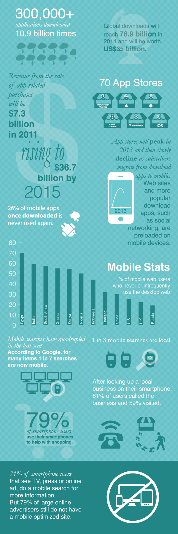
The main rationale behind this concept was to create a simple, minimal and eye catching design using the information given and displaying it from top to bottom, left to right.
Basic design principles were incorporated into the design to increase legibility and improve the overall aesthetics; these included contrast of the background to its content, proximity of relevant or similar content and use of symbols and imagery to convey the statistics in a simple and easy to read manner.

I used a simple font combination using two distinct fonts: a serif alongside a sans-serif. I think this typographic style suited the project and incorporated of a combination of Garamond with Helvetica.
Various colour schemes were explored on Adobe Kuler that invoked a neutral and positive effect ensuring that the colours would not distract too heavily from the content.
In order to maximize legibility and prevent vibration for the reader, a single coloured background and contrasting white tone was selected. A subtle pattern was also used to overlay the background and create a more eye catching and interesting design.
A colour scheme including two shades of both a light and dark turquoise/teal shade of blue were selected due to their calming and neutral connotations which were thought to coincide with the overall simple and minimal design and prevent too much noise in the design.

