
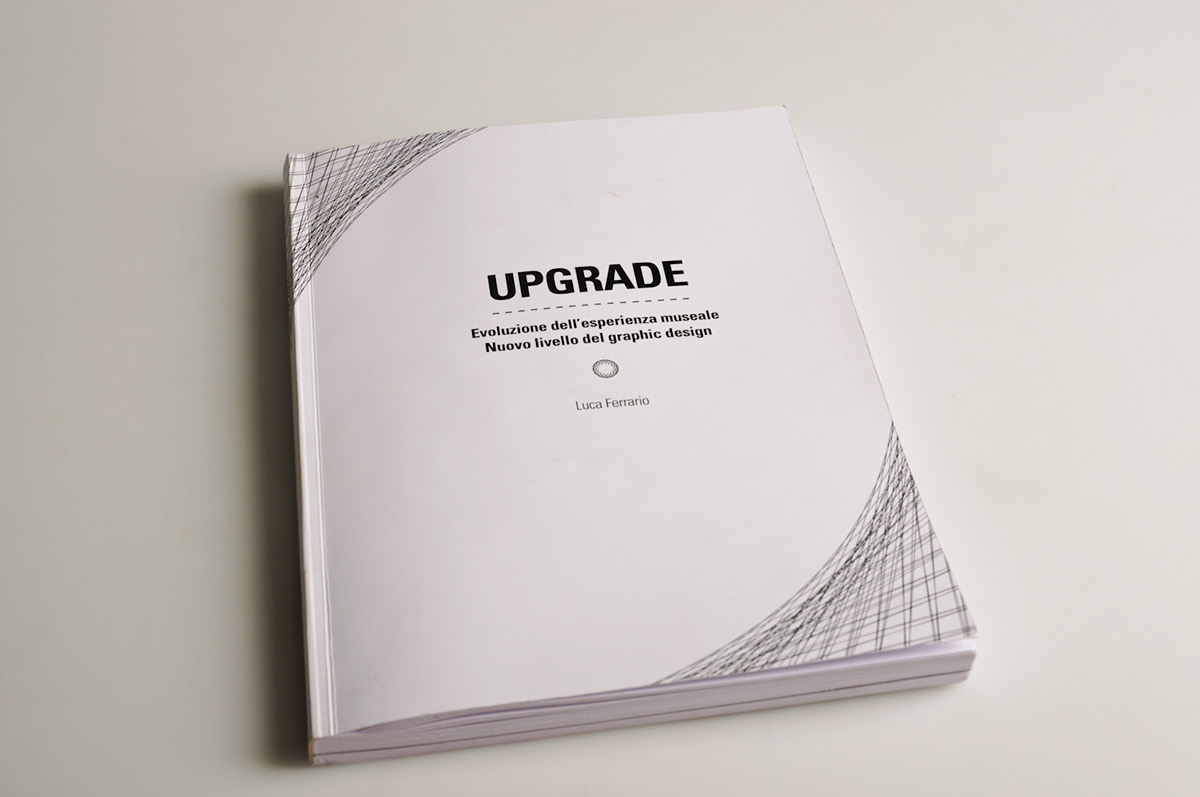


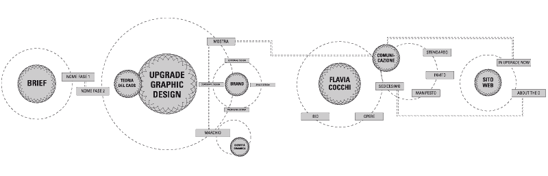
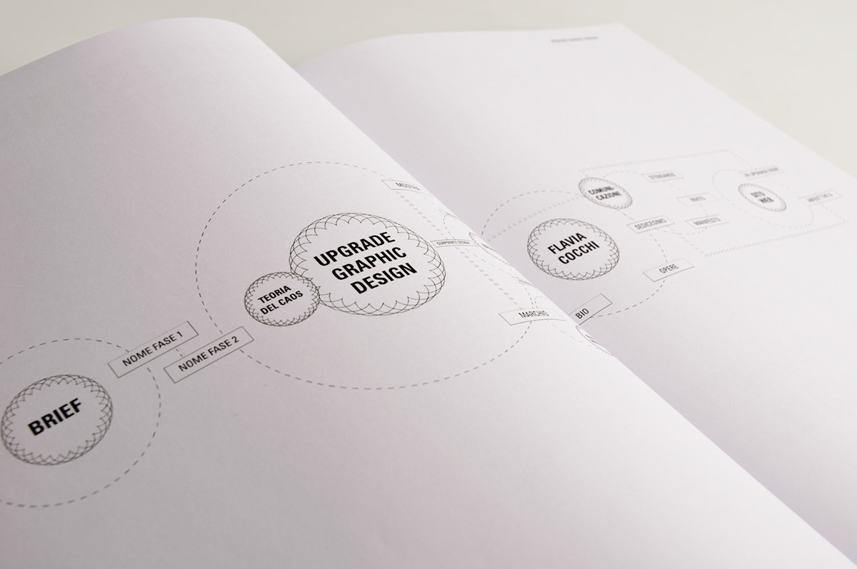
For our Bachelor graduation project at POLITECNICO DI MILANO we had to create a new museum for graphic design, choose its name and design its identity. Moreover, we were given a European graphic designer, and we had to dedicate her an exhibition inside the museum, creating the whole communication, a 16-page book and the website. In the end, we had to design the book to show our process and project.
THE NAME
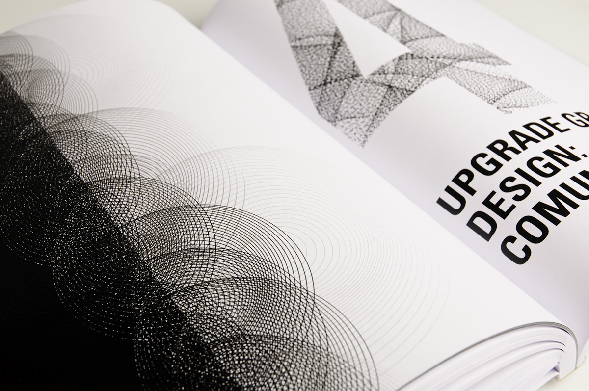
UPgrade GRAphic DEsign
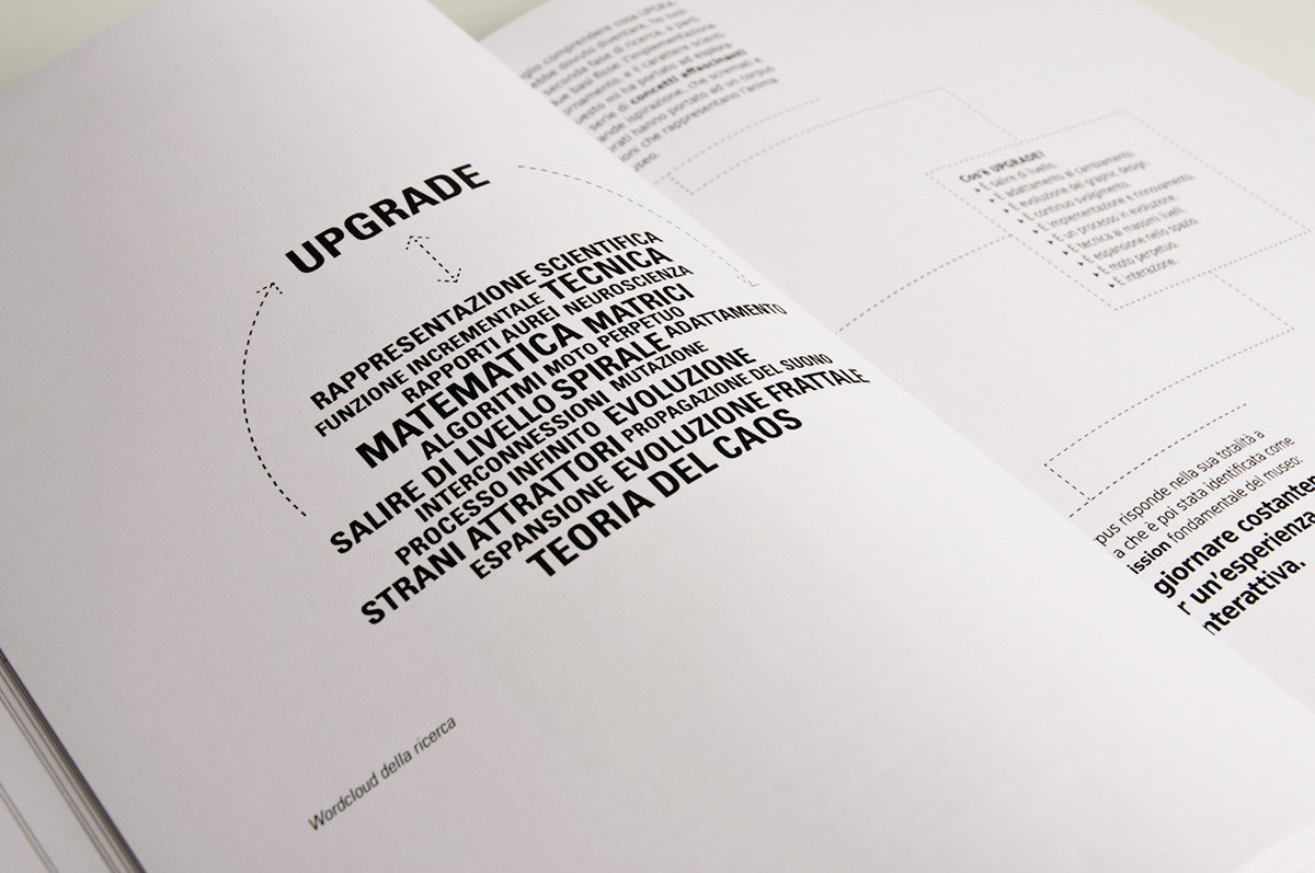
The name I've created is UPgrade GRAphic DEsign: it's a recursive acronym, and it contains the concept itself. The whole museum is centerd around science and math inspired visions and methods; specifically, the identity takes inspiration from the Chaos Theory, both in the logo design process and the brand mission/vision.
The Chaos Theory is the study of evolutive dinamic complex non linear systems.
From Wikipedia: "Chaos theory is a field of study in mathematics,that studies the behavior of dynamical systems that are highly sensitive to initial conditions—an effect which is popularly referred to as the butterfly effect."
From Wikipedia: "Chaos theory is a field of study in mathematics,that studies the behavior of dynamical systems that are highly sensitive to initial conditions—an effect which is popularly referred to as the butterfly effect."
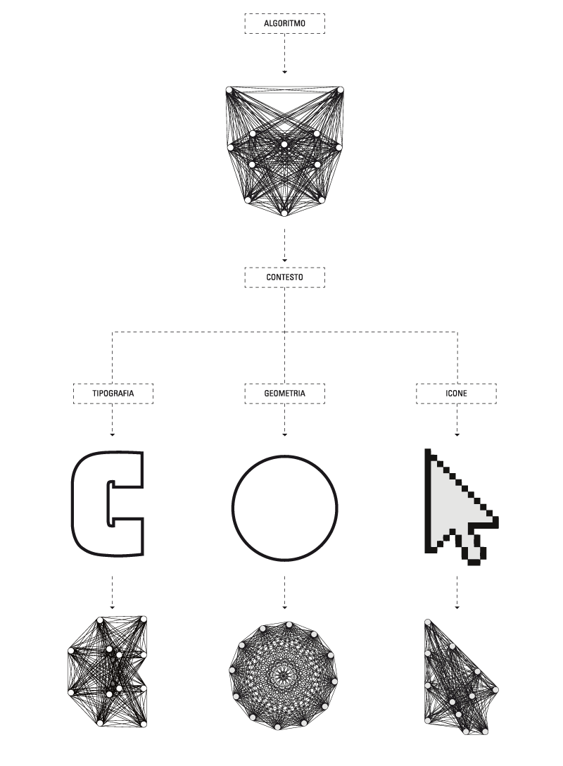
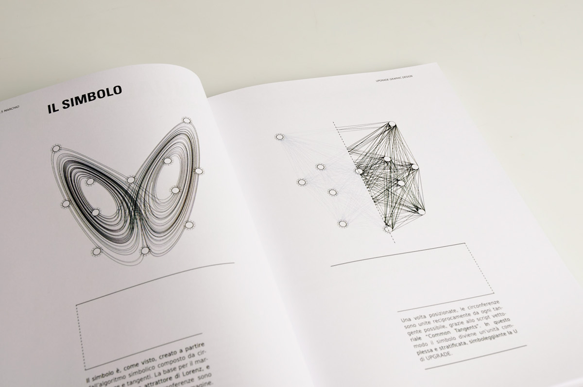
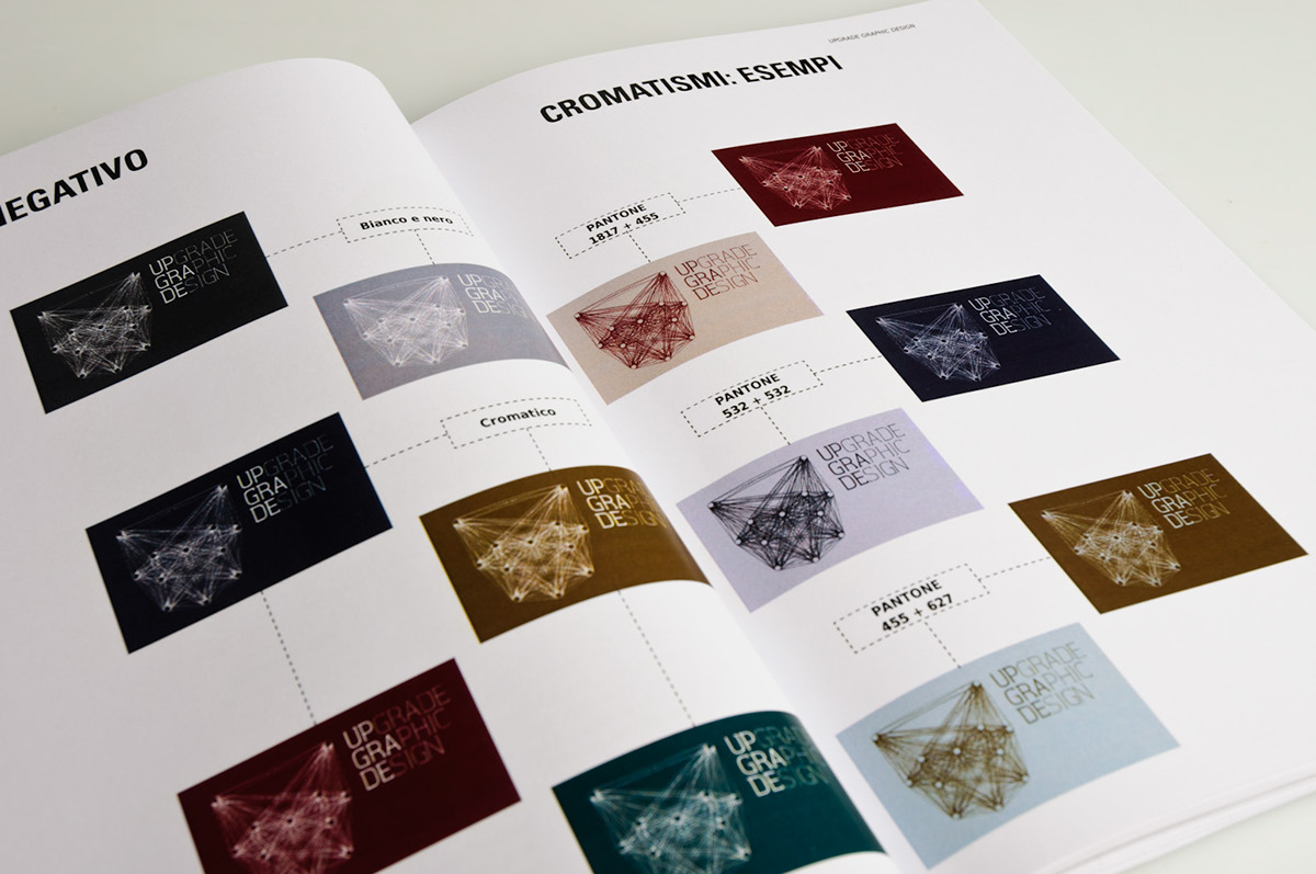
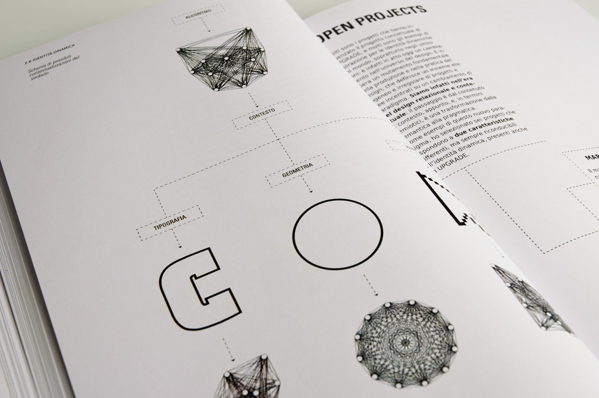
LOGO: the logo is a dynamic identity, based on the shape of a Lorenz Attractor. There is an "algorithm" that allows the logo to take different shapes depending on the context.
12 circles are built on a grid based on an element, and then they are connected with every mutual tangent. The main logo also remembers the shape of a "U", for UPGRADE.
The Lorenz system is a system of ordinary differential equations (the Lorenz equations) first studied by Edward Lorenz. It is notable for having chaotic solutions for certain parameter values and initial conditions. In particular, the Lorenz attractor is a set of chaotic solutions of the Lorenz system which, when plotted, resemble a butterfly or figure eight.
So, the context is the initial parameters, and the shape of the logo is the resultant system.
VISION: Bring the graphic design to the next level through the museum experience and technology, amplifying their scope of science and culture.
MISSION: Upgrade steadily medium and contents, for a multisensory and interactive museum experience.
CONTACT POINTS BETWEEN THE MUSEUM AND CHAOS THEORY


LOGO ALGORITHM


FONT

DINAMIC IDENTITY OF THE LOGO


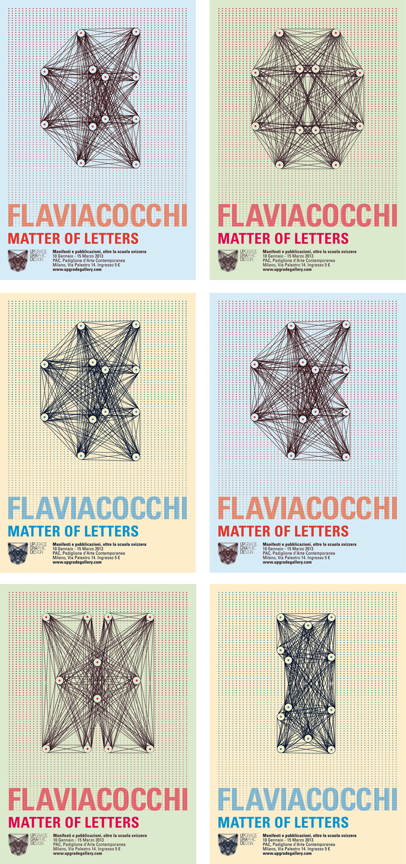
My designer was the swiss Claudia Cocchi. Her style is made of plain fills, typography, pastel colors and patterns.
The communication is made of a poster series, (6, one for every letter of COCCHI), a flyer and a banner. Every element is based on the same grid: the elements (the logo, the pattern, the colors) are the mix between museum identity and designer's elements.
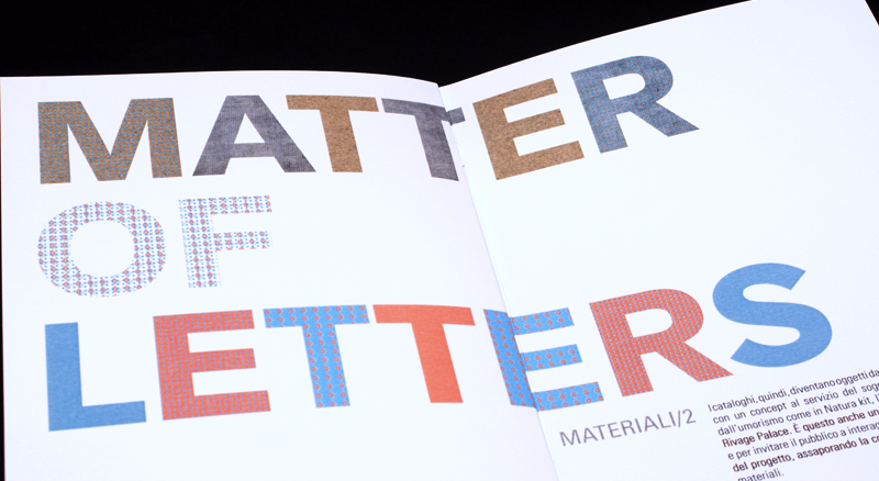
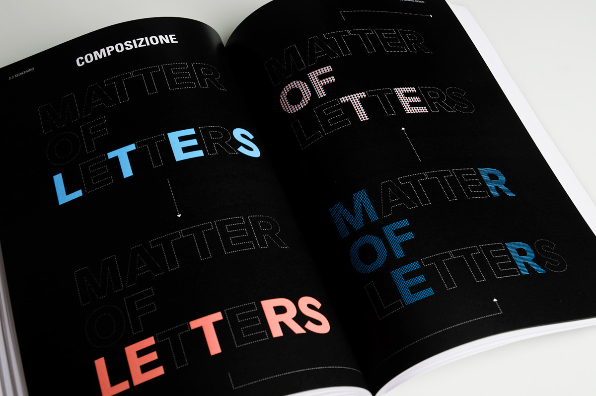
I designed a 16 page booklet too, explaining the style of the author through the sentence "MATTER OF LETTERS" formed by her characteristic elements: typography, patterns and physical matherials.
I designed a 16 page booklet too, explaining the style of the author through the sentence "MATTER OF LETTERS" formed by her characteristic elements: typography, patterns and physical matherials.
POSTERS

FLYER

BANNER

16 PAGE BOOKLET


WEBSITE


BOOK INDEX

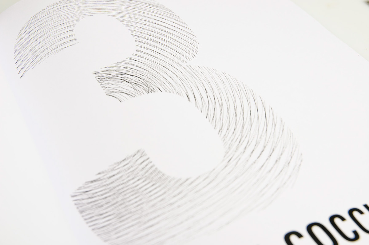
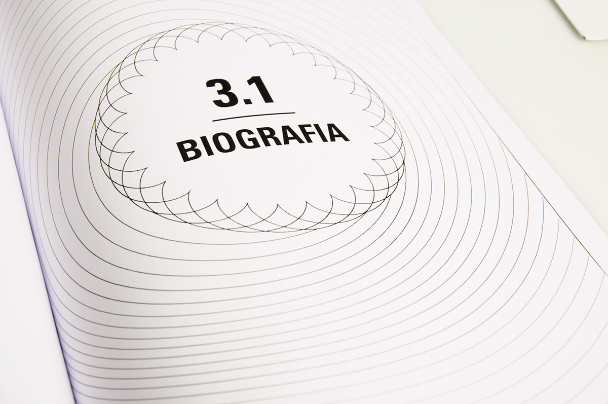
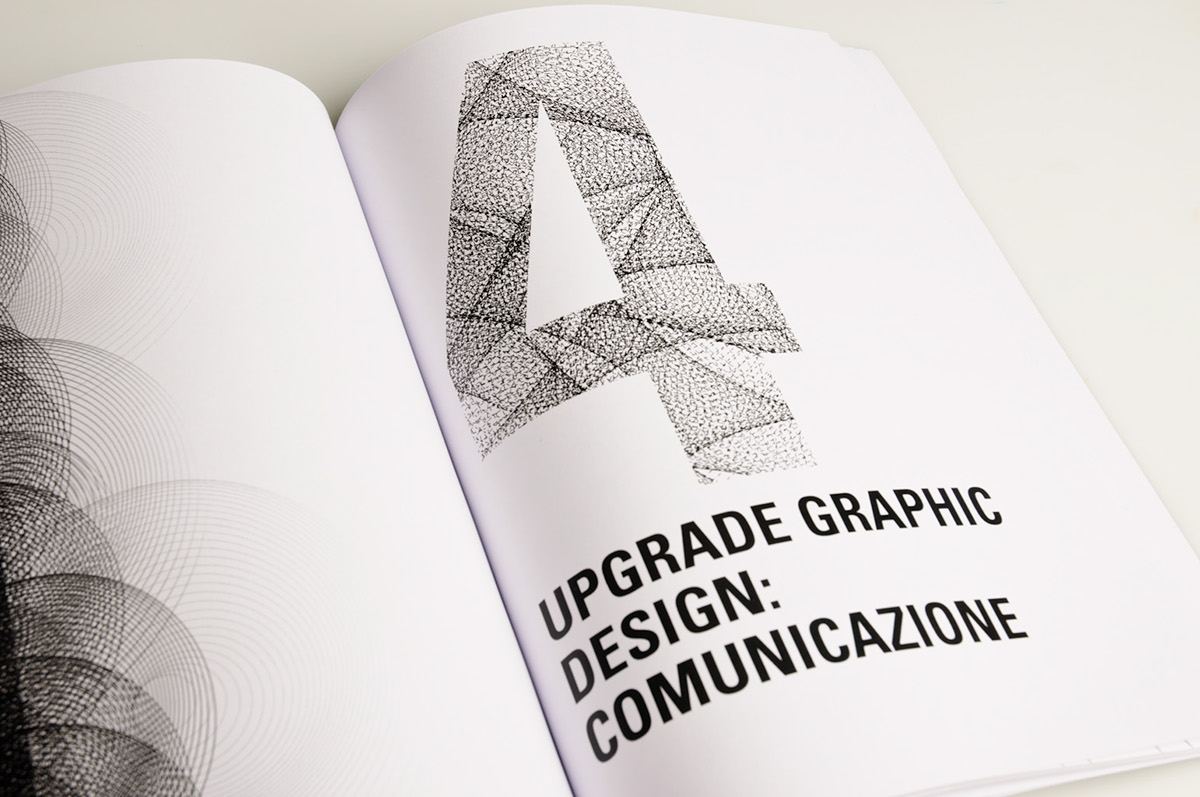
CHAPTERS NUMBERS TREATMENT

DETAILS


If you have arrived until here...thank you!
If you've appreciated, just push the button or leave me feedback!


