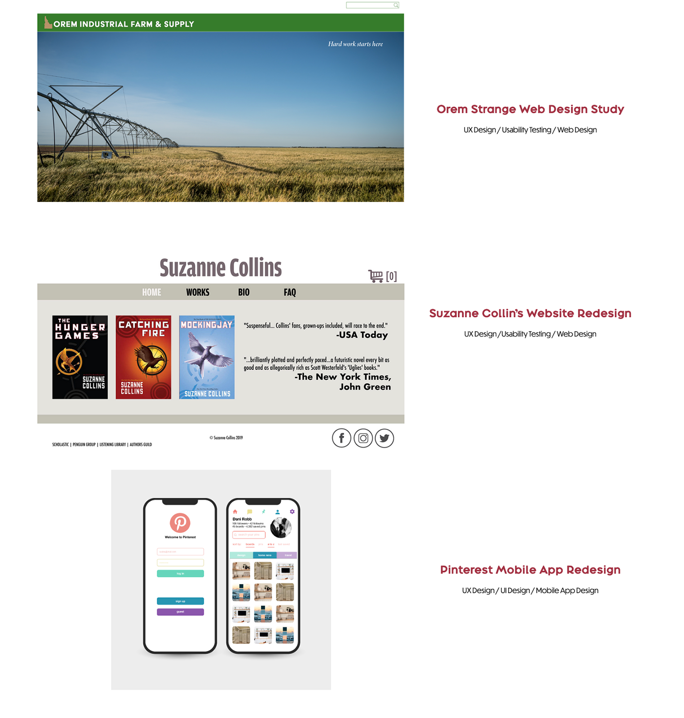
Dani Robb Personal Branding Campaign
Brand Values
Having fun with my work and showing that through my designs is important to me. I come from several different cultural backgrounds and I love that I get to translate ideas using visual communication and design as a sort of universal language. Design should have purpose, be functional, and be beautiful.

Mood Board
I love the dark reds and purples that are painted into the sky and how they fade into each other effortlessly during an Autumn sunset. I love the vibrant pops of oranges that highlight those reds and purples and felt it portrayed my personality well. Autumn also has many organic shapes and I wanted to try and incorporate that into my own logo if possible.

Brand Colors & Typeface
I chose the below colors based on my mood board visuals referencing an Autumn sunset. I chose to use Broadacre Regular as the typeface for my logo and headings, and Dunbar Tall Book for copy text.

Personal Logo
I wanted my name to be the focus of my logo and ended up with a version that joined my first and last name together with a simple extended ascender from the b to the n. I added in my brand colors to reflect that Autumn sunset and also created a black and white version.


Stationery
Drafts of my initial business cards and letterhead included variations that played around with using a gradient of my color values in different ways. My final version was a white version of my logo on a gradient background.


Personal Portfolio Website
https://danirobb.myportfolio.com/
Below is a short video preview of my personal portfolio website created with my brand identity and values created with Adobe's Portfolio site.