13 Month Typographic Calendar
Ibegan this project by thinking about what a calendar is and how it communicatesinformation to people. At itsbase, a calendar is a way to mark the passing of time through a structuredframework of days, months, and years. Calendars have traditionally included both numbers and letters torepresent time. To me,however, time has always been represented by numbers. A day is the passage of 24 hours or 1440 minutes or 86,400seconds. I began designing acalendar that communicated this passage of time but only through numbers.
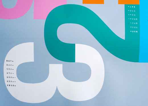
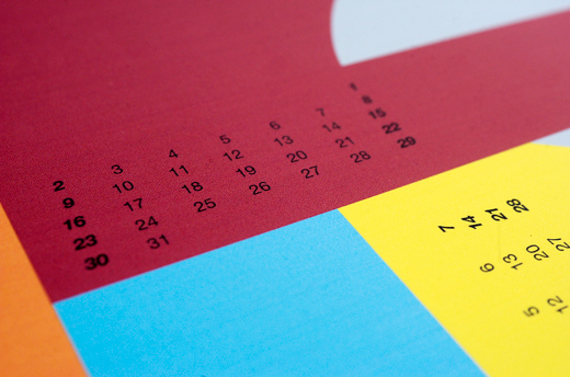
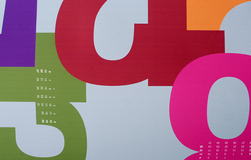
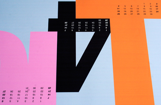
Beinga typographical calendar, I chose to showcase a particular font family(Helvetica Neue) and use as many of the fonts while retaining a sense ofcohesiveness. I also realizedquickly that color and scale were integral to the clarity and excitement of thepiece. It was important that thecalendar was eye-catching; something that could be regarded as a piece of artfrom any distance. Therefore, Istarted with the overall look of the piece. The months are the biggest division of the calendar, so theynaturally were the biggest numbers. I arranged the numbers as if they were puzzle pieces, using the naturalcurves and lines of the number to interlock it with its neighbor. Each large, bold, colorful month numbercontained its weeks and days. Thelayout of the weeks and days was fairly traditional with 7 columns and 3, 4, or5 rows. To separate the weekendsfrom the weekdays and give a frame of reference for the viewer, I chose to setSaturday and Sunday in italics.
OnceI determined that I wanted the calendar to be a single piece of paper, I feltthat it had to be fairly large to accommodate all the type and be easilyreadable.