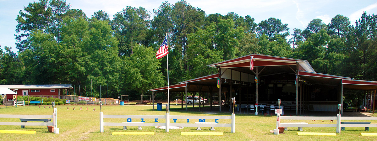
For this project, I was tasked with choosing a location and representing it typographically as both place and space. I chose Mossy Oaks Music Park in Guyton, Ga. Mossy Oaks is a family owned and operated campground where they have weekend long Bluegrass music festivals. They also have a campground with RV hookups, an antique store, a kitchen, and a snack shop. Everything someone needs for a weekend of camping and bluegrass.
A lot of time was spent out at Mossy Oaks observing, researching, interviewing, and of course enjoying the environment in order to determine how to best represent the location.
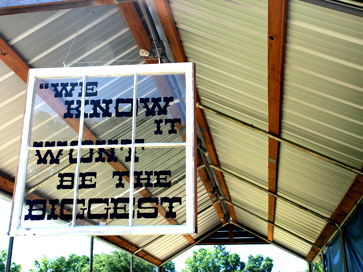
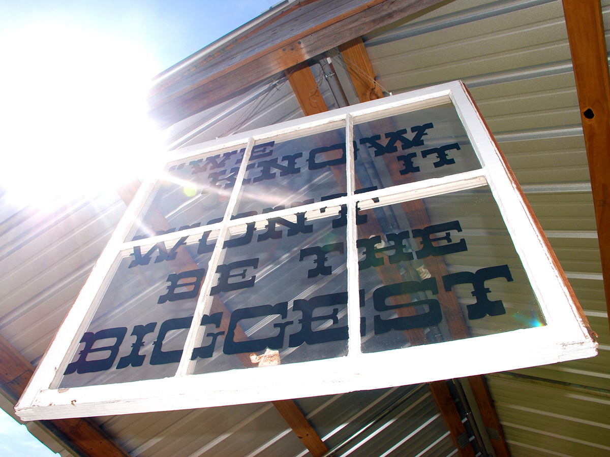
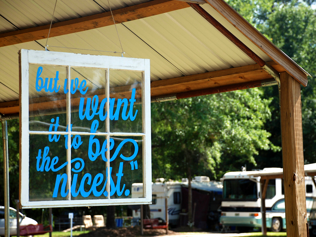
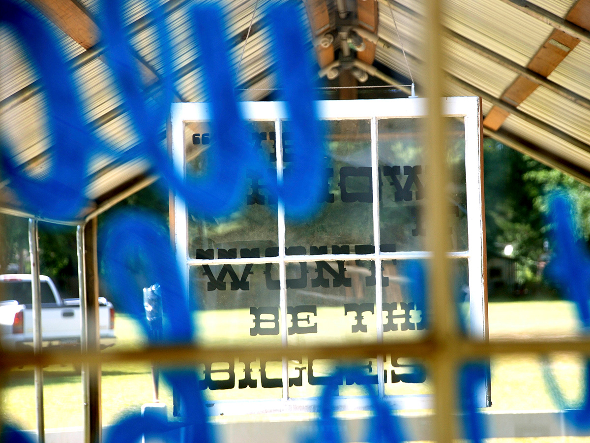
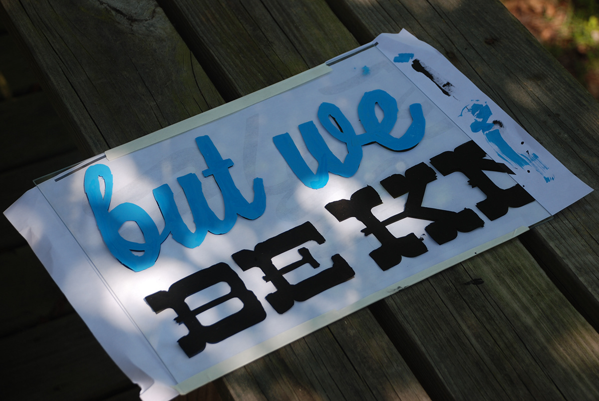
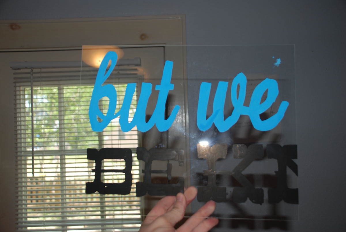
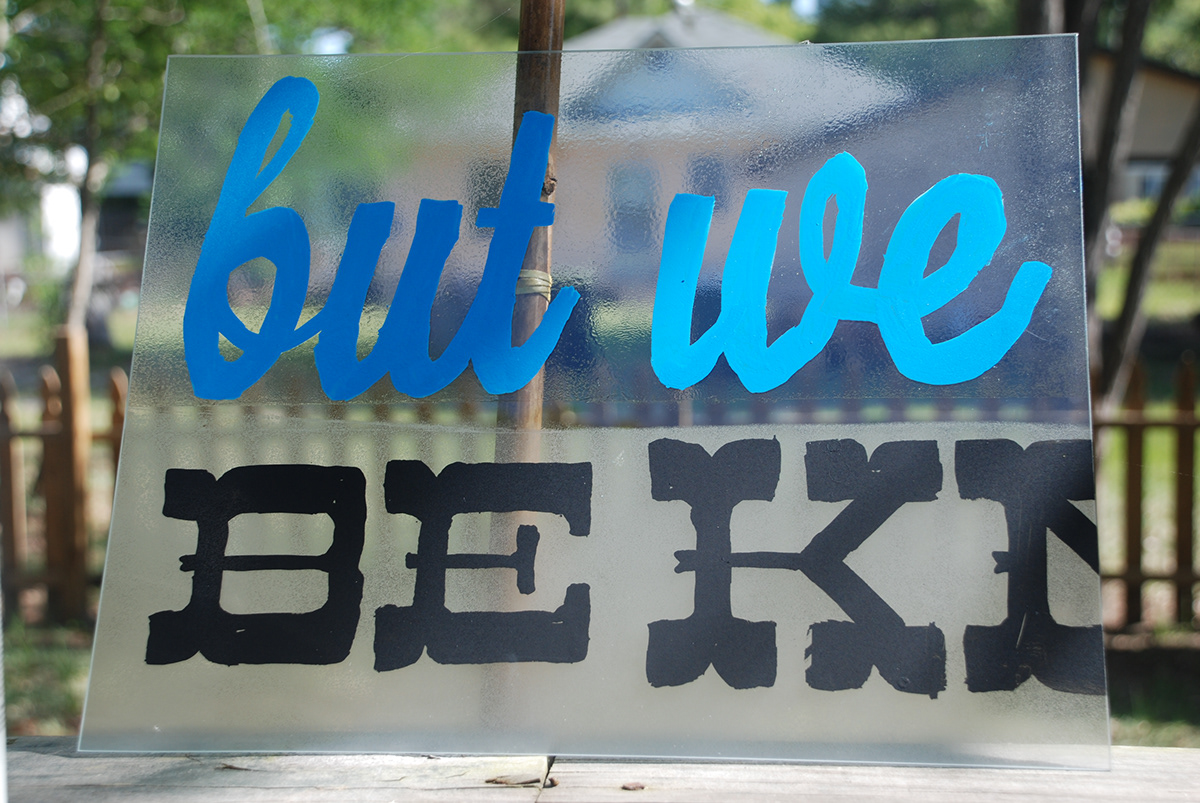
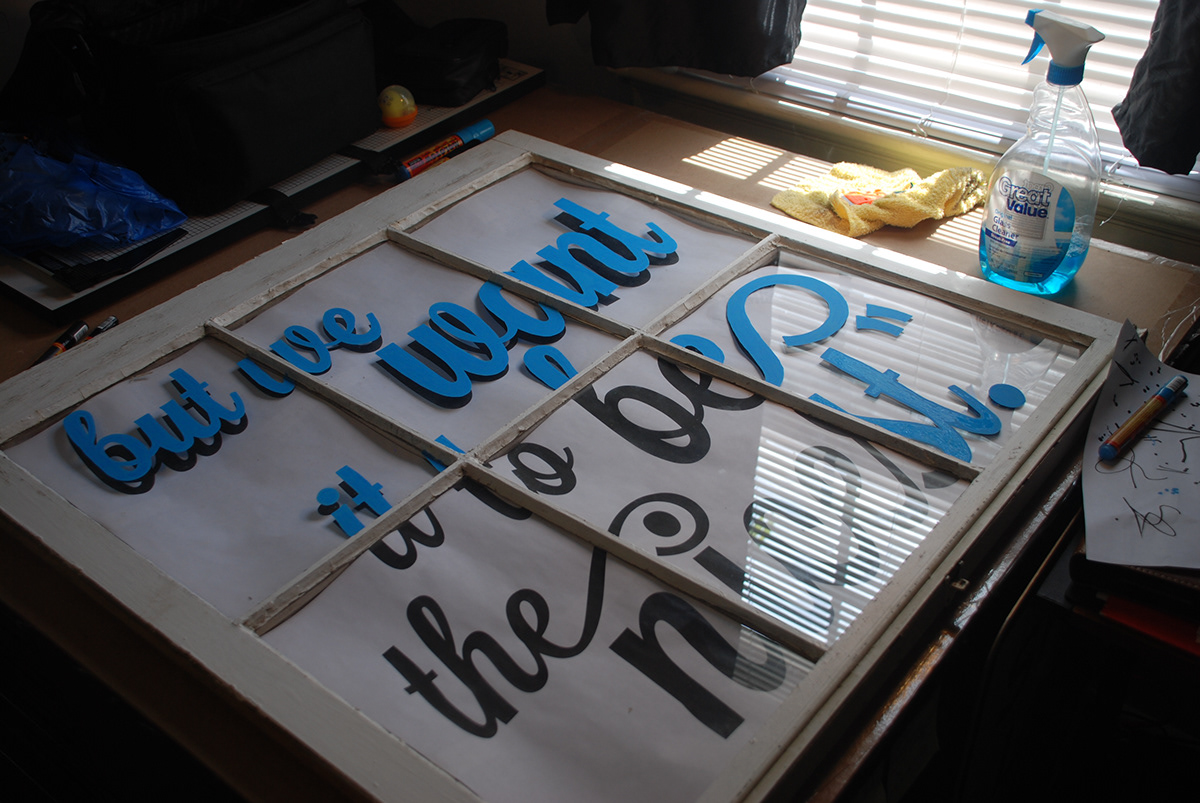
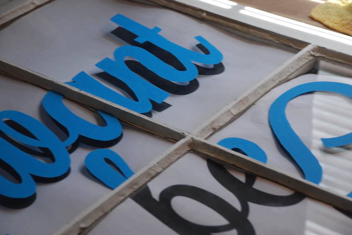
Place is represented through the quote graphic on the old fashioned windows. This quote sums up that Mossy Oaks Music Park understands that it won’t ever be the biggest bluegrass music park, but it aspires to be the nicest. The words were actually spoken to me by the son of the man who started the park.
Windows were chosen to play up the transparent nature of the park. They are hanging at the main walkway from the campground area to the stage, each one is at the end of a covered area set up for merchandise.
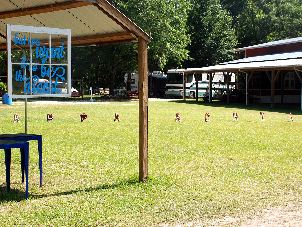
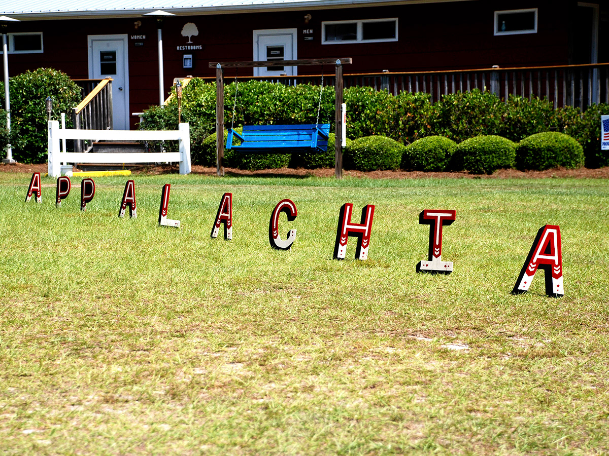
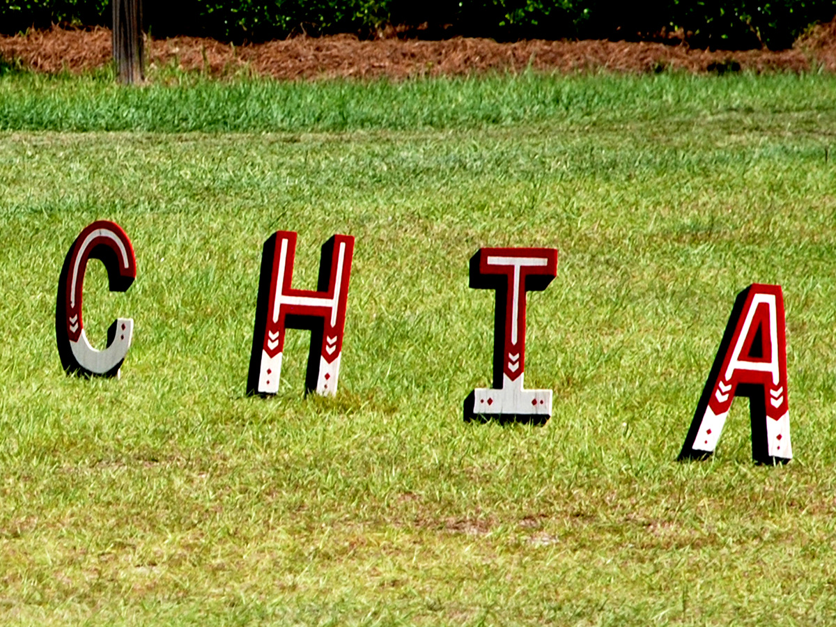
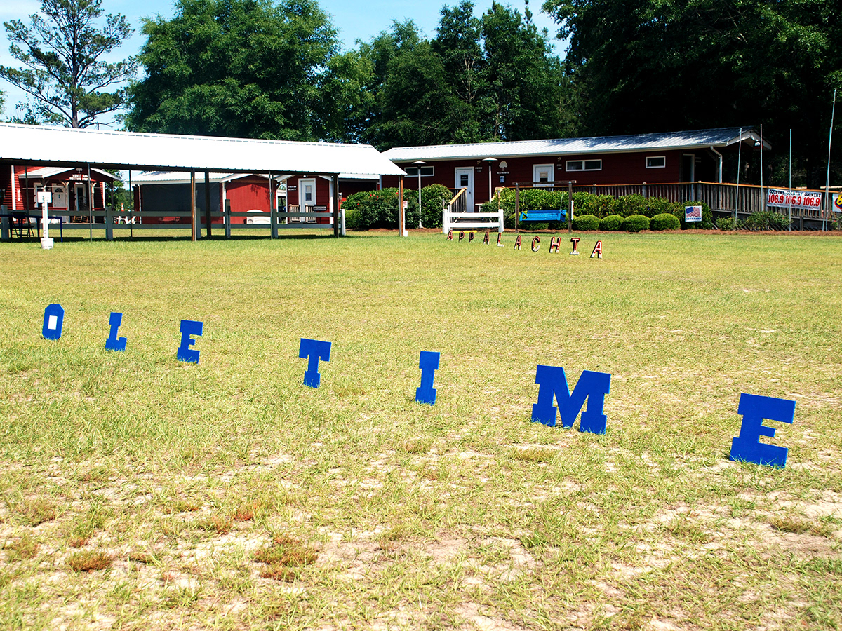
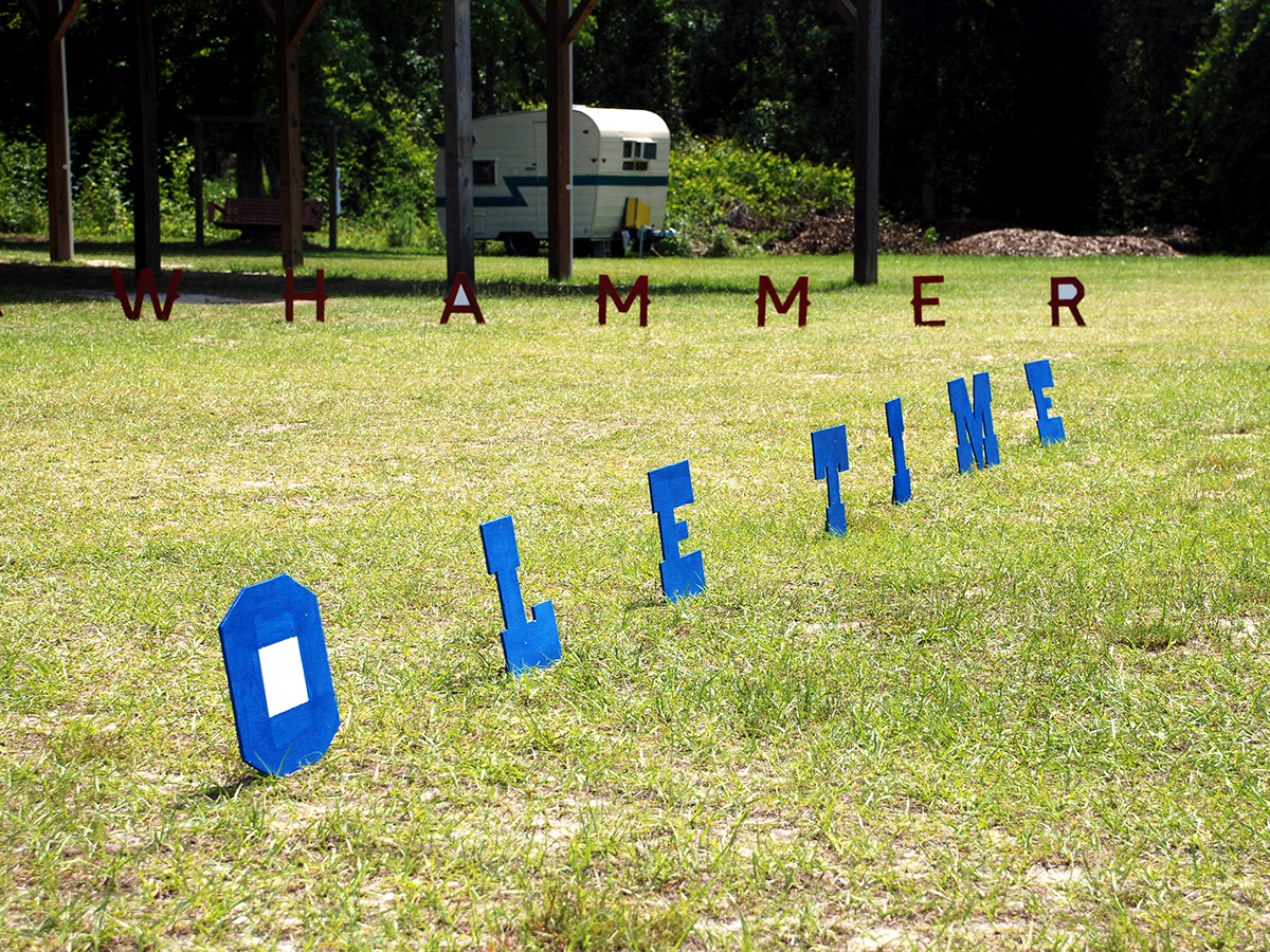
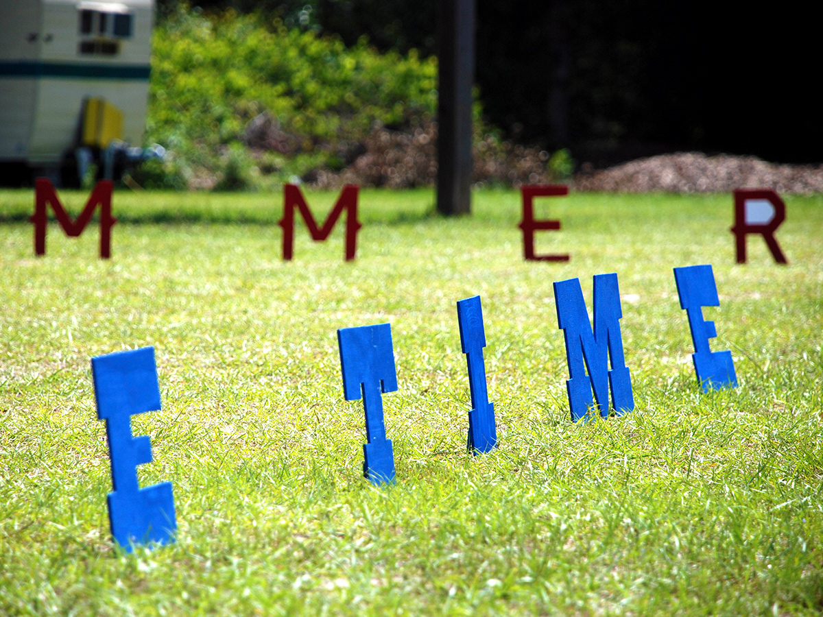
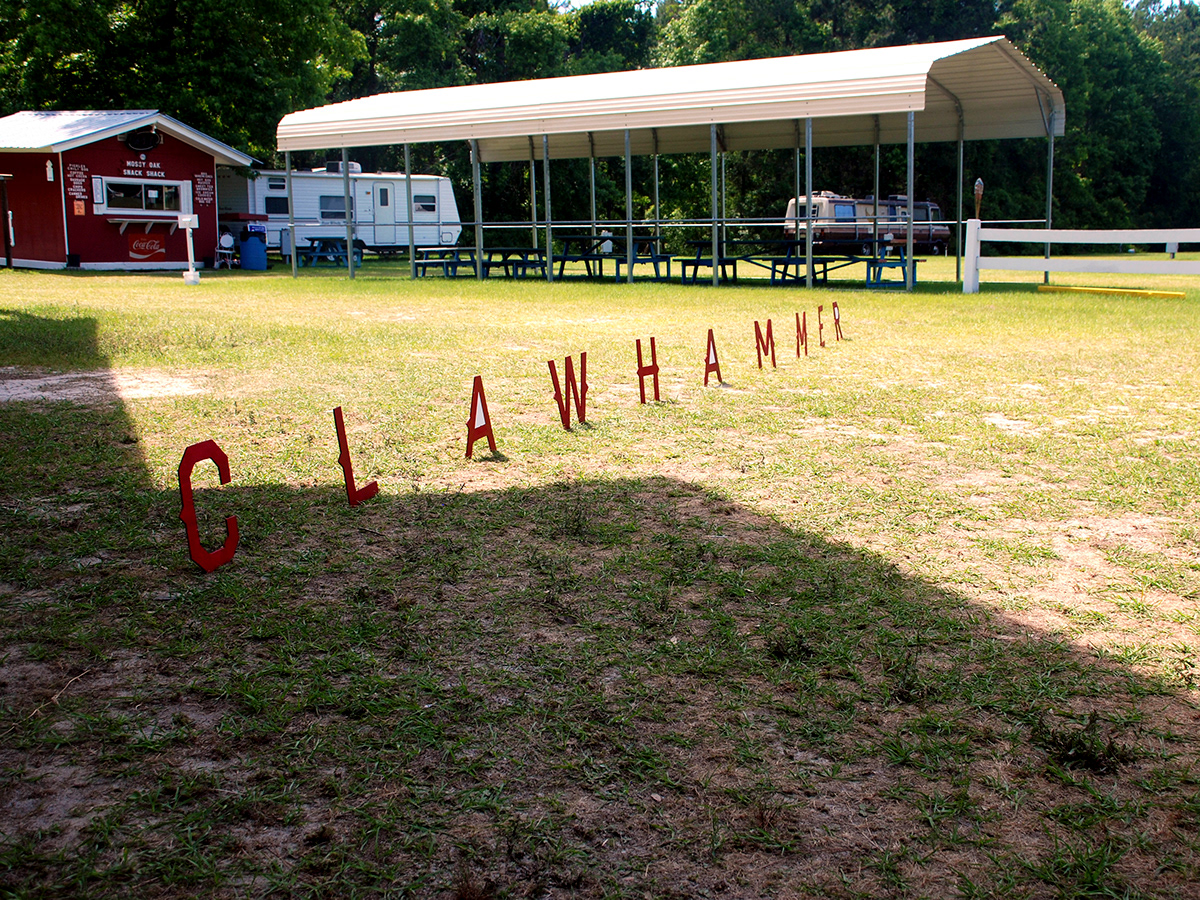
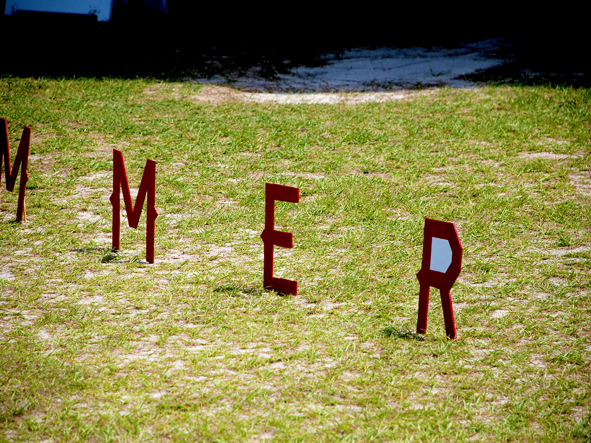
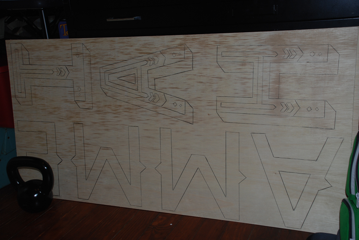
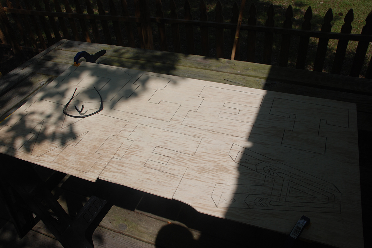
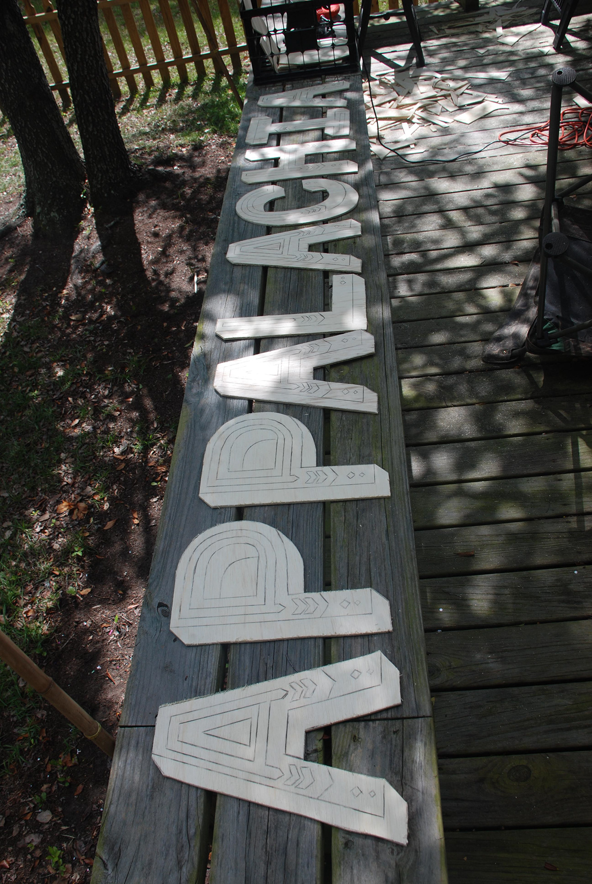
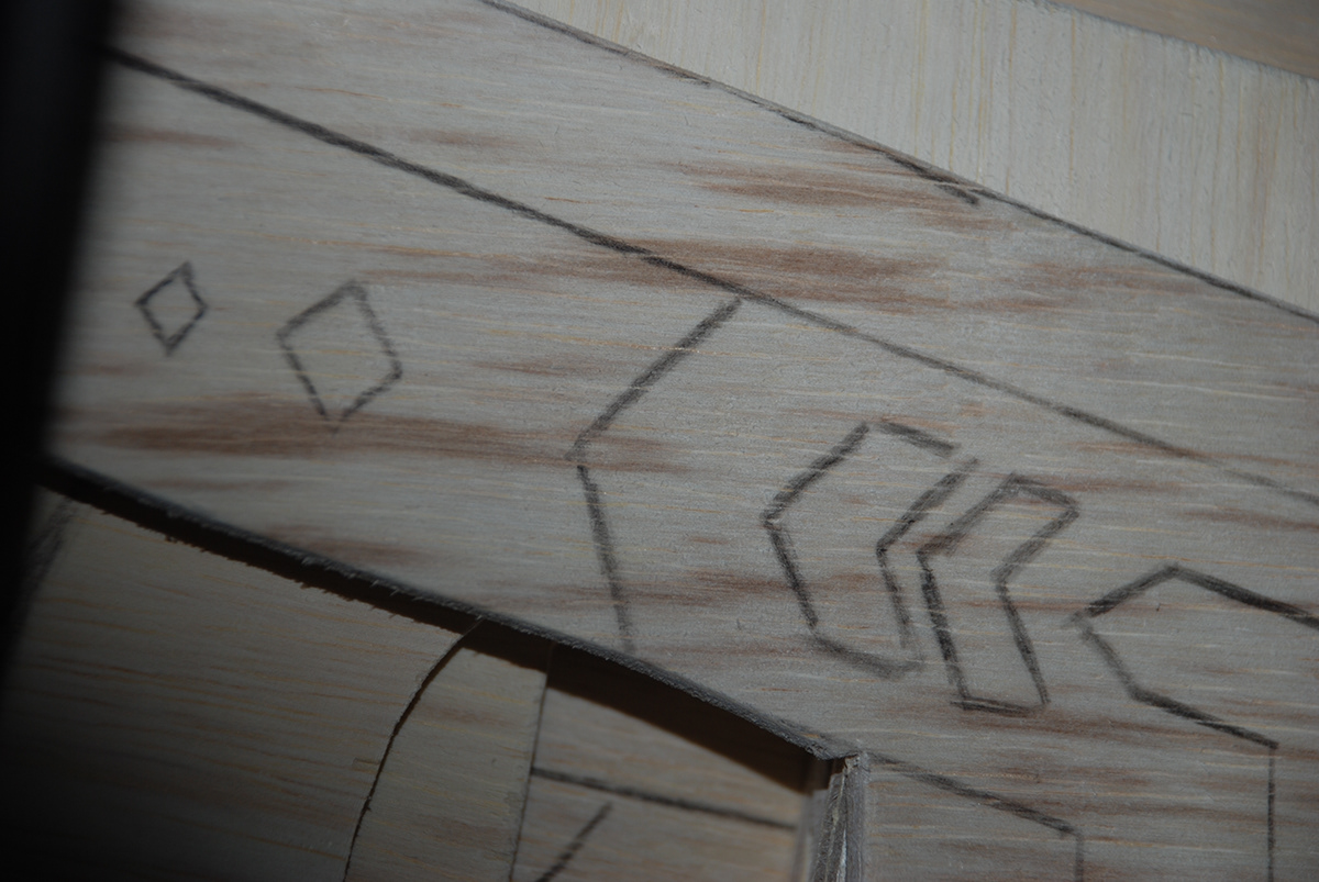
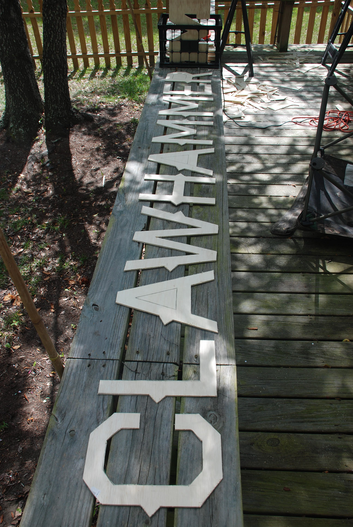
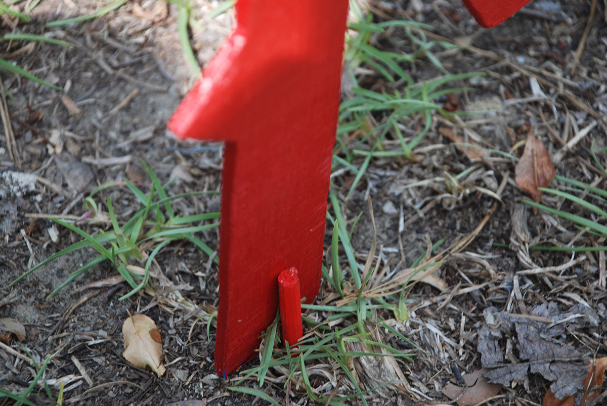
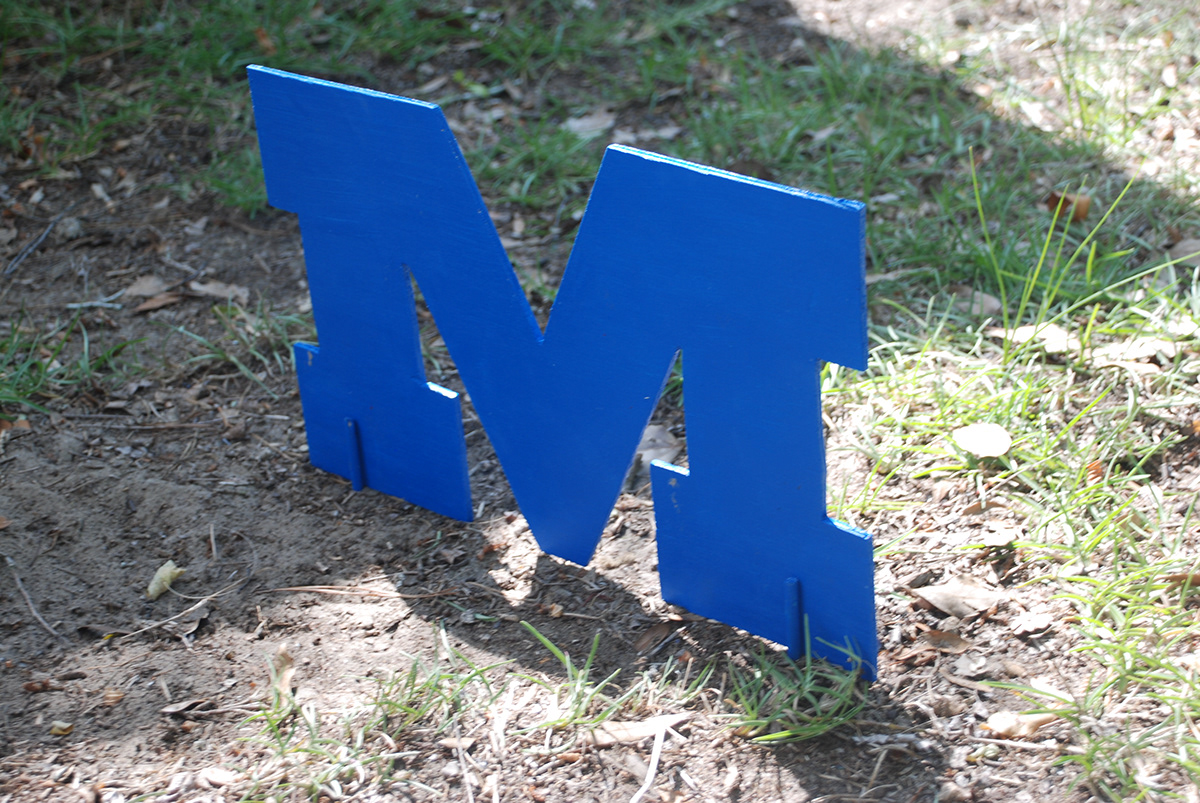
Space is represented through the bluegrass terms that are sprinkled throughout the small field between the rest of the campground and the stage area. Each specific word was chosen for its connotation in Appalachian culture and the typefaces were chosen to enhance that relationship as well.
The space at Mossy Oaks is lively, but there is a difference in atmosphere whether you are in the stage area or around the rest of the campgrounds. The location of the letters are set up so that as you walk to the stage area, you pick up the Appalachian nostalgia, but since you can’t take all of that nostalgia with you as you go back to your everyday lives, you leave it there for next time.
Since a lot of traditional bluegrass listeners are of the older crowd, many of them travel around the campgrounds on golf carts. I want to note, though, that it does not mean they aren’t lively. It’s actually quite the opposite. The festivalgoers will sometimes park their golf carts by the white fence shown in the first photograph. They will hangout here throughout the live music, having a great time. The location of the words also acts to break up the empty field between this area and the stage.
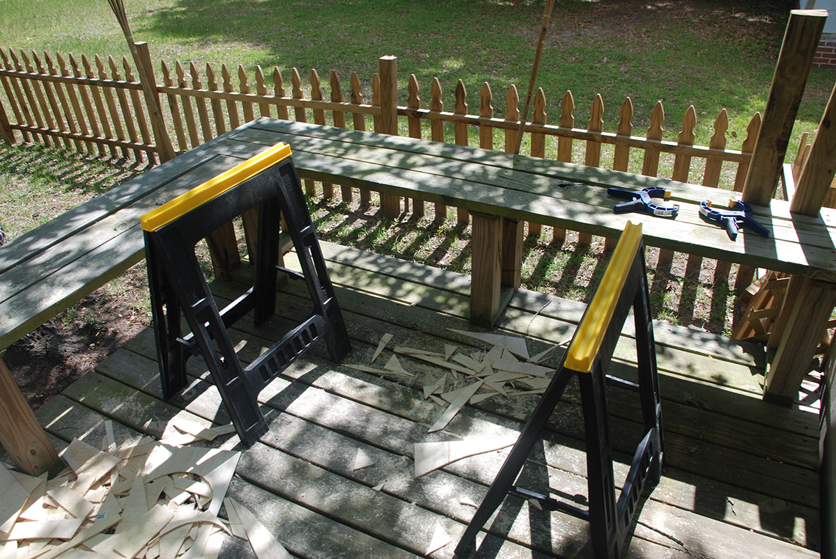
Production
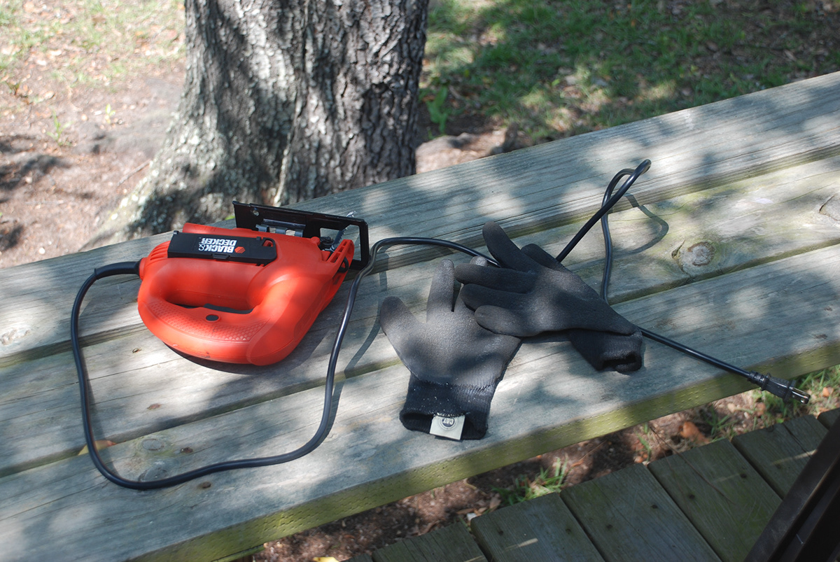
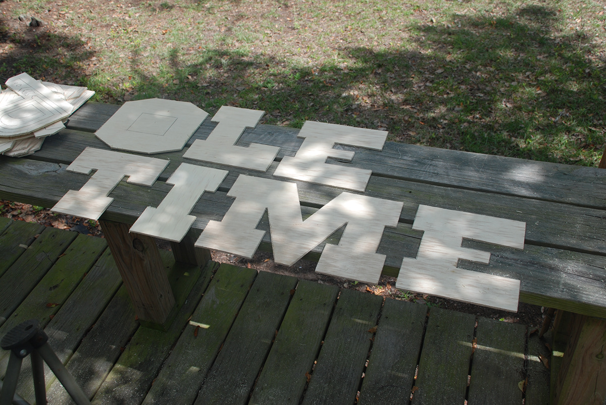
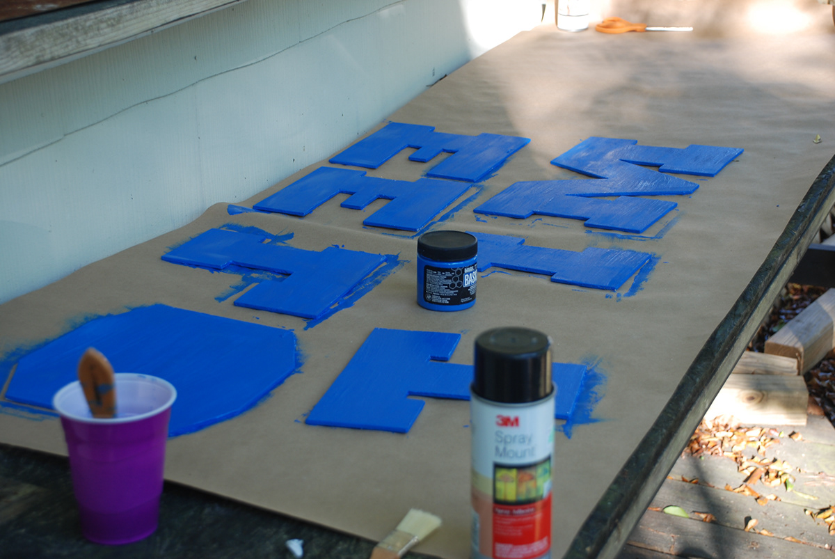
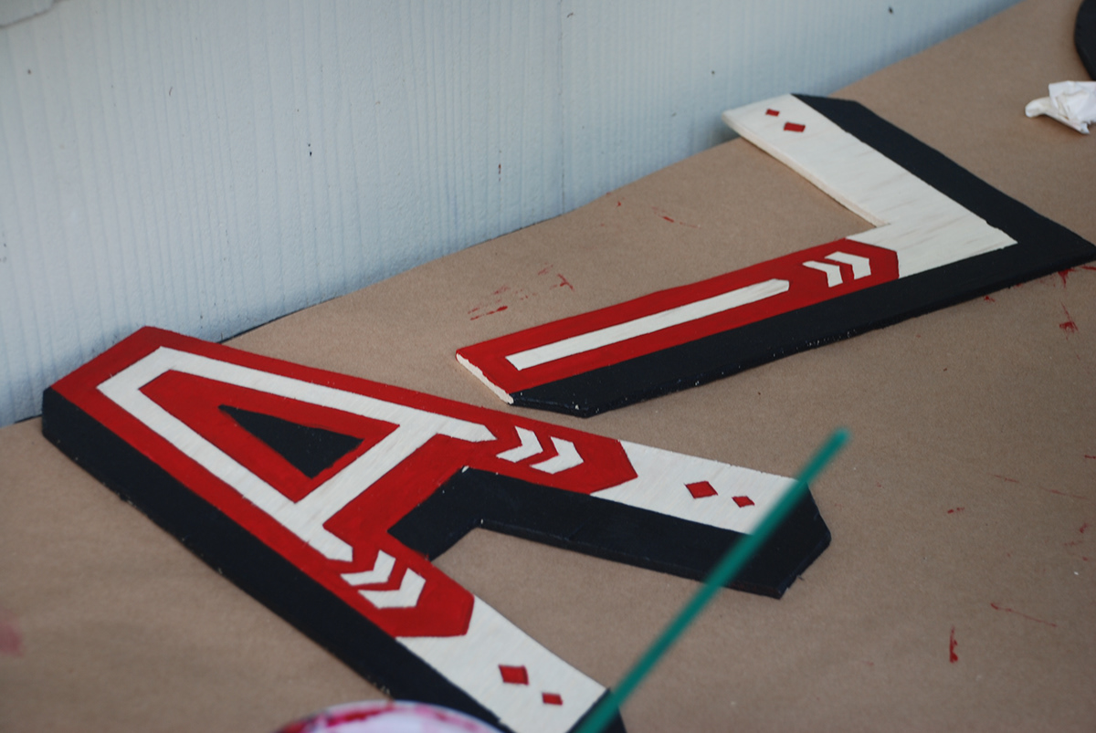
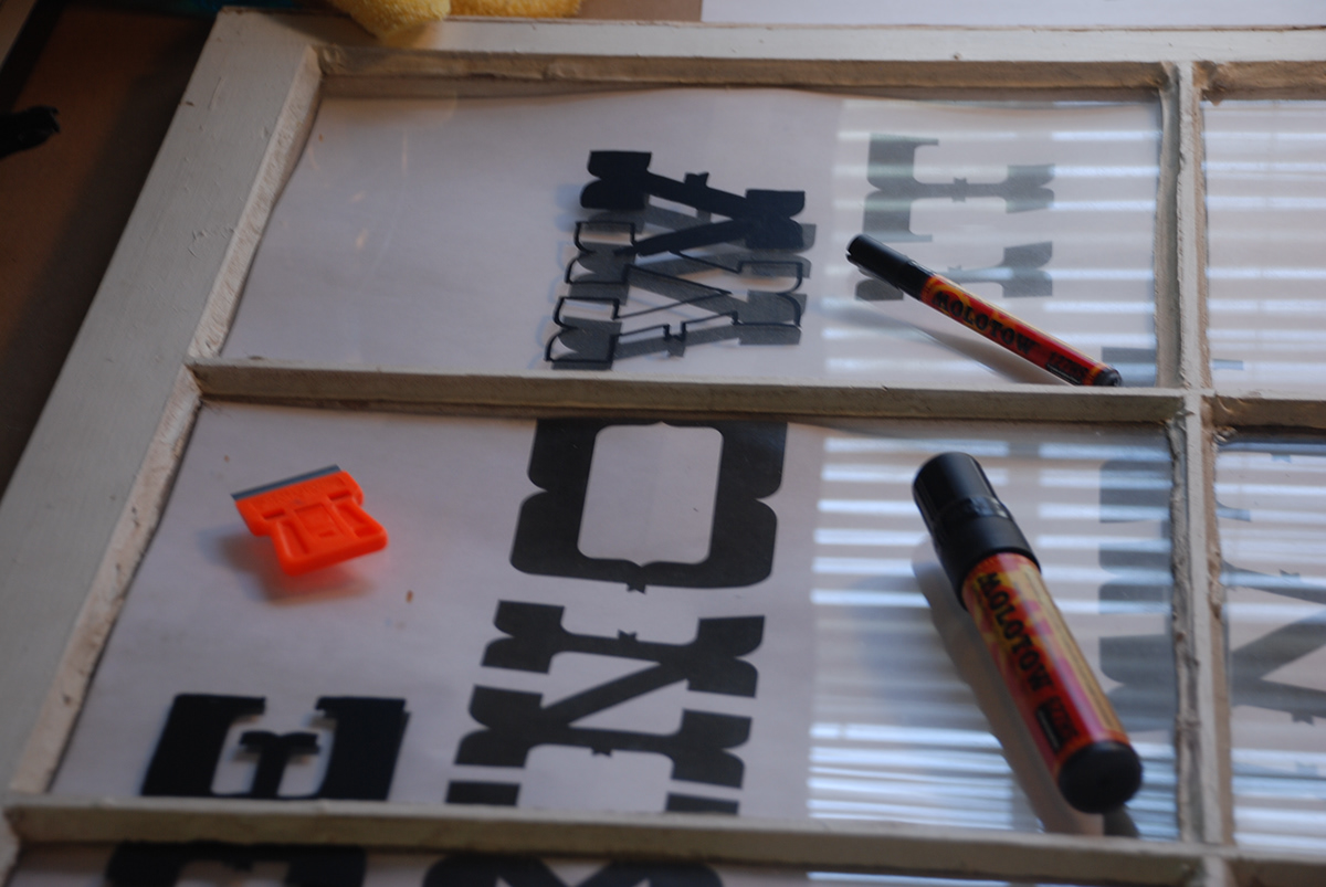
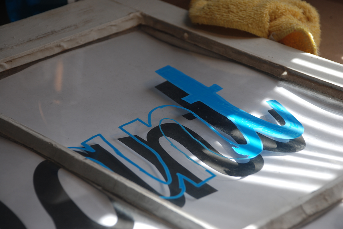
The wooden letters were cut and painted by hand. The windows were also hand painted. The typefaces were chosen because they best represented the style of Mossy Oaks in a new and refreshing way, while still paying tribute to the past. The words were chosen for their impact and meaning to the Bluegrass culture. And the quote on the window was picked out from a conversation with the owner's son
Typefaces Used:
Haymaker Hellforge Homeward Lavenderia Tightrope
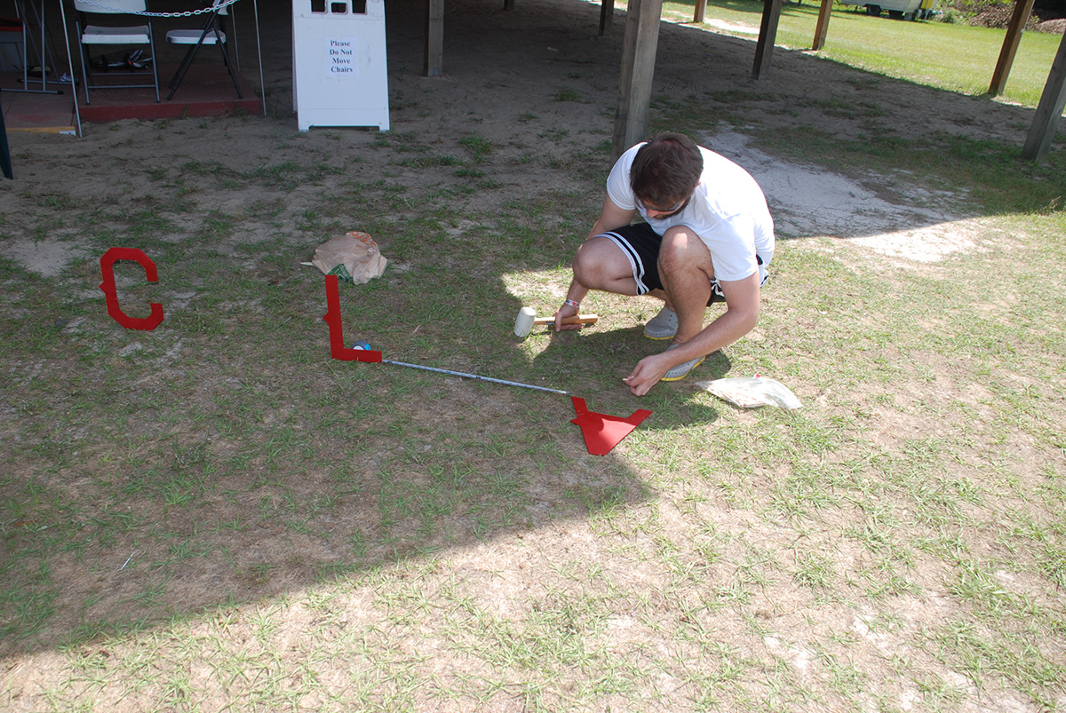
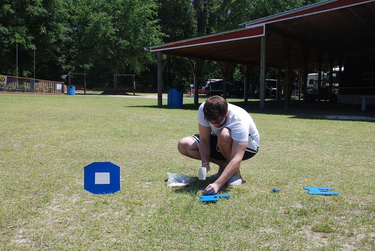
Below are some process shots that I have gathered together. I have started with the beginning of the project construction and ended with the final installation.

The End. Thank You.

