A brief given to me by a design agency in Nottingham which had to be completed in 2 days in order to get an interview.
I had to create a brand for a wedding planner.
The concept behind the logo is focussed on what marriage stands for, which is eternity, everlasting, hope, and togetherness.
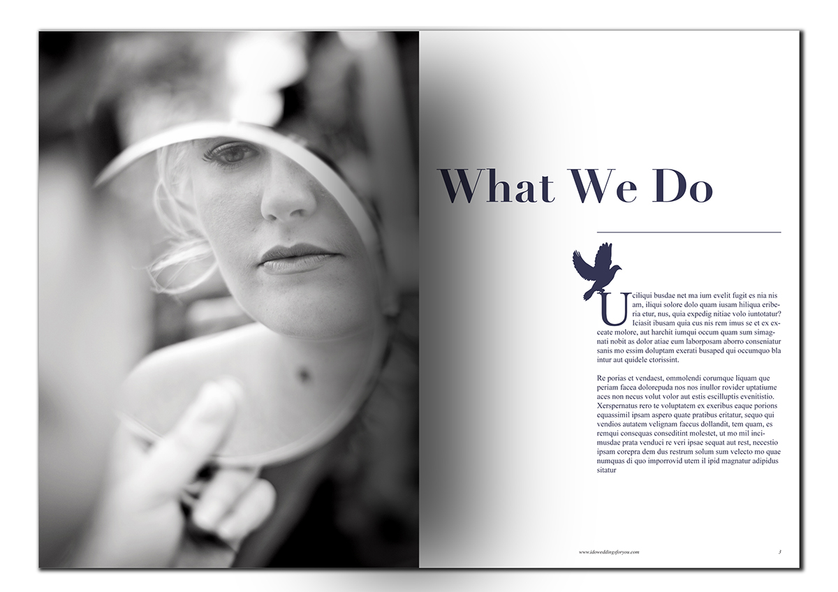
I used a dove which is often seen at weddings as a way to portray eternity, harmony and peace. The dove is carrying the letter “o” and is placing it next to the D.
I used Didot as the primary font as it is sophisticated, elegant, but with a modern style. It has class and moderninity, and the clean, simple serifs keep it fresh and trendy.
I also used Times New Roman which is a timless font, this is used to portray the eternity and longevity of marriage.