Breaking Bad: Bitch.
The Process
Introduction
I've been wanting to do a breaking bad design for a long time now. Finally over Thanksgiving weekend, I got some time to myself to just sit, listen to music, and just do what I wanted to do in photoshop. Here's a look at the process.

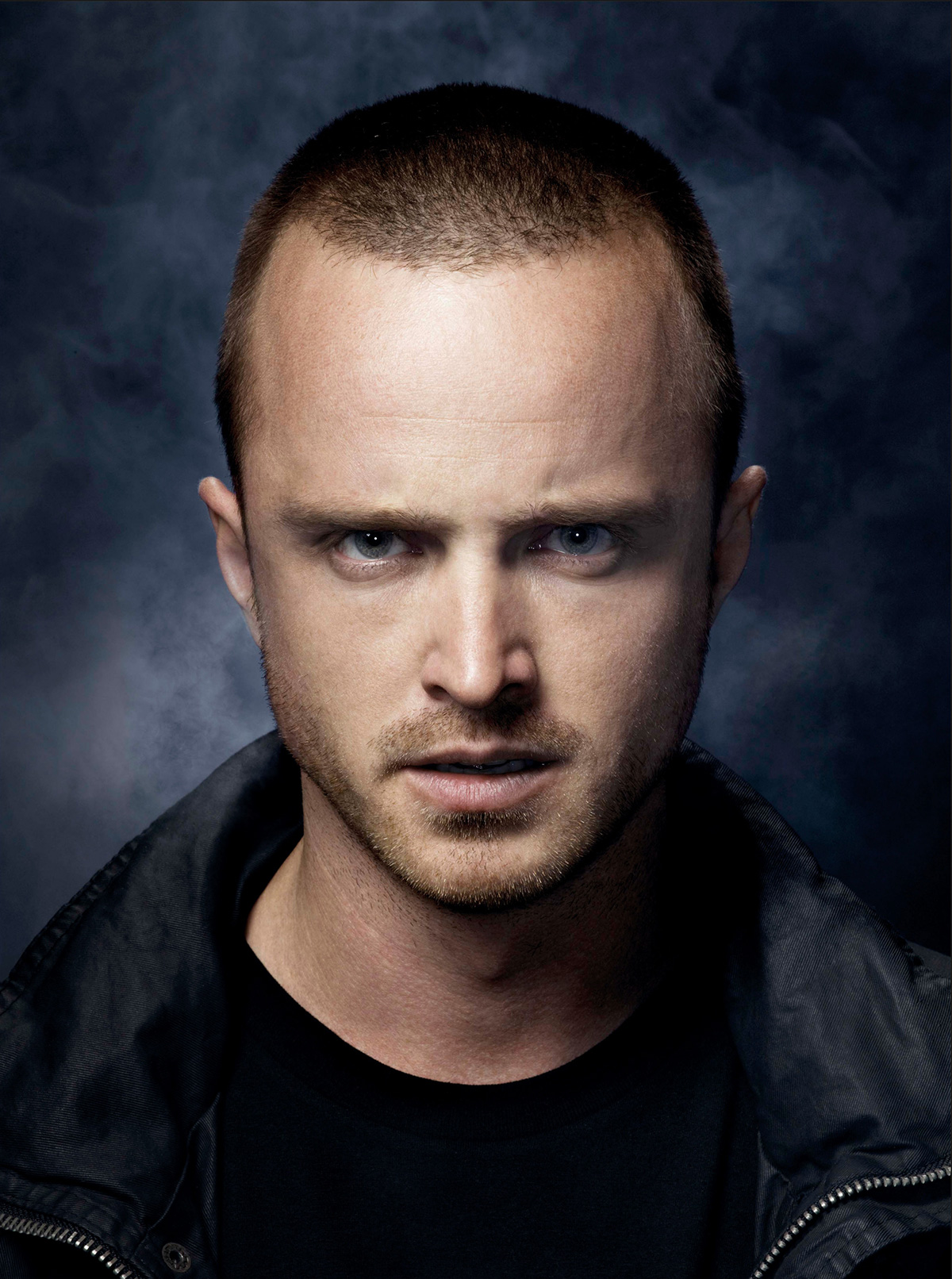
original image

Step 1: Removing the background, centering image.
Note: Originally I wasn't going to use two photos and do the before and after, but as I was designing, it just felt like it needed something. The more I thought about it, it just made sense to do a split view of Jesse before and after. This is the original image for the second photo.

Step 2: Touch up second photo, and started the split view. The photos won't line up perfectly because Jesse's head is slightly nodding down just a little in the second photo, but I'll work with what I have. I also fixed Jesse's shoulder on the left side since the initial photo was taken a bit off center.

Step 3: The neck really stood out between the two photos. So I took the neck/collar from the second photo of Jesse and blended it with the first. I wasn't too concerned with the skin tones not matching at this point, because I knew from the begining that this design was going to be a two tone image, and I would take care of that with color adjustment layers later.
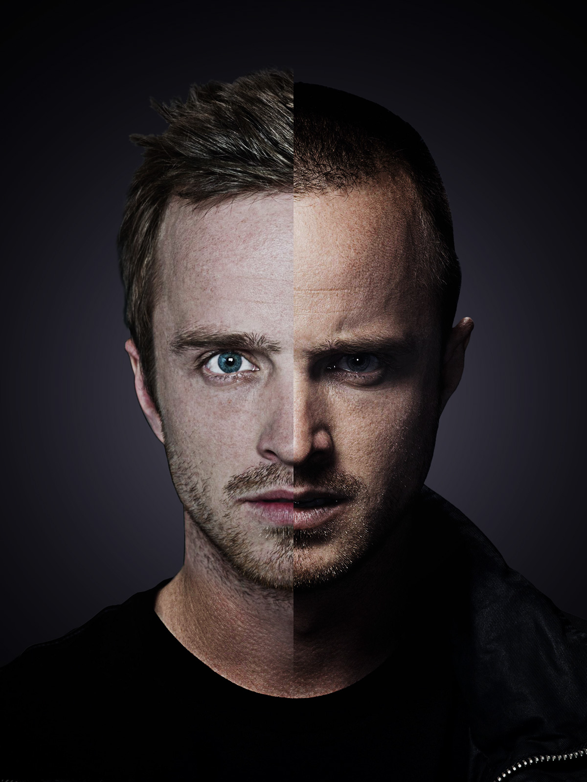
Step 4: Started working with adjustment layers, specifically black and white, curves, and levels to get more contrast and shadows in the images.

Step 5: Now I started messing with gradient maps to get the two tone color I wanted. I tried multiple color combinations. This one and a blue/green color really worked for me. In the end I went with this purple/yellow though because I have a tendency of using blue in a lot of my work and just wanted to do something a little different.

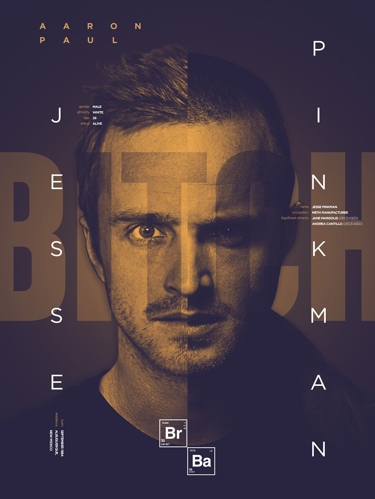
Note: AH TYPOGRAPHY! The whole reason I wanted to start this design. I love nice clean type, and really wanted to some type of design like this after seeing this poster from Caroline Grohs. That was what sparked my creativity and inspiration for this project.
Step 6: I tried a couple different typefaces for bitch at first, and ended up going with Chalet Comprime. I liked it the most becuse it was very strong, and being condensed helped with me being able to make it very big without cutting to much of the letter forms on a portrait style design. I gave Jesse some shadows to help it look like the text was behind him.

Step 7: I duplicated the bitch layer and turned the text color to black with the layer blending mode on soft light. I used both of the Jesse's silhouettes to mask out the black "bitch" text where it ran off his face. This way I was able to achive to different color styles with the text that worked together without bleeding into each other.
The Final Design
Now all the fun typography. The type used in the final step are facts about Jesse such as the basics name, age, location ect. and also relationships. For this typography I used a combination of gotham fonts (light, medium, and bold).

