


Olivas da Lua
Packaging Design
Porto Alegre, Brasil, 2021.
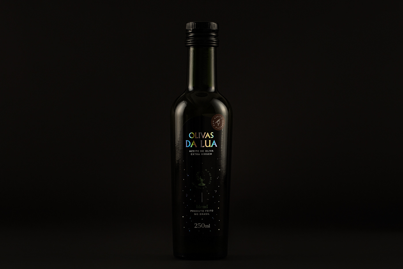
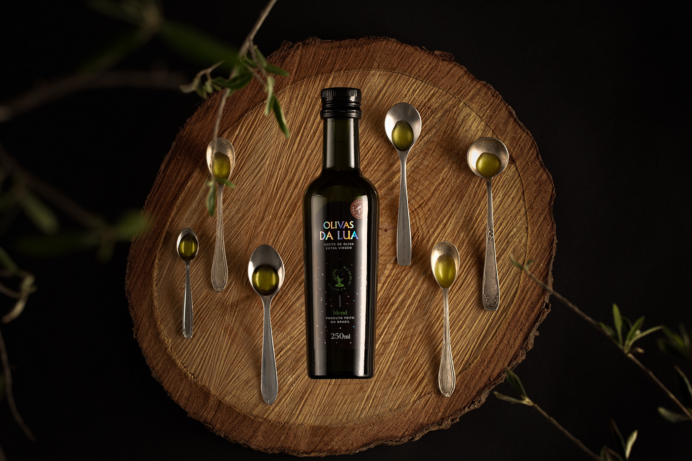
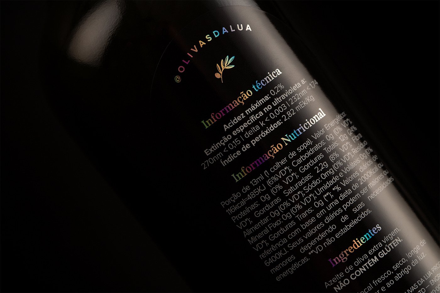
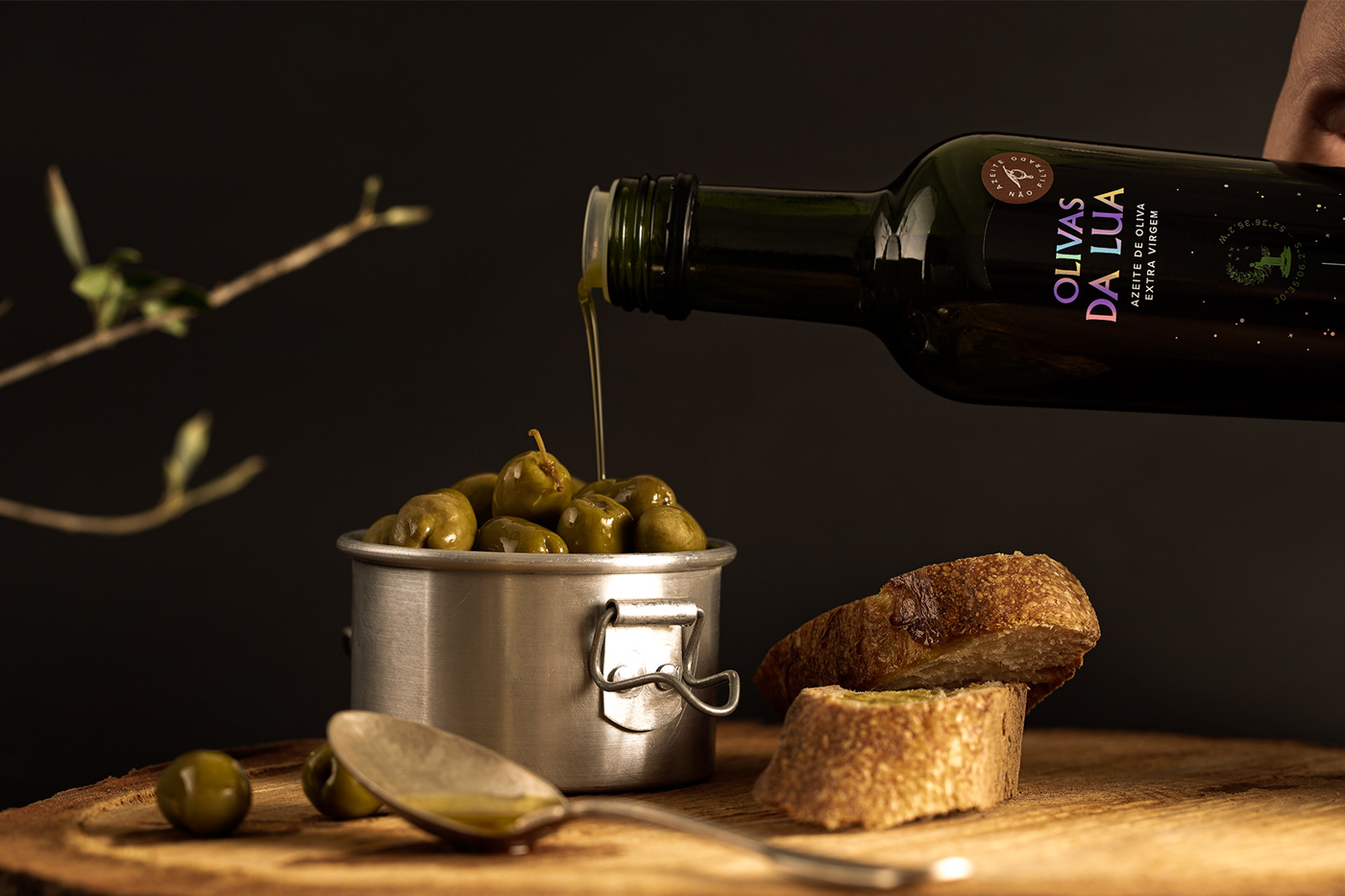
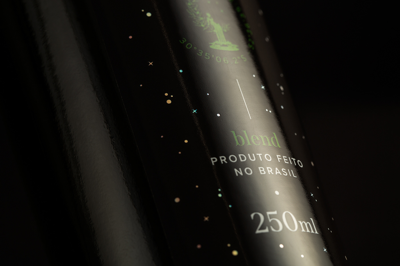
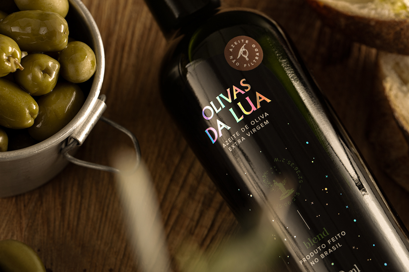
A marca Olivas da Lua apresentaria oficialmente seu azeite ao mercado e, para isso, sentiu a necessidade de uma embalagem impactante que causasse ao consumidor a sensação de ter em mãos um produto raro. Portanto, o trabalho deveria trazer em pequenos detalhes a força de um azeite de alta qualidade. O nome da marca foi o ponto de inspiração para a construção do projeto, onde a Lua se expandiu para um grande céu estrelado e brilhante, que ganhou vida através do papel holográfico em contraste ao tom escuro do rótulo. Este artifício proporcionou uma nova dinâmica à experiência do rótulo, visto que o efeito furta cor do material salta aos olhos de diferentes formas de acordo com o manuseio da garrafa. Com isso, o projeto de embalagem proporciona ao consumidor uma experiência com o produto muito além da gustativa.
The brand Olivas da Lua ("Moon's Olives") would officially present its olive oil to the market and, for that, it felt the need for an impactful packaging that would give the consumer the feeling of having a rare product in their hands. Therefore, the work should bring in small details the strength of a high quality oil. The brand name was the inspiration for the construction of the project, where the Moon expanded to a large, bright starry sky, which came to life through the holographic paper in contrast to the dark tone of the label. This artifice provided a new dynamic to the label experience, as the iridescent effect of the material pops out in different ways depending on how the bottle is handled. With this, the packaging project provides the consumer an experience with the product that goes far beyond the taste.


S T U D I O B A H ® 2021
Creative Director: Felipe Ba.
Design Team: Maria Laura Pereira
Photography: Duda Bussolin (Moropolo Studio)
Retouch: Carlo Barros, Rafael Poloni
Say hello@studiobah.com.br
Follow us | Facebook | Instagram
Follow us | Facebook | Instagram


