Fable & Mane
Fable & Mane is a modern hair wellness brand inspired by Ancient Indian beauty secrets. We worked with the F&M team to develop the brand from the ground up – working from Research, Strategy and Naming through to Brand Identity, Packaging and Print/Digital rollout.

It all started at the Roots
Fable & Mane is rooted in the founder's Indian heritage and personal experiences. During a time of stress, she was reminded of the power of the Indian tradition of hair oiling and was drawn back to her roots for a solution. We helped take this story and turn it into a modern, forward-thinking brand that is still very much rooted in tradition.
Fable & Mane is rooted in the founder's Indian heritage and personal experiences. During a time of stress, she was reminded of the power of the Indian tradition of hair oiling and was drawn back to her roots for a solution. We helped take this story and turn it into a modern, forward-thinking brand that is still very much rooted in tradition.


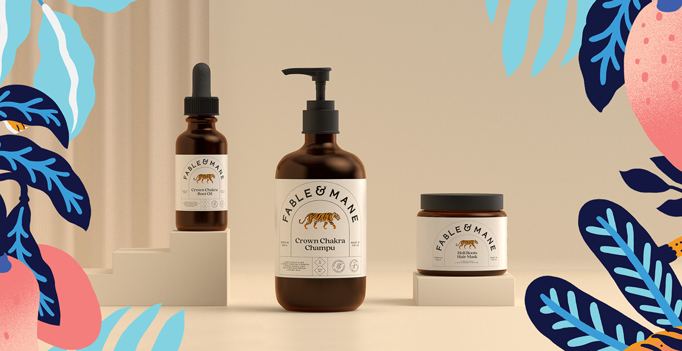
The Symbolic Tiger
Tigers occupy an important place in the Indian culture. Since ages, it has been a symbol of magnificence, power, beauty and fierceness and has been associated with bravery and valor. The tiger also has a significant place in Hindu mythology as the vehicle of Goddess Durga. The tiger is a key part of the brand imagery and is an important aspect of the logo itself as well as supporting illustration.


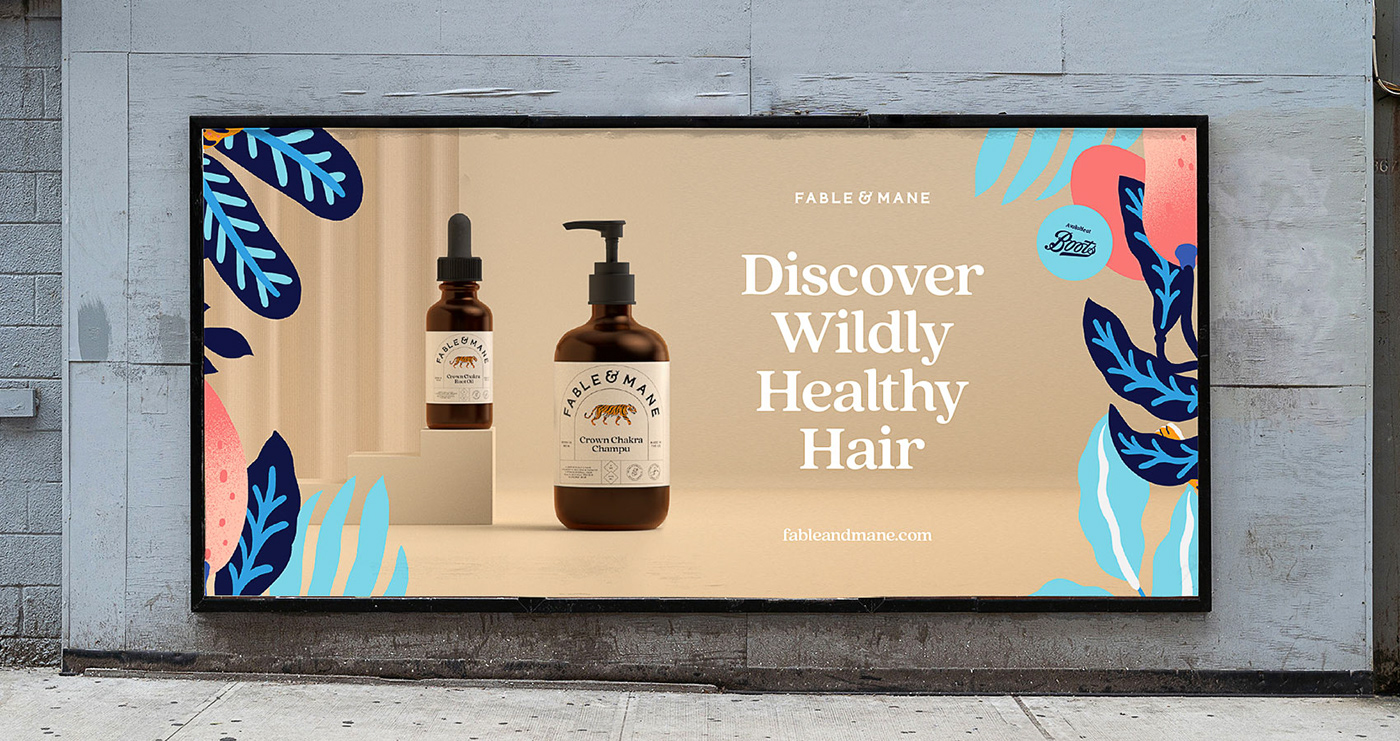
Crafting the Label
The structure of the label is very much a modern take on traditional Indian Beauty product packaging, which often used devices or containers to hold text and graphics. The rounded window shape of the core device also takes its inspiration from iconic and historic Indian architecture, bringing an eastern touch to a western design.
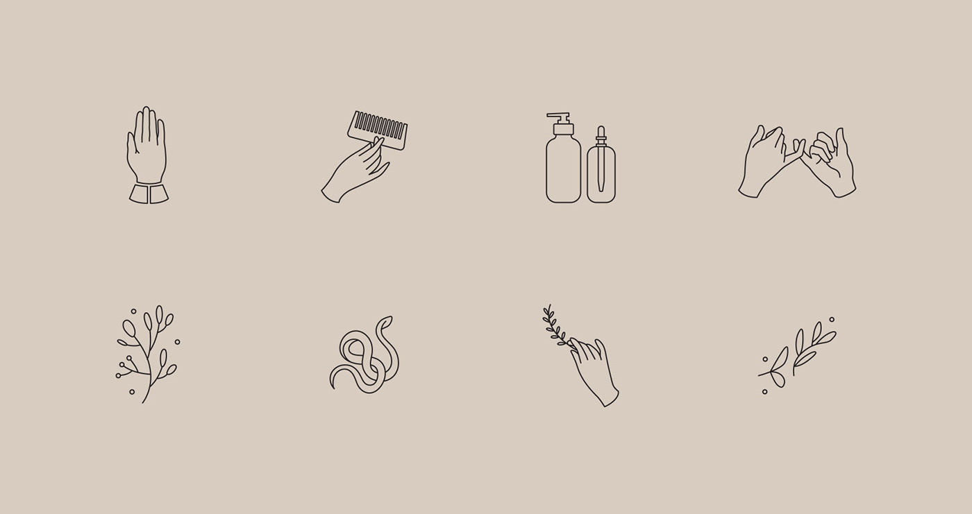
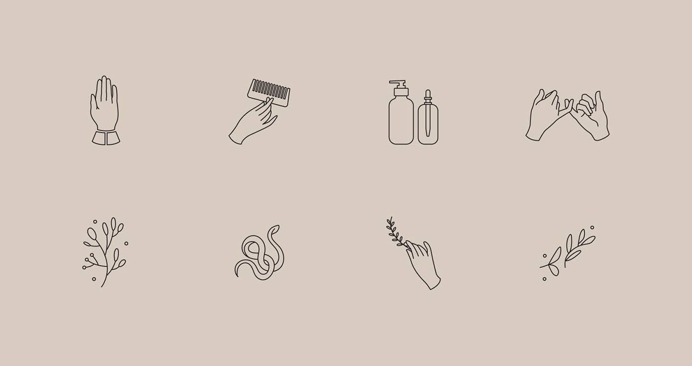
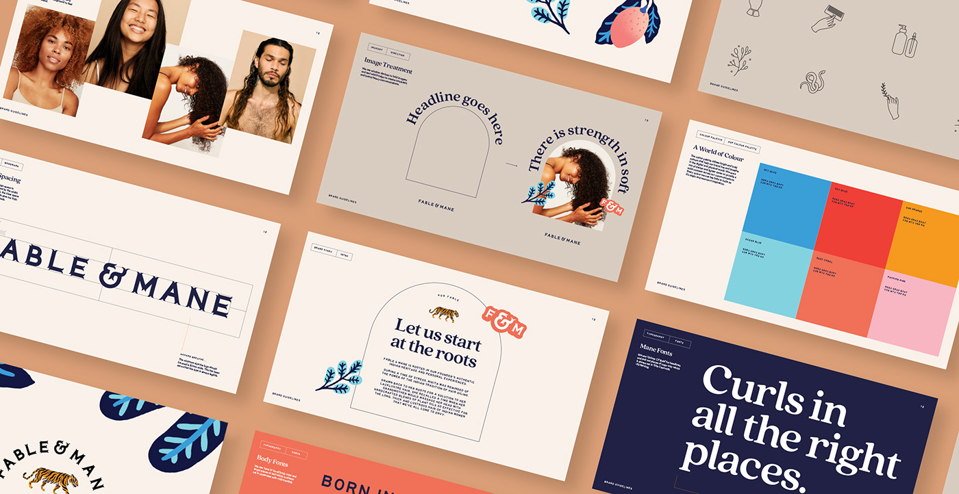
Ancient Modern Iconography
A key component of the F&M brand is its symbols. We created a clean keyline iconography style that felt modern whilst retaining an ancient quality. The visual style and positioning of the hands, in particular, draw upon traditional Indian culture.
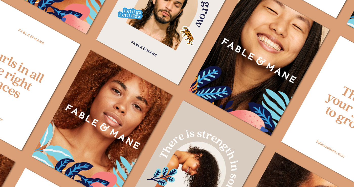
Story-led Illustration
We worked with Marcos Navarro to create a series of Story-led illustrations to help tie the brand components together, from Product Packaging to Portrait Photography and Key Messaging.
We worked with Marcos Navarro to create a series of Story-led illustrations to help tie the brand components together, from Product Packaging to Portrait Photography and Key Messaging.


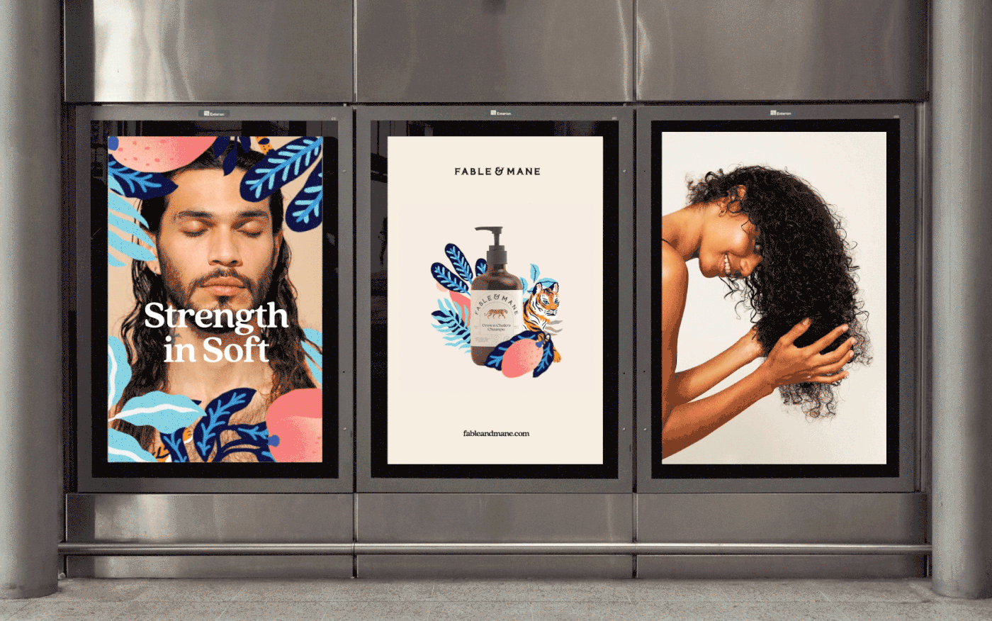
East meets West
In contrast to some of the symbolism running through the logo and packaging design, the photography style we opted for was fresh, modern, and clean. When combined with a playful and bright illustration style, we crafted a perfect balance of 'east meets west'.
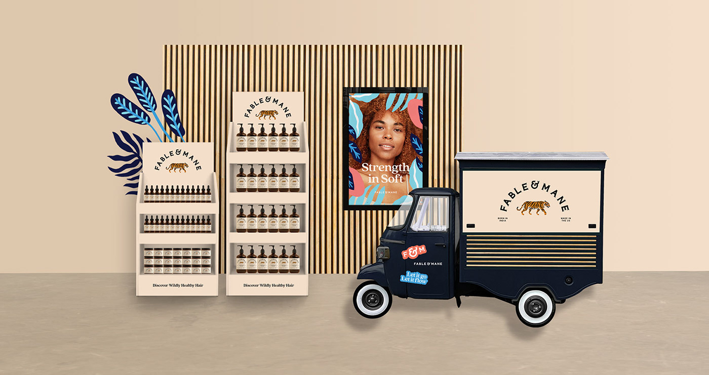


Growing from Within
We worked with the F&M team to create visually engaging and tactile POS displays and surrounding marketing collateral – making the brand feel cohesive at every single touchpoint.


Using the same illustration style and combining it with typographic lock-ups, we created a series of 'sticker devices' which could be used as digital or physical brand assets across various pieces of brand collateral.

"Although the Fable & Mane identity is clearly rooted in tradition through the iconic symbolism and positioning of the brand, we have balanced this with a modern and relevant execution, using a positive tone of voice and a playful illustration style.”
Sebastian Needler, Co-founder, Alphabet
Sebastian Needler, Co-founder, Alphabet


The Mane Edit
To further cultivate a sense of community and togetherness, we created 'The Mane Edit' – A bi-monthly newsletter and digital blog space that celebrates individuality, shares wild news, invitations and good karma treats.


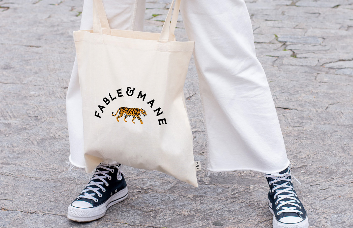
The Fable & Mane world needed to flex to resonate in different communities. Every asset and brand touchpoint has been designed to adapt to the local nuances each market brings.
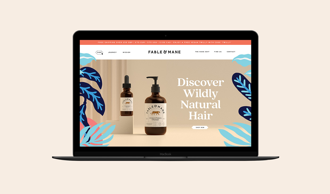
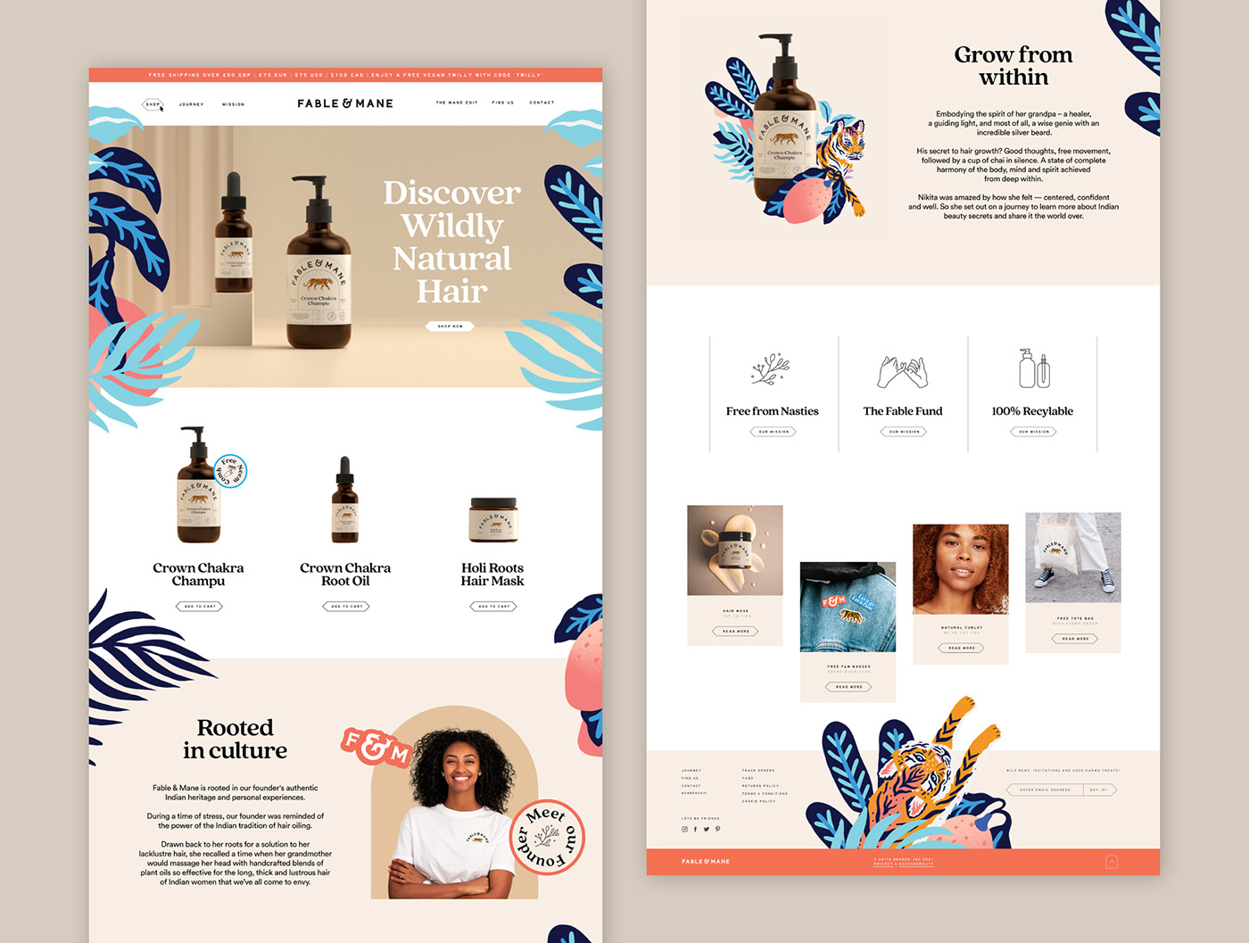
One of the first primary applications for any modern brand is the online presence. We balanced Photography of the Product and the People and combined this with Illustration, Iconography, and Sticker Devices to bring personality and life to the product.


Multiple logo variations allow the brand to work on diverse digital and physical formats, creating a fully scalable brand from top to bottom.
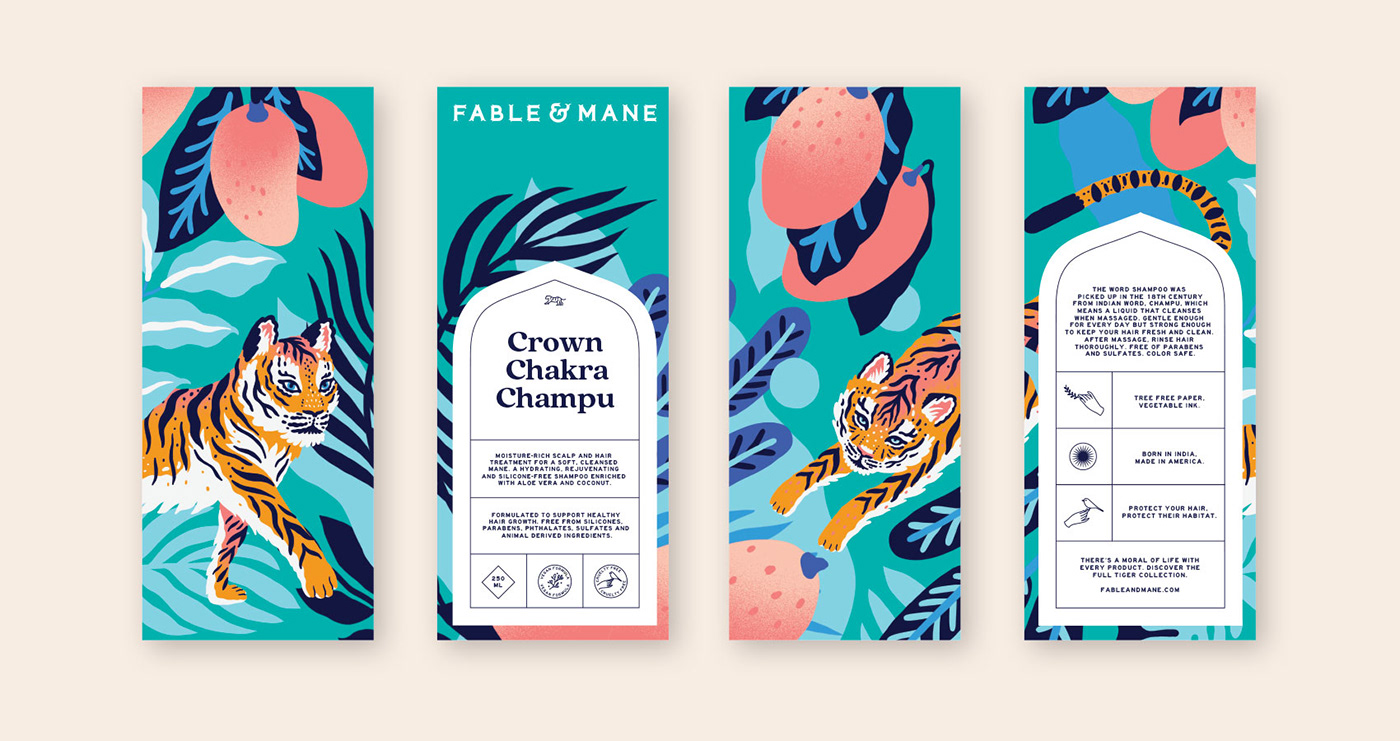


A Full 360 Packaging Experience
The outer packaging made full use of the illustration style. We created a full 360 wrap-around story-led illustration that referenced the foundations of the brand and created a vibrant, living scene for the product to be housed in.
Thanks for scrolling
To see the full case study, visit our website;
madebyalphabet.com
Want to work with us?
madebyalphabet.com
Want to work with us?
Copyright Alphabet Design Agency Ltd / Akita Brands Ltd 2021. All Rights Reserved.