


Temperô
Marca e Identidade Visual
PT
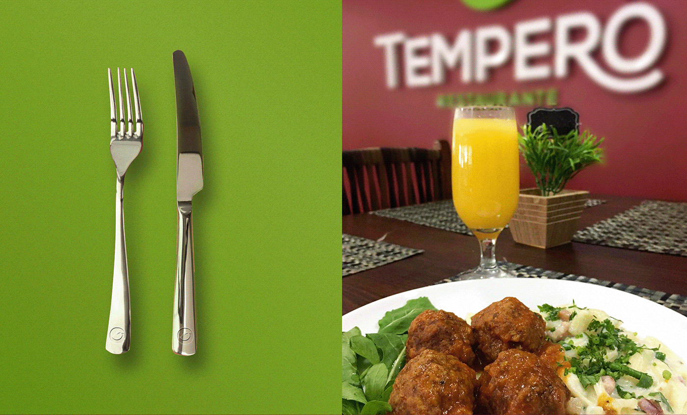
O Temperô é um restaurante self-service da cidade de Guarapuava-PR. Um empreendimento familiar, que nasceu com o propósito de oferecer comida caseira do dia a dia para seus clientes. A comida caseira povoa a memória afetiva de todos nós. Toda casa tem seu tempero, mas é quase como se houvesse um sabor universal de uma refeição farta, divertida e calorosa que todos nós lembramos e desejamos.
Nossa missão foi criar a marca e a identidade visual do projeto transmitindo essa essência universal e propósito que o restaurante tem.
EN
Temperô is a self-service restaurant in the city of Guarapuava-PR. A family business, which was born with the purpose of offering everyday homemade food to its customers. Homemade food populates the affective memory of all of us. Every home has its seasoning, but it's almost as if there's a universal flavor of a full, fun, hearty meal that we all remember and crave.
Our mission was to create the brand and visual identity of the project, communicating this universal essence and purpose that the restaurant has.

PT
Em um processo de entrevista em profundidade com os donos do negócio, chegamos a algumas palavras-chave que nortearam o trabalho: Receptivo / Calmo / Confortável / Fresco / Família / Caseiro / Aconchego / Alimento / Comer com os olhos / Sabor / Tempero.
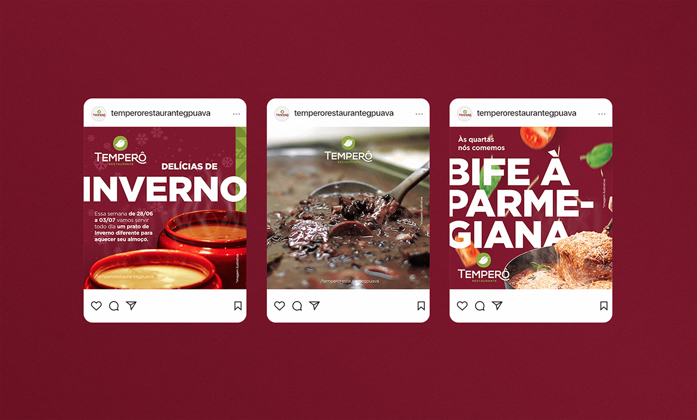
Então a criação buscou inspiração nos antigos restaurantes e cafés que trazem memórias afetivas e relacionadas a negócios familiares, daí a tipografia trabalhada no estilo Art Deco muito utilizada por eles. Os temperos comuns da cozinha caseira também estão presentes, daí o ícone de uma folha de manjericão e outros temperos na padronagem criada como apoio. Por fim as cores verde e vermelho que trazem o frescor e o aconchego que completam o conceito e transmitem a essência e propósito da marca.
EN
In an in-depth interview process with the business owners, we came up with some keywords that guided the work: Receptive / Calm / Comfortable / Fresh / Family / Homemade / Cozy / Food / Eating with your eyes / Flavor / Seasoning.
So the creation was inspired by the old restaurants and cafes that bring affective memories and related to family businesses, hence the typography worked in the Art Deco style very used by them. Common home cooking seasonings are also present, hence the icon of a basil leaf and other seasonings in the pattern created as a support. Finally, the green and red colors that bring the freshness and cozyness that complete the concept and communicate the essence and purpose of the brand.


Design Gráfico
Graphic Design
João Papi
Pesquisa & Estratégia
Research and Strategy
João Papi e Mariana Papi
Siga nossas redes!
Follow us!
Muito Obrigado!
Thanks for watching!

_____


