
Skypark is the one and only high-altitude adventure park in Russia. Here you can walk the longest suspended bridge, go on the highest swings, jump from the highest bungee platform in the country, ride the high-speed trolley and cross the gorge by zipline.
The park’s location is truly unique: the Akhshtyr Gorge in Sochi National Park, surrounded by mountains and old-growth forest.
In 2019 we changed the park’s visual system and communication strategy and afterwards we began to create a wayfinding system for Skypark.

The first stage included understanding the existing problems and offering a solution. To assess the problems we studied all the necessary research results, visitor’s poll results and carried out our own field research to understand customer journeys, current and potential touchpoints.
Visitors’ circulation in the park was dictated by its layout and the main architectural object — the suspended bridge. Upon entering visitors began moving towards it and missed other activities and locations. We spotted some comments about this on social media: “Turned out I didn’t notice other parts of the park” or “Activities closest to the entrance were easy to find, but we failed to visit other parts just because we didn’t know about them”.
The existing wayfinding system was not telling enough about all the activities in the park and had been created inconsistently. As a result it was not focused on visitors’ needs. Besides, the shift in target audience from extreme lovers to families demanded to highlight additional family activities.
As our research result we completed a thorough description of our scope of work that allowed us to place the project team in context and map out aims, deadlines and project stages.


In order to find the concept we carried out an in-house workshop and came to several important conclusions. Firstly, we decided to divide the wayfinding system into 3 separate subsystems: the way to the park, parking and the park itself. Each subsystem was responsible for different things, so they could vary in design and logic but still stay connected visually.

Then we created Customer Journey Maps for each subsystem. Based on each map we located all touchpoints, analyzed all the necessary visitors information and created a content hierarchy.

It was also important to file the names of all the existing locations, attractions and directions and create a unified system for all place names. For instance, we added “Sky” to all cafes and restaurants and some places got completely new names. We listed all place names in Russian and English accordingly.
Despite the different logic inside the 3 subsystems, they were all united by elements of Skypark visual system — icons and style for maps, schemes and infographics.
New icons became more emotional and family-oriented. The new set of icons could be widely used in communications.


One of the main components of the system was the scheme of the park that described its layout and marked all places of interest. The scheme allowed visitors to plan their route and follow it using the signs.
The scheme’s design was based on the park’s geography and consisted of layers to show volume and tie it to the location. The whole territory was divided into zones like “Park”, “Bridge” or “Forest”, which was an intuitive solution that additionally stimulated visitors to explore the territory behind the bridge. Zones were colour-coded, and those colours were also reflected in the design of the wayfinding system.
The scheme included all objects of the park’s infrastructure like ticket windows, toilets, smoking areas, cafes and places of interest. Attractions were highlighted by using larger icons and text. Additionally it showed all viewpoints and selfie points.
To make route planning easier we decided to show the time visitors would need to move from one zone to the other, even if they were walking with a stroller or a wheelchair.
The scheme was completed in several variations with regard to cardinal directions. Bright-blue person on the scheme showed where you were in the park.

For each attraction we developed a custom illustration that told visitors how it worked and showed its scale against surrounding objects. All AJ Hackett attractions had an indication of the trajectory of the jump or flight. Additionally all illustrations were followed by some practical tips with a good sense of humour incorporated.

The tone of voice was considered one of the important elements of the system. It was important for us to explain all of the existing rules, especially for the risky attractions. The restrictions they already had were rephrased to sound friendlier or offer an alternative.

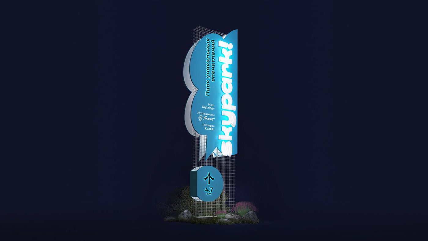
For the wayfinding system we used a general solution, but the park incorporated two very different environments: one urban, with metal and concrete constructions, another one — natural, with wooden elements and surrounding flora. So we offered different bases for signs and other wayfinding elements: metal gauze for urban parts and vertical wooden planks for wayfinding objects in the nature. This helped us keep the system consistent and incorporate it into two different landscapes.

This is the first part of the story that shows the concept development stage. In the 3 following parts we are going to describe each of the wayfinding subsystems: “Way to the park”, “Parking” and “Park”.

Project team:
Alyona Naumova, Producer
Egor Myznik, Creative Director
Mikhail Ivanov, Art Director
Maria Sinyutina, Art Director
Alia Karnaukhova, Designer
Irina Purtova, Designer
Evgeniya Khludentsova, Designer
Nikita Boldyrev, Architect
Oleg Ahn, Content Producer
Anna Volkova, Motion Designer
Artyom Leontyev, Head of Marketing and Sales, Skypark
Olga Troyanova, Advertising Manager, Skypark


