

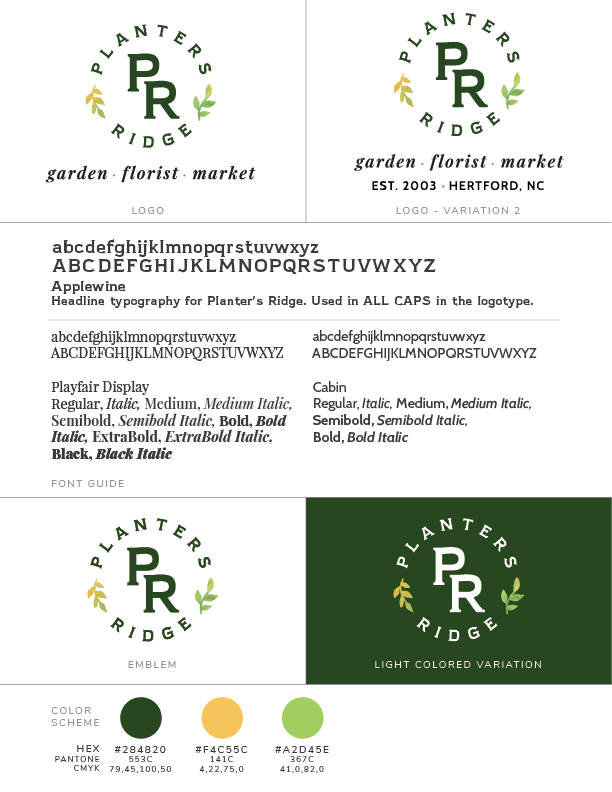
Planters Ridge is a small-town garden, market, and florist who has been a part of their community for almost 20 years. Natalie wanted a logo that still spoke to their original monogramed uniforms with a bit of modern twist. We went through many iterations until we landed on something that felt like a meld of modern and homey.
We started our process with moodboards, since Natalie was very new to the branding process. I wanted to share ideas in a way that wasn't too overwhelming and to get an overall feel of what she wanted. We landed on something bright, but earthy.

We went through several iterations before landing on the final logo. Here are some pencil sketches which I digitized and mocked up for Natalie to see in different aspects of her brand. None of these brought the feel of small-town for the client.


Until we landed on this - a small-town, modern feel. A friend and mentor of mine has this amazing slab serif font that I thought would be perfect for this brand. It was small town in feel, but has a modern edge to it. It was a great combination of sign-painter lettering and Copperplate Gothic. I was very excited to introduce this typeface since it worked so nicely with her branding and tone.

The project was completed with simple-to-use Canva templates for their social media campaigns. I wanted to make it easy to plug and play templates where they can use their own photos and products to shine.


