Branding & Logotype Update 2013
by Jeroen van Eerden
'It's already been a busy and fun year for me. Lots of awesome new projects and I've met a lot of great people. With Behance, I was able to present my works to a broad audience, land some awesome project and to find new inspiration everyday. Check out some of my recent projects, artworks and branding marks. I hope you will enjoy what you see!
Open for comments, feedback, critiques and love.'
Please visit my new website if you'd like:
Client: Secret // LDC Monogram/Icon.
Story behind the Monogram/Icon: This concept is one out of many concepts for the mark i'm working at. So it's not the final mark but feel like i wanted to share this because i liked it. You see a D+L+C combined. Tried to not just make a simple monogram, but also a unique overall feel with it.

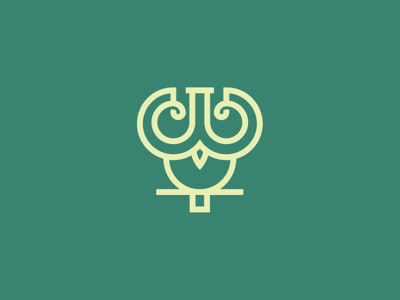
Client: PasteBin // Owl Icon.
Story behind this icon: This is one out of many concepts. The meaning was to create a mascotte for the website. It had te be an owl because of the targets the company is working on. Elements like code, programmers and share had to be combined in the mark. Currently made a whole different icon, more in the direction the company suited.
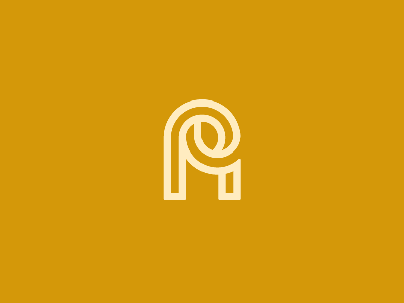
Client: Personal // AP Monogram.
Story behind the Monogram: I'm always been experimenting with shapes and letters. While being busy with a project it sort of happend by accedent creating this monogram. Thought it was fun working it out like this. Maybe oneday this monogram get his home. If interest, contact me!
Story behind the Monogram: I'm always been experimenting with shapes and letters. While being busy with a project it sort of happend by accedent creating this monogram. Thought it was fun working it out like this. Maybe oneday this monogram get his home. If interest, contact me!
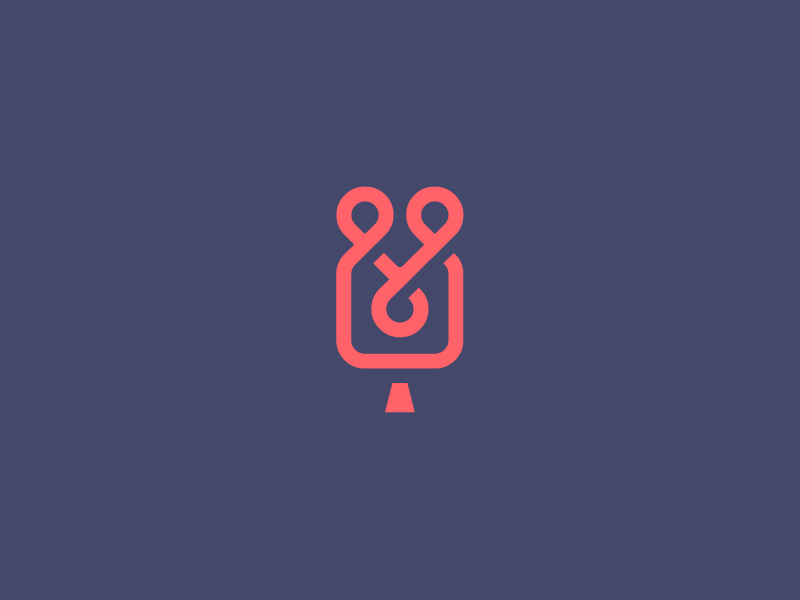
Client: The Poets // Wedding Videographer icon.
Story behind the icon: I've tried to combine elements like a couple holding hands, while being posed in a camera frame that loops infinity. On the top you also have to see a heart.
Story behind the icon: I've tried to combine elements like a couple holding hands, while being posed in a camera frame that loops infinity. On the top you also have to see a heart.
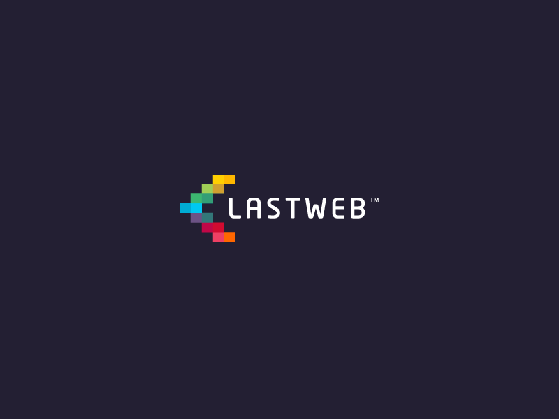
Client: LastWeb // Branding identity.
Story behind the branding: LastWeb is a full service internet agency based in Groningen, the Netherlands. They deliver websites, applications and also provide unique databases. LastWeb is a young and creative company were i've been working with for a while know. I've choose to use blocks as cuilding elements that shows the grow and buidling like programming software and stuff. I've also wanted to include some elements that shows that the company is mainly a technical and code kind of bussiness that they provide. The colors are picked out of program codes that inspired me to work with. I'm always been a very big fan of those many bright and strong colors in a identity.
Story behind the branding: LastWeb is a full service internet agency based in Groningen, the Netherlands. They deliver websites, applications and also provide unique databases. LastWeb is a young and creative company were i've been working with for a while know. I've choose to use blocks as cuilding elements that shows the grow and buidling like programming software and stuff. I've also wanted to include some elements that shows that the company is mainly a technical and code kind of bussiness that they provide. The colors are picked out of program codes that inspired me to work with. I'm always been a very big fan of those many bright and strong colors in a identity.
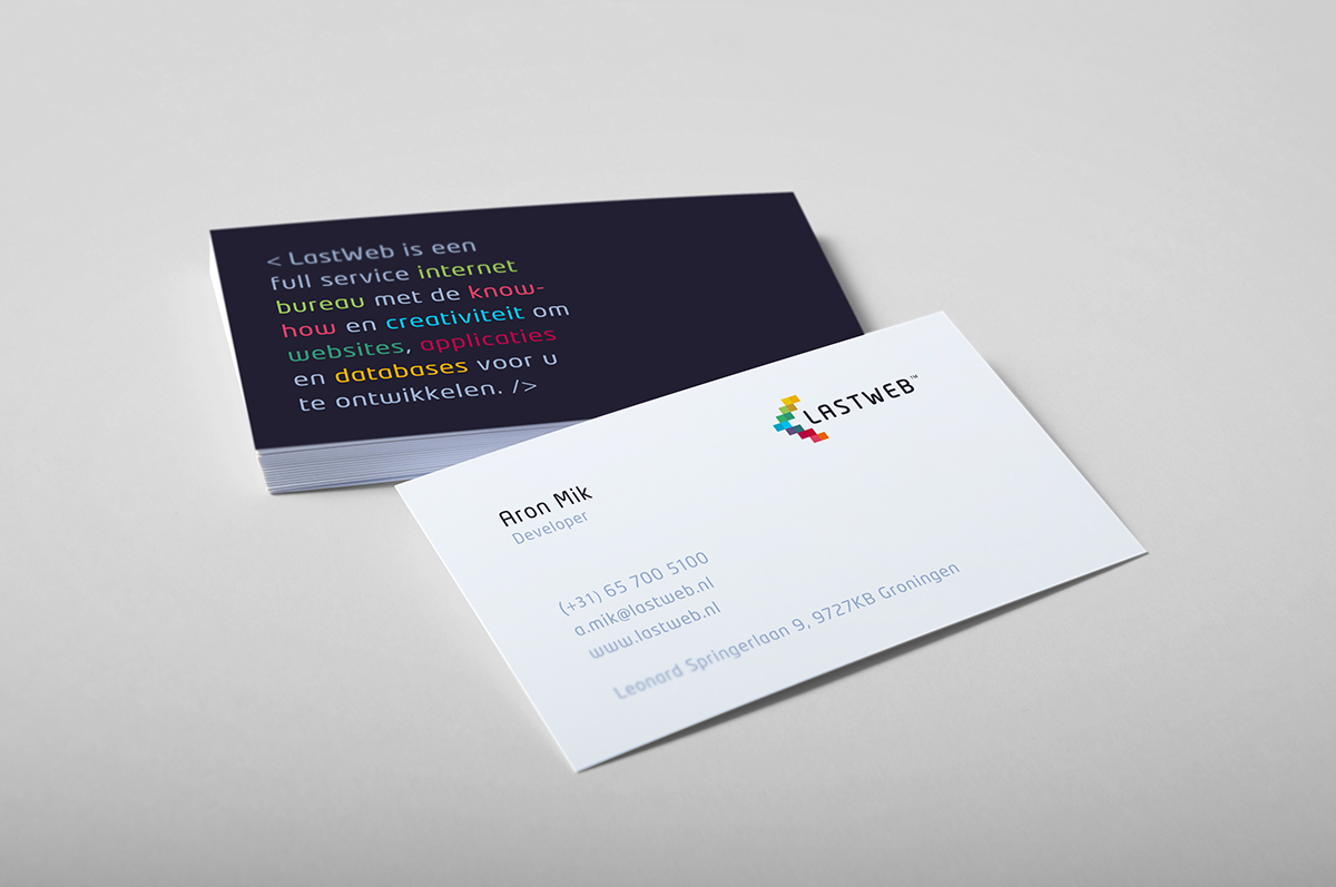
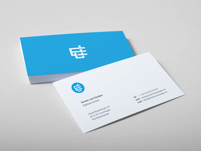
Client: LastWeb // Business Card Design.
Story behind the Busniess Card Design: My main idea was to make it obvious that the company had something to to with programming and webdeveloping. On the back of the card i've present the company in words and elements they focus on, and put it in a sort of program language so that people would understand they do things with web and code. I think I really succeeded with this idea. The client loved it too lucky enough!
Story behind the Busniess Card Design: My main idea was to make it obvious that the company had something to to with programming and webdeveloping. On the back of the card i've present the company in words and elements they focus on, and put it in a sort of program language so that people would understand they do things with web and code. I think I really succeeded with this idea. The client loved it too lucky enough!
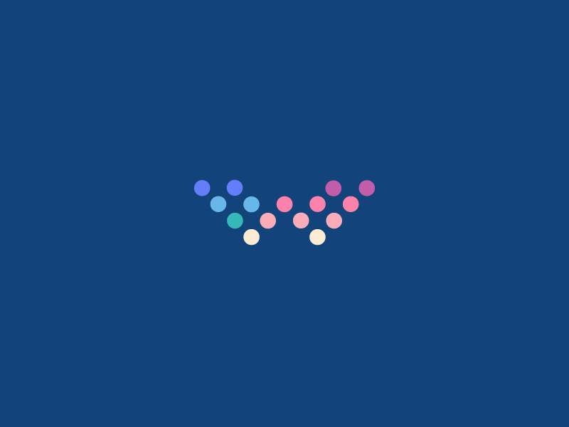
Client: LastWeb // W.
Story behind the icon: In a seach for the right mark for the LastWeb identity, i've tried many things.
Story behind the icon: In a seach for the right mark for the LastWeb identity, i've tried many things.
This 'W' was my first real concept. Loved the way the dots created the letter. The client didn't like this version as much as I did unfortunately. Currnetly this mark is not in use. So if interest, contact me!
Client: Personal // Experimanting Monogram/Symbol.
Story behind the Monogram/Symbol: I've always love new things and exploiring my skills. In this shape i've been trying out the overlapping views. I've always loved those shapes that are combined. It was just a fun thing to do I guess. Also not found a home for this one. If interest, contact me!
Story behind the Monogram/Symbol: I've always love new things and exploiring my skills. In this shape i've been trying out the overlapping views. I've always loved those shapes that are combined. It was just a fun thing to do I guess. Also not found a home for this one. If interest, contact me!
Client: Personal // Infinity Hearts icon.
Story behind the icon: While experimenting I was discorvered this beautiful mark. I think it's a lovely mark for a wedding or dating business. Still not in use. So if interest, conctact me!
Story behind the icon: While experimenting I was discorvered this beautiful mark. I think it's a lovely mark for a wedding or dating business. Still not in use. So if interest, conctact me!
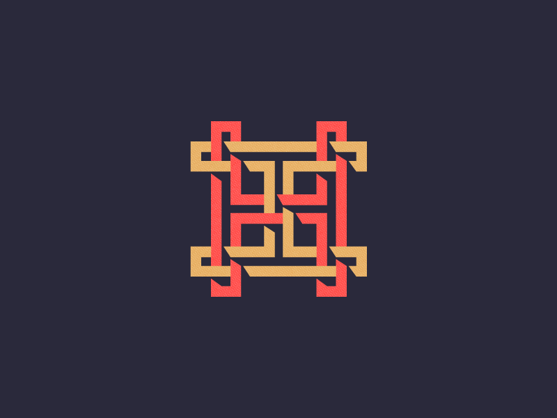
Client: Personal // HH Monogram.
Story behind the icon: A combination of two H's. Tried different techniques for the overlapping and shadings. I always love the fact that the shapes are in a perfect balance and it does look good for the eye. Also this mark isn't jet in use. If interest, contact me!
Story behind the icon: A combination of two H's. Tried different techniques for the overlapping and shadings. I always love the fact that the shapes are in a perfect balance and it does look good for the eye. Also this mark isn't jet in use. If interest, contact me!
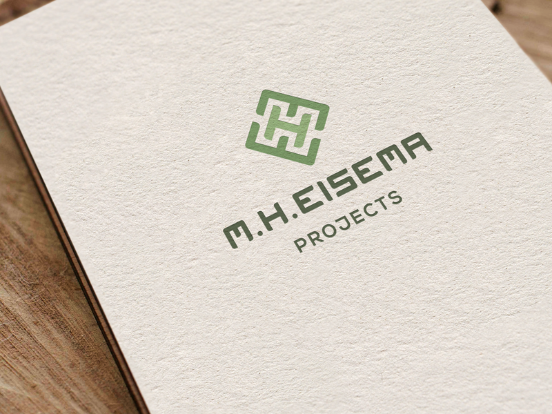
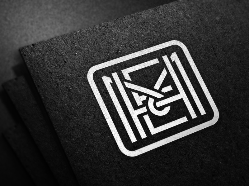
Client: MHE Projects // Branding identity.
Story behind the icon: The client asked me to invent a monogram for his consultancy business. The monogram had to made out of three letters: M+H+E. Been working together with freelance designer Jan Meeus to create this identity. This is still not the final one, still working on it.
Story behind the icon: The client asked me to invent a monogram for his consultancy business. The monogram had to made out of three letters: M+H+E. Been working together with freelance designer Jan Meeus to create this identity. This is still not the final one, still working on it.
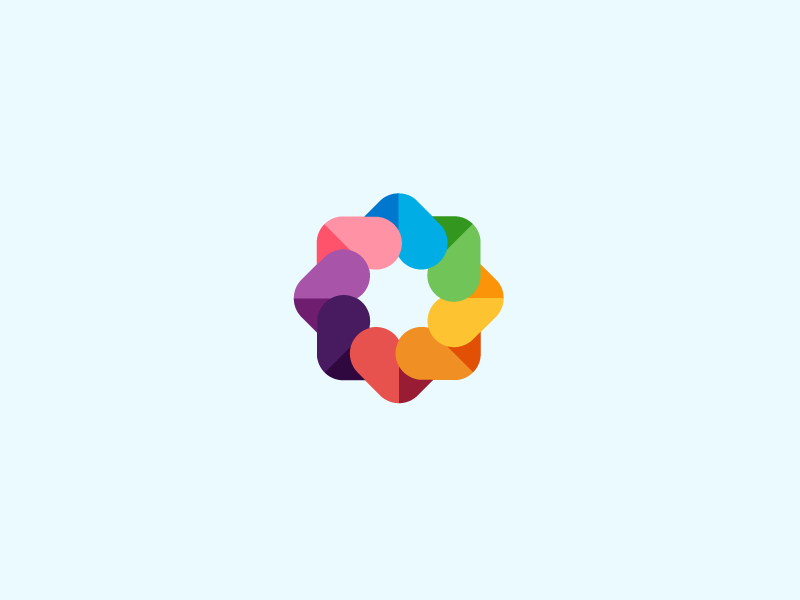
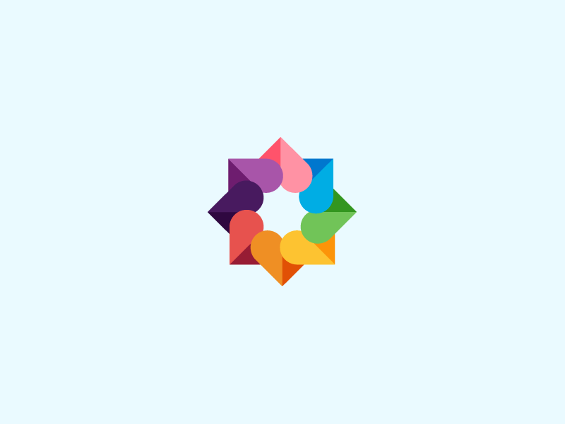
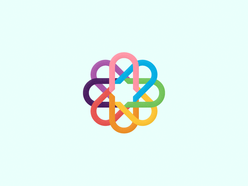
Client: Personal // Hearts Origamy Experiment.
Story behind the symbol: I've been experimenting with these origamy, symmetric symbols many times lately. I just love these color palette and been trying to use those combinations as many as i can. The symbol has many colorful hearts included. Currently not in use. So if interest, contact me!
Story behind the symbol: I've been experimenting with these origamy, symmetric symbols many times lately. I just love these color palette and been trying to use those combinations as many as i can. The symbol has many colorful hearts included. Currently not in use. So if interest, contact me!
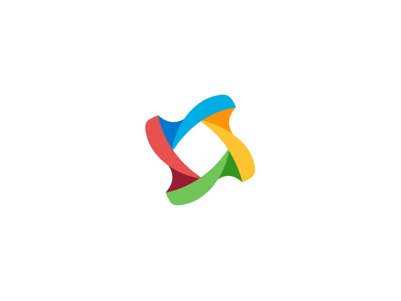
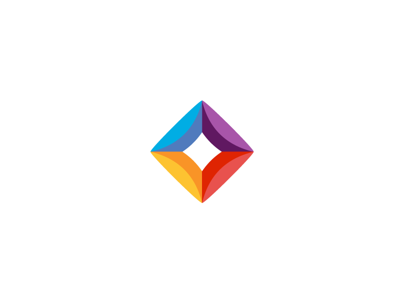
Client: Personal // Shape Experiment.
Story behind the shape: While experimenting, concluded that this mark has something.
Story behind the shape: While experimenting, concluded that this mark has something.
Currently not in use. So if interest, contact me!
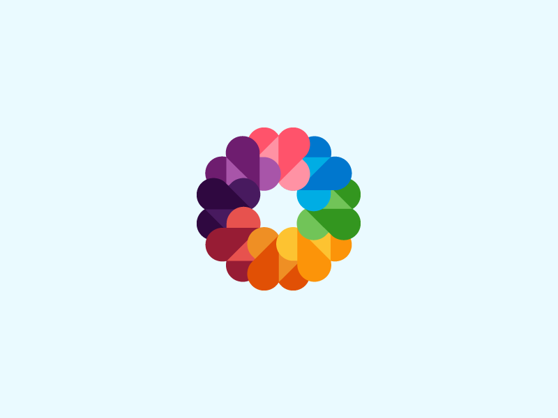
Client: Personal // Hearts Origamy Experiment 2.
Story behind the symbol: I've been experimenting with these origamy, symmetric symbols many times lately. I just love these color palette and been trying to use those combinations as many as i can. The symbol has many colorful hearts included. Currently not in use. So if interest, contact me!
Story behind the symbol: I've been experimenting with these origamy, symmetric symbols many times lately. I just love these color palette and been trying to use those combinations as many as i can. The symbol has many colorful hearts included. Currently not in use. So if interest, contact me!
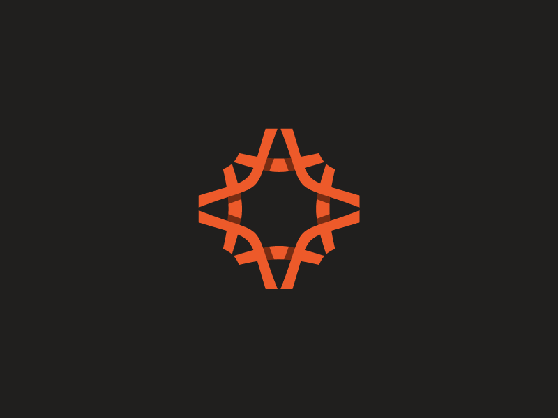
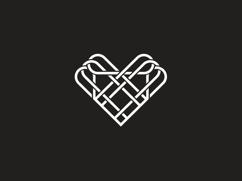
Client: Personal // Complex Heart line-art.
Story behind the symbol: Been busy creating differnt symbols that shows the overlapping and shadings. Lately those simple, but complex shapes are very interest for me to create. It's not that easy creating a line-work like this. Had to figure out that these shadings and overlappings are pretty hard to create. Currently not in use. So if interest, contact me!
Story behind the symbol: Been busy creating differnt symbols that shows the overlapping and shadings. Lately those simple, but complex shapes are very interest for me to create. It's not that easy creating a line-work like this. Had to figure out that these shadings and overlappings are pretty hard to create. Currently not in use. So if interest, contact me!
Client: Personal // Hearts Origamy Experiment 3.
Story behind the symbol: I've been experimenting with these origamy, symmetric symbols many times lately. I just love these color palette and been trying to use those combinations as many as i can. The symbol has many colorful hearts included. Currently not in use. So if interest, contact me!
Story behind the symbol: I've been experimenting with these origamy, symmetric symbols many times lately. I just love these color palette and been trying to use those combinations as many as i can. The symbol has many colorful hearts included. Currently not in use. So if interest, contact me!
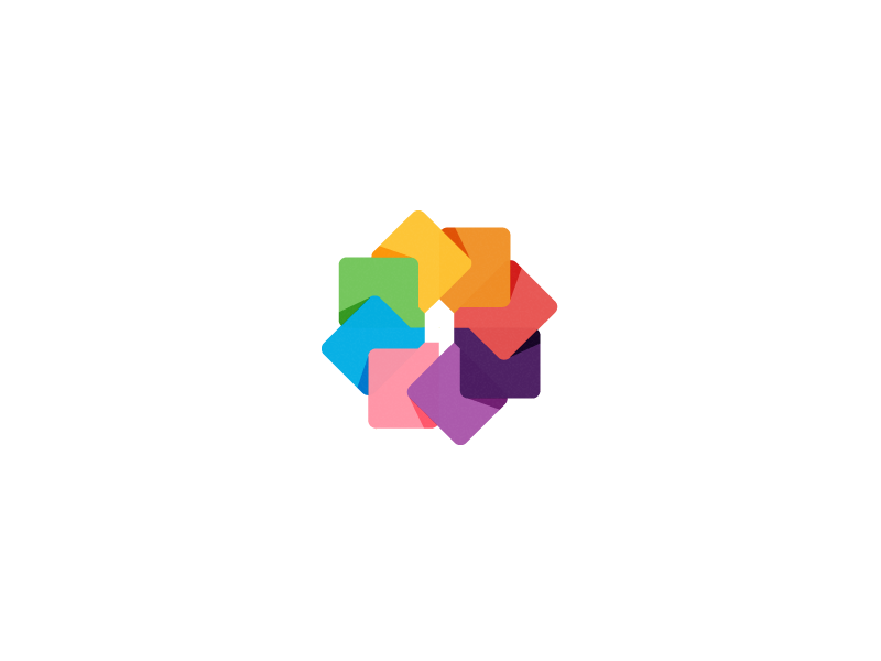
Client: Secret // Colorful icon set for a secret company.
Story behind the icons: I've always been a fan of the abstract shapes. After I completed the direction on where to go with the shapes, which were mosly random, I picked the colors just by feel. I had a color palette were I can choose out. Loved these combinations immediately! Currently not in use.
Story behind the icons: I've always been a fan of the abstract shapes. After I completed the direction on where to go with the shapes, which were mosly random, I picked the colors just by feel. I had a color palette were I can choose out. Loved these combinations immediately! Currently not in use.
So if interest, contact me!

Client: BoldMedia // Colorful Logo.
Story behind the icons: This icon had to show; connection, multimedia, creativity and completions (check marks) in it. This mark wasn't picked, but loved it right away! So if you'd be interested, please contact me!
Story behind the icons: This icon had to show; connection, multimedia, creativity and completions (check marks) in it. This mark wasn't picked, but loved it right away! So if you'd be interested, please contact me!
Client: Personal // Personal Business Cards.
Story behind the design: There's not really a story behind these cards. Although, there's my new logo! If you'd like to work with mee feel free on contacting me. Would love to hear your story!
Story behind the design: There's not really a story behind these cards. Although, there's my new logo! If you'd like to work with mee feel free on contacting me. Would love to hear your story!
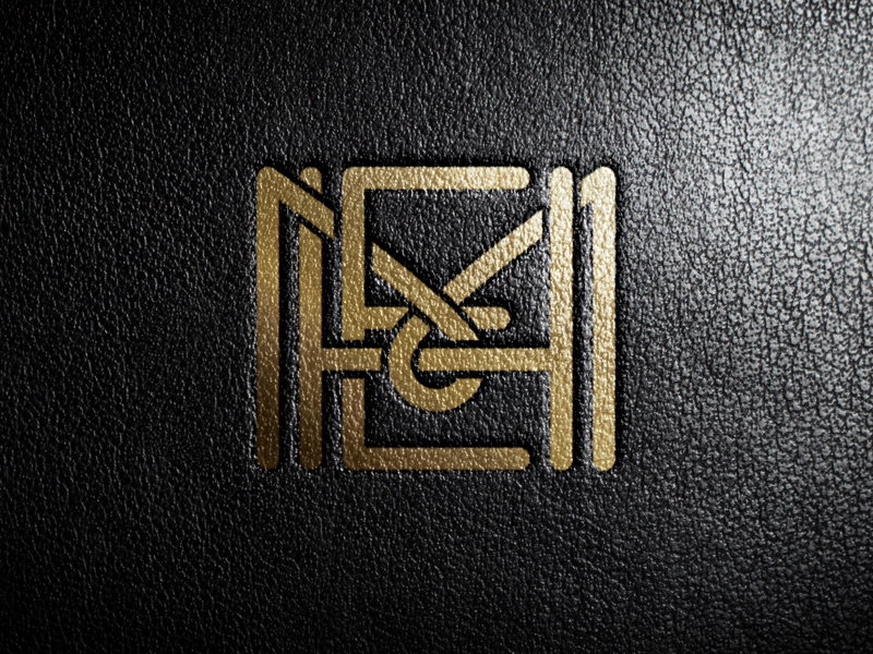
Client: MHE Projects // Branding identity.
Story behind the icon: The client asked me to invent a monogram for his consultancy business. The monogram had to made out of three letters: M+H+E. Thought this suited the client very well. Although the final version is total different at the moment, still a work in progress. These two printed versions were for presentation for the client. Currently not in use. So if interested, please contact me!
Story behind the icon: The client asked me to invent a monogram for his consultancy business. The monogram had to made out of three letters: M+H+E. Thought this suited the client very well. Although the final version is total different at the moment, still a work in progress. These two printed versions were for presentation for the client. Currently not in use. So if interested, please contact me!
Client: Personal // Random Origamy Experiment 4.
Story behind the symbol: I've been experimenting with these origamy, symmetric symbols many times lately. I just love these color palette and been trying to use those combinations as many as i can. The symbol has many colorful hearts included. Currently not in use. So if interest, contact me!
Story behind the symbol: I've been experimenting with these origamy, symmetric symbols many times lately. I just love these color palette and been trying to use those combinations as many as i can. The symbol has many colorful hearts included. Currently not in use. So if interest, contact me!
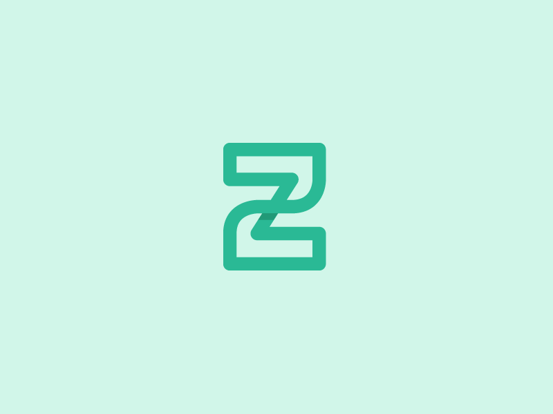
Client: Personal // UP Monogram.
Story behind the Monogram: I've been experimenting with these monograms. Always love the simplicity in inventions. Also in branding marks. I've been searching for new ways to inprove my skills and experimenting with shapes and custum lettering. You can read here: UP. Currently not in use. So if interest, contact me!
Story behind the Monogram: I've been experimenting with these monograms. Always love the simplicity in inventions. Also in branding marks. I've been searching for new ways to inprove my skills and experimenting with shapes and custum lettering. You can read here: UP. Currently not in use. So if interest, contact me!

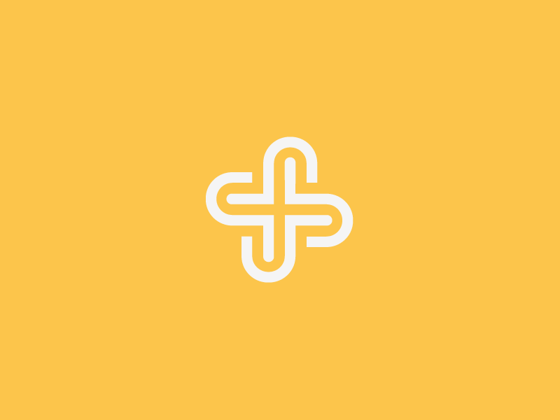
Client: Personal // SF Monogram.
Story behind the Monogram: I've been experimenting with these monograms. Always love the simplicity in inventions. Also in branding marks. Been searching for new ways to inprove my skills and experimenting with shapes and custum lettering. You can read here: SF.
Story behind the Monogram: I've been experimenting with these monograms. Always love the simplicity in inventions. Also in branding marks. Been searching for new ways to inprove my skills and experimenting with shapes and custum lettering. You can read here: SF.
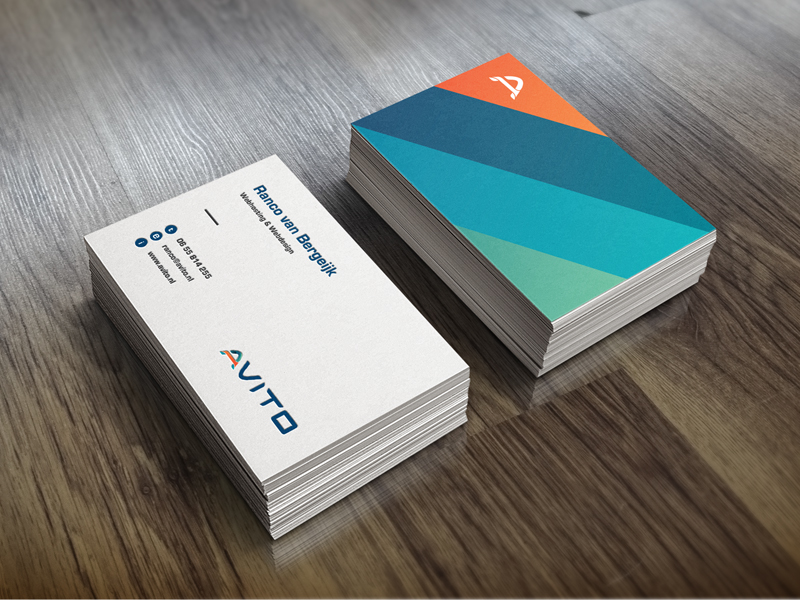
Client: Avito Webhosting // Business Cards Design.
Story behind the Business Card Design: Made these lovely cards early this year. Never shared these cards but thought it would be cool showing you these as well. I've tried to made a fresh and clean set of cards. Also a lot of color because it's sort of my signature. The client was very satisfied with these cards. I think this branding is one of my best completed projects so far.
Story behind the Business Card Design: Made these lovely cards early this year. Never shared these cards but thought it would be cool showing you these as well. I've tried to made a fresh and clean set of cards. Also a lot of color because it's sort of my signature. The client was very satisfied with these cards. I think this branding is one of my best completed projects so far.
Client: Personal // PhotoTalk.
Story behind the Mark: I just love those simple icons/marks lately. So i've been busy trying to made these ones myself. The mark shows a picture with a chat element within it. Also added the shading to create a extra dimention. Currnetly not in use. So if interest, contact me!
Story behind the Mark: I just love those simple icons/marks lately. So i've been busy trying to made these ones myself. The mark shows a picture with a chat element within it. Also added the shading to create a extra dimention. Currnetly not in use. So if interest, contact me!

Client: Personal // PR Monogram.
Story behind the Monogram: Simple idea that I worked out from sketch to digital mark. It's a one lined PR Monogram. Currnetly not in use. So if interest, contact me!
Story behind the Monogram: Simple idea that I worked out from sketch to digital mark. It's a one lined PR Monogram. Currnetly not in use. So if interest, contact me!

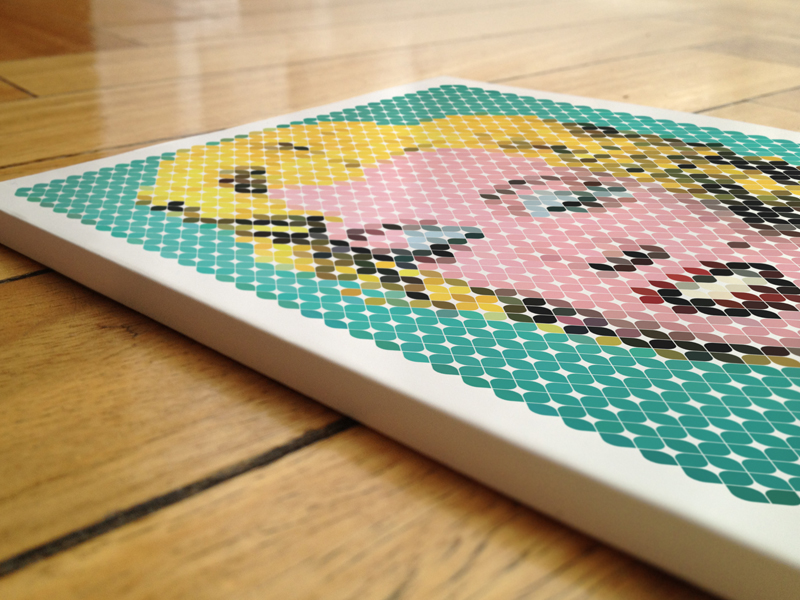
Client: NachtCafe De Warhol // Digital artwork.
Story behind the artwork: Besides branding i'm also specialized in digital art. This piece I created for a nightclub here in my hometown called Warhol. You can find more of these works in one of my other projects. Feel free to take it a visit!
Story behind the artwork: Besides branding i'm also specialized in digital art. This piece I created for a nightclub here in my hometown called Warhol. You can find more of these works in one of my other projects. Feel free to take it a visit!
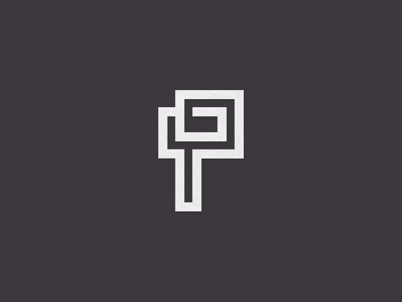
Client: Personal // GP Monogram.
Story behind the Monogram: Simple idea that I worked out from sketch to digital mark. It's a one lined PR Monogram. Currnetly not in use. So if interest, contact me!
Story behind the Monogram: Simple idea that I worked out from sketch to digital mark. It's a one lined PR Monogram. Currnetly not in use. So if interest, contact me!
Client: Profey // Custum lettering identity.
Story behind the identity: A fellow designer asked me to come up with a personal identity for his business as a freelance digital artist. He asked me to create a unique identity for his profession name: Profey. The main idea was to work with custum letters. This suitis his works very well.
Story behind the identity: A fellow designer asked me to come up with a personal identity for his business as a freelance digital artist. He asked me to create a unique identity for his profession name: Profey. The main idea was to work with custum letters. This suitis his works very well.

Client: Personal // Random Origamy Experiment 5.
Story behind the symbol: I've been experimenting with these origamy, symmetric symbols many times lately. I just love these color palette and been trying to use those combinations as many as i can. The symbol has many colorful hearts included. Currnetly not in use. So if interest, contact me!
Story behind the symbol: I've been experimenting with these origamy, symmetric symbols many times lately. I just love these color palette and been trying to use those combinations as many as i can. The symbol has many colorful hearts included. Currnetly not in use. So if interest, contact me!

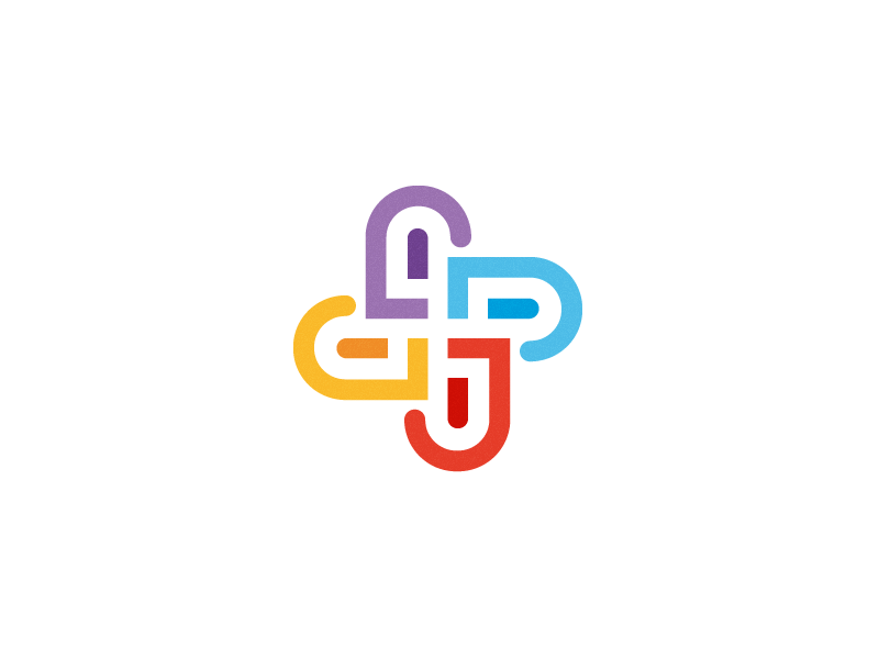
Client: MediaConnect // Colorful icon for a software develop company.
Story behind the symbol: The client give me my creative freedom on creating this symbol. I've tried to combine different shapes that shows the targets the company stands for. Connection, people, communication, media. Currnetly not in use. So if interest, contact me!
Story behind the symbol: The client give me my creative freedom on creating this symbol. I've tried to combine different shapes that shows the targets the company stands for. Connection, people, communication, media. Currnetly not in use. So if interest, contact me!
Client: Personal // Random Origamy Experiment 6.
Story behind the symbol: I've been experimenting with these origamy, symmetric symbols many times lately. I just love these color palette and been trying to use those combinations as many as i can. The symbol has many colorful hearts included. Currnetly not in use. So if interest, contact me!
Story behind the symbol: I've been experimenting with these origamy, symmetric symbols many times lately. I just love these color palette and been trying to use those combinations as many as i can. The symbol has many colorful hearts included. Currnetly not in use. So if interest, contact me!

Client: Personal // Random Origamy Experiment 7.
Story behind the symbol: I've been experimenting with these origamy, symmetric symbols many times lately. I just love these color palette and been trying to use those combinations as many as i can. The symbol has many colorful hearts included. Currnetly not in use. So if interest, contact me!
Story behind the symbol: I've been experimenting with these origamy, symmetric symbols many times lately. I just love these color palette and been trying to use those combinations as many as i can. The symbol has many colorful hearts included. Currnetly not in use. So if interest, contact me!
Client: Personal // Colorful icon not in use.
Story behind the symbol: This icon was made just for fun. I love the simplicity in design and tried to make a lovely icon that shows a friendly vibe. Currnetly not in use. So if interest, contact me!
Story behind the symbol: This icon was made just for fun. I love the simplicity in design and tried to make a lovely icon that shows a friendly vibe. Currnetly not in use. So if interest, contact me!

Thank you all so very much for checking out my works!
Would love to hear your thoughts or just some love
by clicking the 'APPRECIATE' button! :)
Want to work with me? Would love to hear your story!
www.jeroenvaneerden.nl
info@jeroenvaneerden.nl
Connect trough social media:


