

PRIMARY / logo & package design
objective:
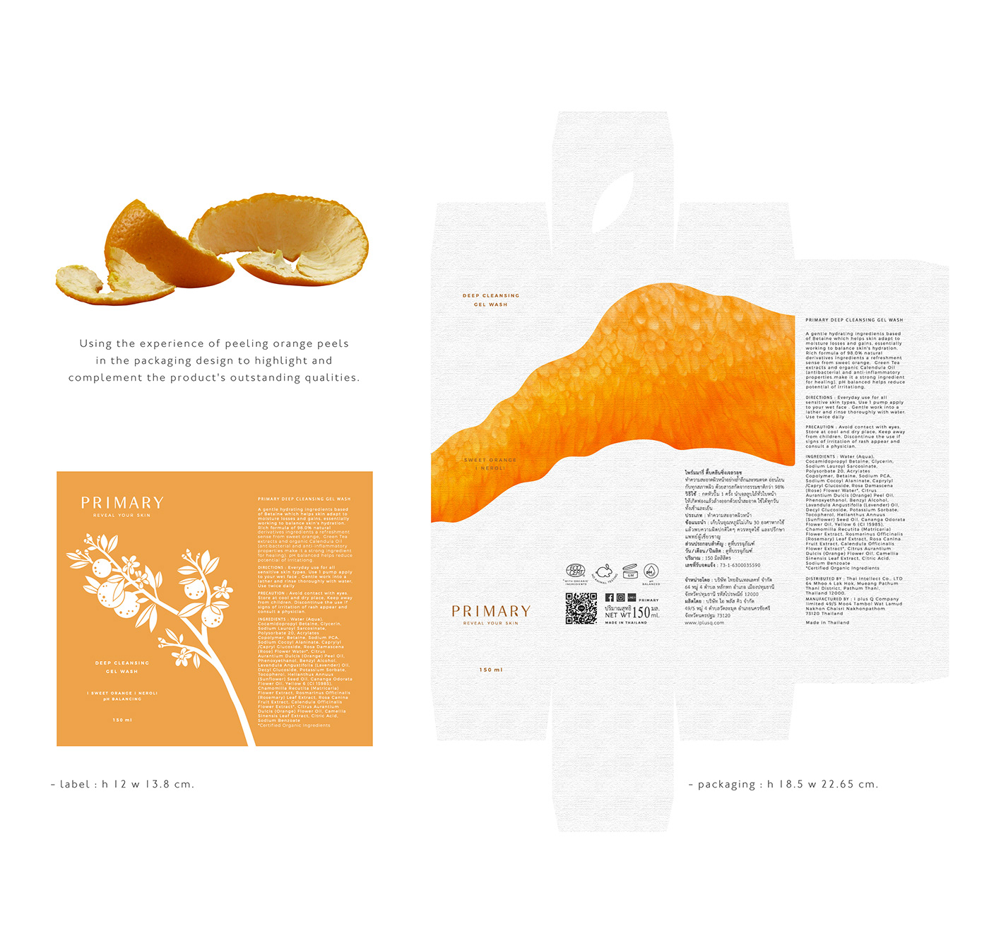
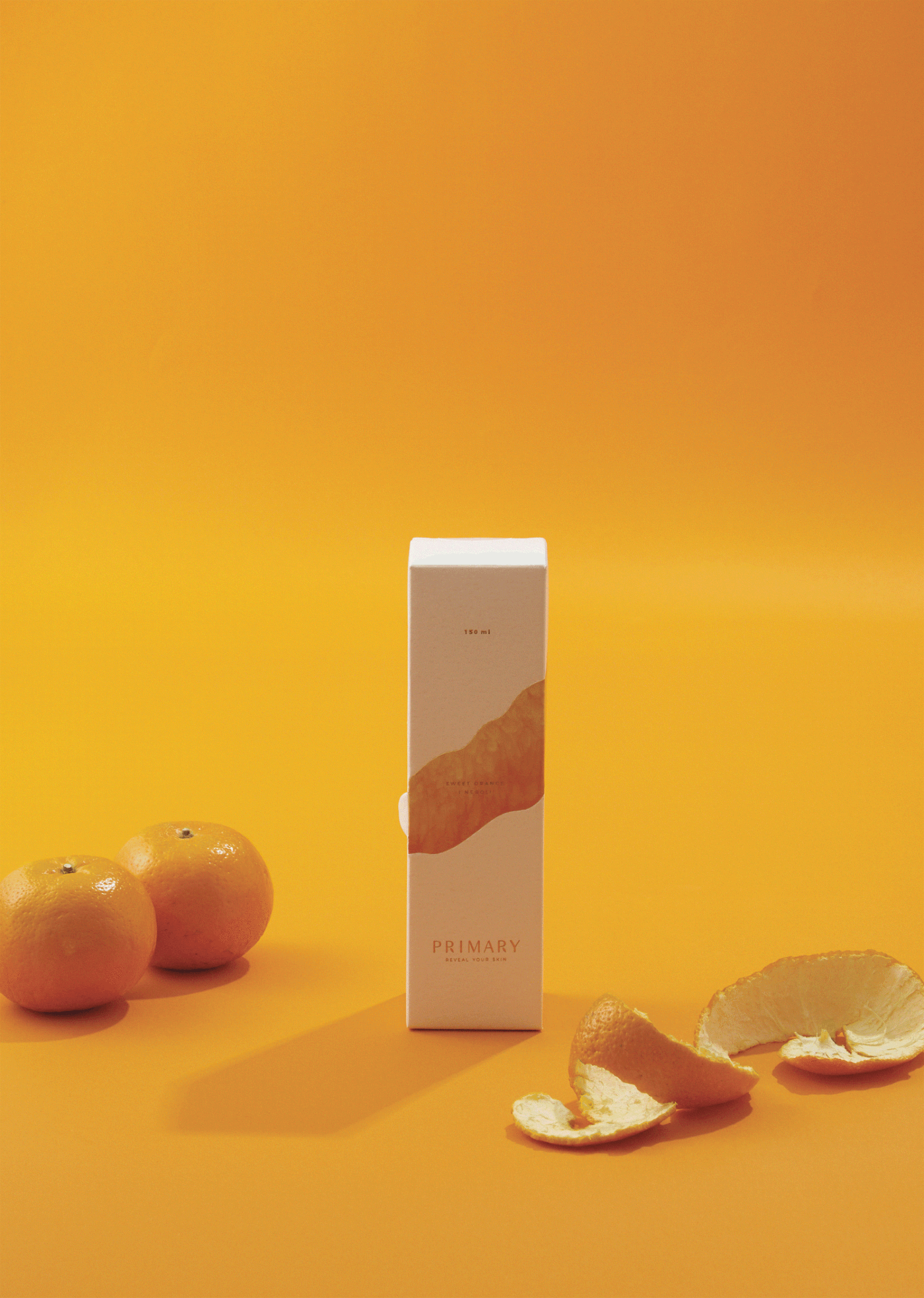
The packaging design conveyed a sense of naturalness by emphasising and complementing the main product's feature ingredient, an orange. As well as creating a visual and valuable package for sustainability.
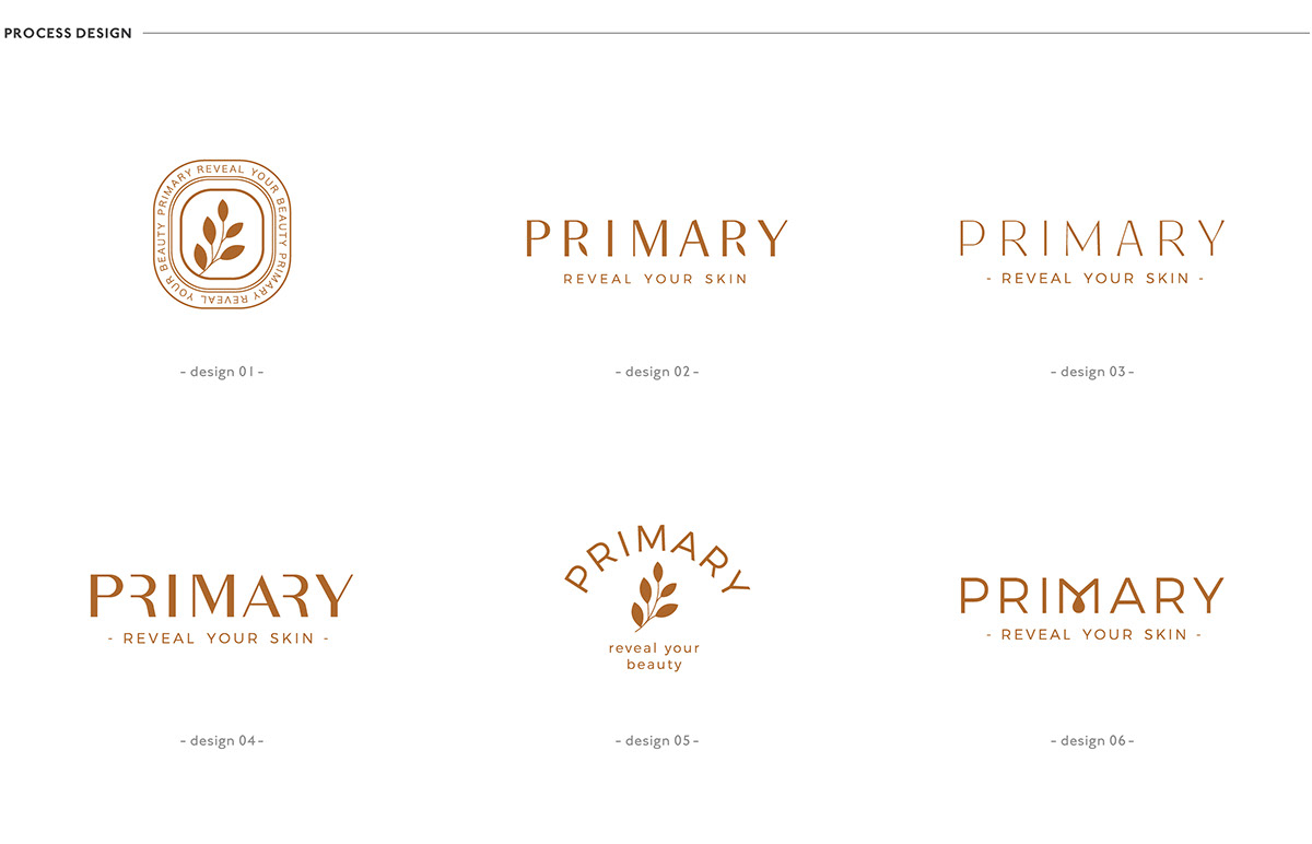
logo concept:
The name “PRIMARY” refers to the brand's origin as a natural source. The rice shape is used as a symbol to create a memorable visual that presents clean and simple.
packaging concept:
The product is a deep cleansing gel wash with a rich formula of 98% naturally derived ingredients and a featured sweet orange refreshment scent. According to the logo, the packaging material is elaborately selected with textured paper to present the look and feel of handcrafted quality. Not only the visual appealing that could easily indicate the product’s feature ingredient but applying the experience of peeling orange peels into the packaging design is another gimmick to highlight and complement the product's outstanding qualities.


PUBLICATION : APD No17 (Asia-Pacific Design) 2021


AGENCY :
Andon Design Daily Co.,Ltd.
CREDIT :
Design Director by Pongtorn Wachirapoka
Logo Design by Nuttavee Jiratthitikan
Package & Visual Design by Natcha Dusadeepun
Photographed by Parinya Kawsrito
PUBLICATION :
http://www.designerhub.in.th/andondesigndaily/f9f737ee1c
APD No17 (Asia-Pacific Design) 2021
VIA :
www.primaryofficial.com
www.facebook.com/Primary.officialthailand/
www.instagram.com/primary.officialthailand/
Copyright © Andon Design Daily Co.,Ltd. All Rights Reserved.


