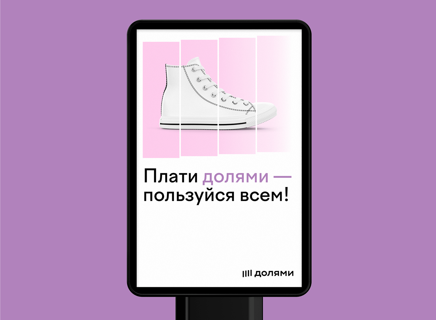
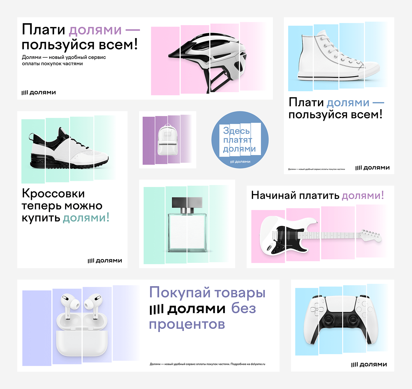
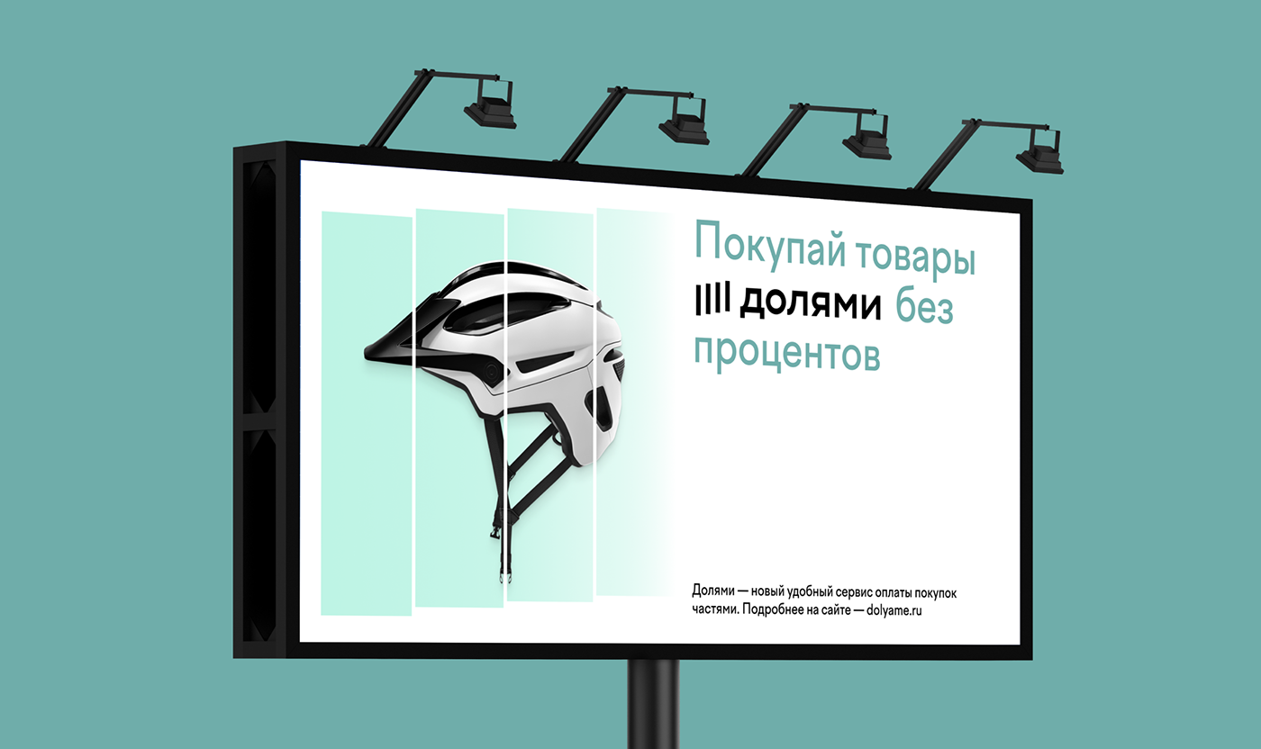
With Долями by Tinkoff you can buy goods in online stores by paying in four equal parts. The sneakers, a coffee machine, and the bicycle helmet are yours for a quarter of its price — the three other parts will be charged fee-free during the next six weeks.
#shukadesign 2021

Splitting is the visual metaphor. We imagined the material world consists of things, divided into equal parts — each lighter than the previous, and together they illustrate the premonition of letting go. The idea unites the elements of an identity, it is applied in interface design and spears the communication.

The brand name is divided into short equal syllables. The simple increasing geometry makes the icon recognizable in the list of payment systems on external platforms. In corporate graphics, the metaphor is elaborated by the soft palette, the gradient, and the transparency, and the wider parts accommodate copyright or photos and change the proportions depending on the size of the object and the type of asset.

SHUKA
art director → sasha koltsov
designer → evgeny drozhzhev
digital art director → victor akifiev
digital designer → marina gaiman
lead motion designer → dmitry kozlyaev
motion designer → dmitry okulich-kazarin
creative directors → ivan vasin, ivan velichko
designed by shuka ®
© all rights reserved
© all rights reserved