
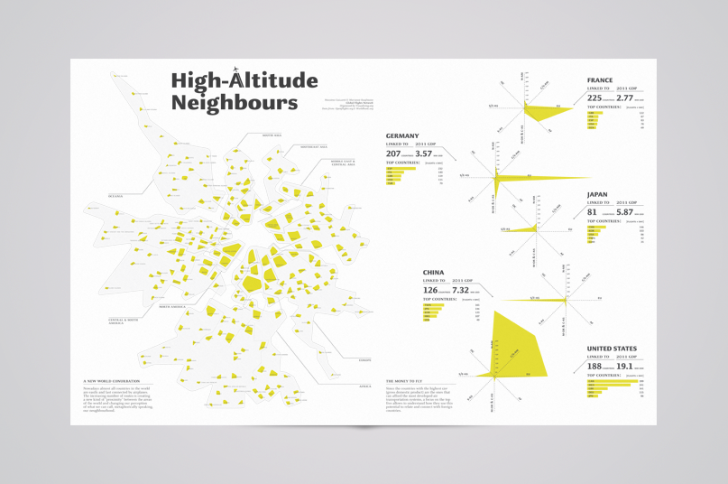
Visualization for the 2012 Visualizing Global Marathon, one-weekend data visualization competition that has gathered design and computer science students from 176 universities in the world. The project aims at visualizing a data set about the international network of airports and flights, and offers a new image of the planet: since nowadays almost all countries are easily and fast connected by airplanes, the increasing number of routes is creating a new kind of “proximity” between the areas of the world and changing our perception of what we can call, metaphorically speaking, our neughbourhood.
Infographic winner of the competition.
View larger on Visualizing.org website.
Infographic winner of the competition.
View larger on Visualizing.org website.


Project realized with Marianne Kaufmann.

