Project: Cut Identity Branding
Typeface: Helvetica
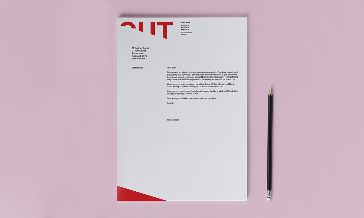
For this brief I re-designed the identity of a hair salon called Cut. The aim was to create a set structure between logo and text so that it was consistent in each branded item. The logo pushes the boundaries of what is readable and creates a typographic game that the viewer can decipher.