


It's cold in Russia—three-quarters of the country is Far North. The frost is in the songs, the fairytales, and the paintings of Russia. Most local ice cream brands use folklore symbols and images or speculate on Soviet nostalgia. It’s all long past. Together with Freezers, we’ve created the present of Russian ice cream, using the pure idea of frost.
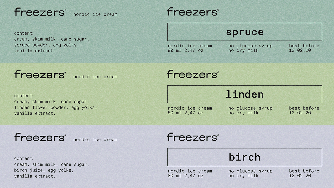
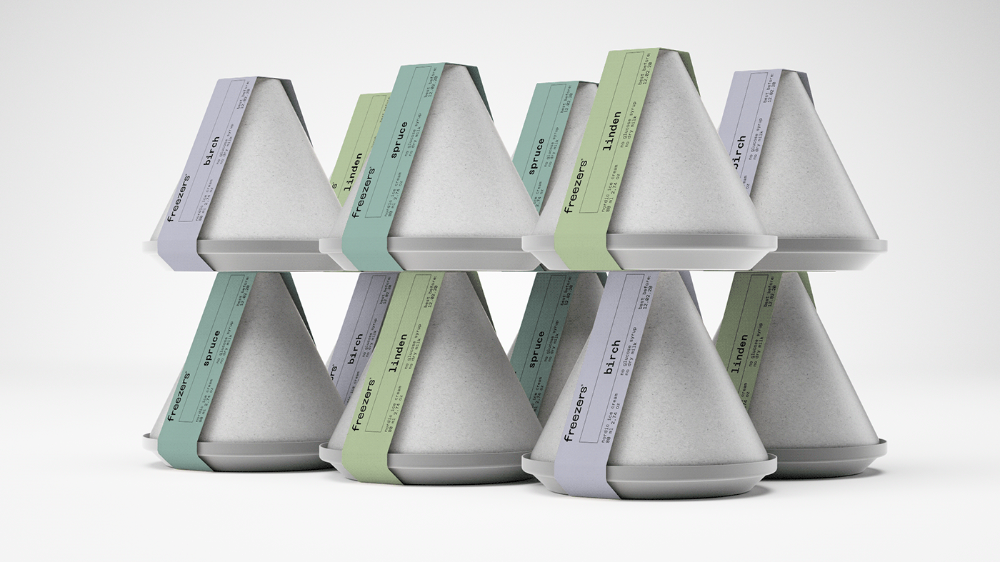
Freezers is the selective ice cream brand, that turns product into the experience. The pavilion made of iron and wood and the container made of biodegradable plastic embody the archetypical forms, that can be be whatever you wish to imagine. The flavors of linden, birch, and spruce are frozen fantasies and premonitions. Simple and natural shapes, a strict logo, and clear typography strive to keep the experience as untouched as a snow-covered trail.
Freezers is the selective ice cream brand, that turns product into the experience. The pavilion made of iron and wood and the container made of biodegradable plastic embody the archetypical forms, that can be be whatever you wish to imagine. The flavors of linden, birch, and spruce are frozen fantasies and premonitions. Simple and natural shapes, a strict logo, and clear typography strive to keep the experience as untouched as a snow-covered trail.
#shukadesign 2021


SHUKA
creative director → ivan velichko
art director → dasha zudina
wordmark → varya goncharova
design → mary yudina, dmitry okulich-kazarin
art director → dasha zudina
wordmark → varya goncharova
design → mary yudina, dmitry okulich-kazarin
motion design → dmitry okulich-kazarin
3D → dmitry saveliev
3D → dmitry saveliev
designed by shuka ®
© all rights reserved
© all rights reserved


