


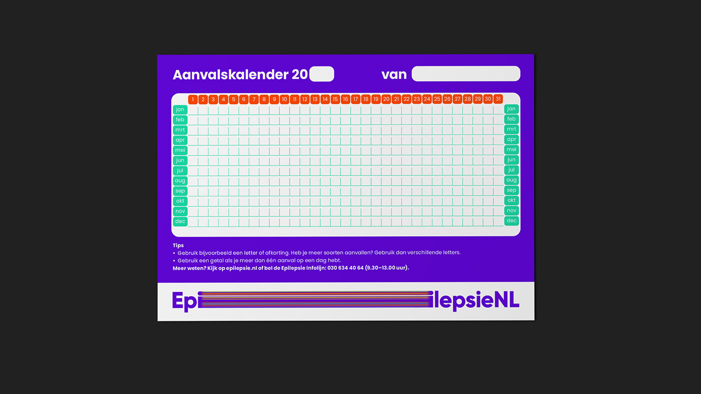
Unity makes stronger
As of 2021, The Royal Epilepsy Fund and De Epilepsie Vereniging join forces as one team: EpilesieNL. It’s the perfect time for a completely new and unique branding and marketing approach. The aim of the merger is to maximise research, recruitment and communication, and bring people together. One in 100 people has one of the 2,500 types of epilepsy. Seizures are brought on by a sudden, temporary disruption of the electrical activity in the brain.
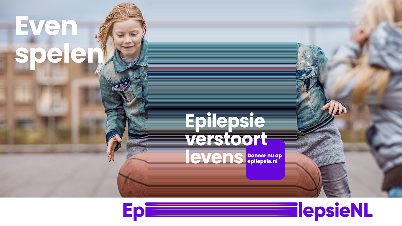
Stretching it
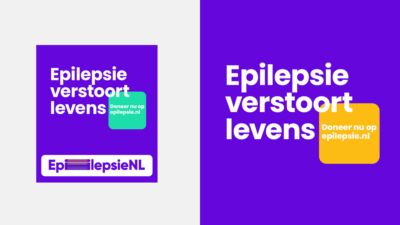
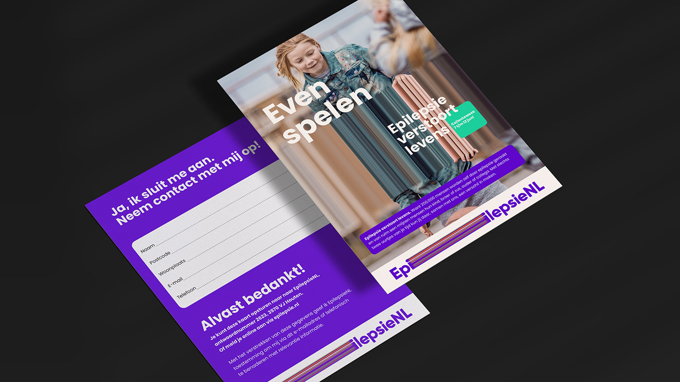
“Suddenly, I felt ‘detached’ from the world. I heard my friend say something to me, but I couldn’t answer. An hour later, it felt as though nothing had happened.” This is typical of the stories that epilepsy patients tell, and it resulted in the graphic imagery that we have developed for EpilepsieNL. It’s far removed from all the clichéd images that pop up in our minds when we think of epilepsy. The central theme is the use of graphics to create empathy for the impact of epilepsy. It disrupts lives. It makes time stand still. It is unpredictable, which is what makes it so frightening. The stretch is recognisable to patients and evokes empathy among people who don’t have epilepsy.


A disruptive double whammy
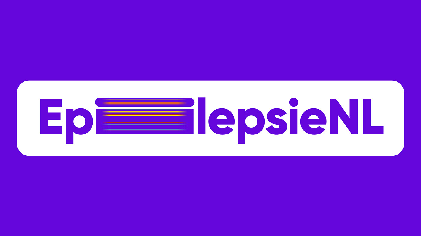
We use the graphic representation of what epilepsy means in both the campaign images and in the EpilepsieNL logo. We went for a range of everyday situations to illustrate the unpredictable nature of the disorder. We have taken this unpredictability to extremes by not giving the ‘disruption’ a fixed position in the logo. It is in a different position in every
manifestation. This creates a unique, ever-changing logo that is still immediately recognisable.
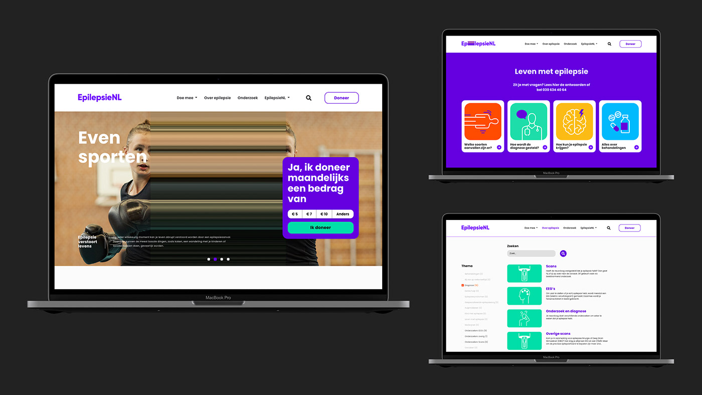
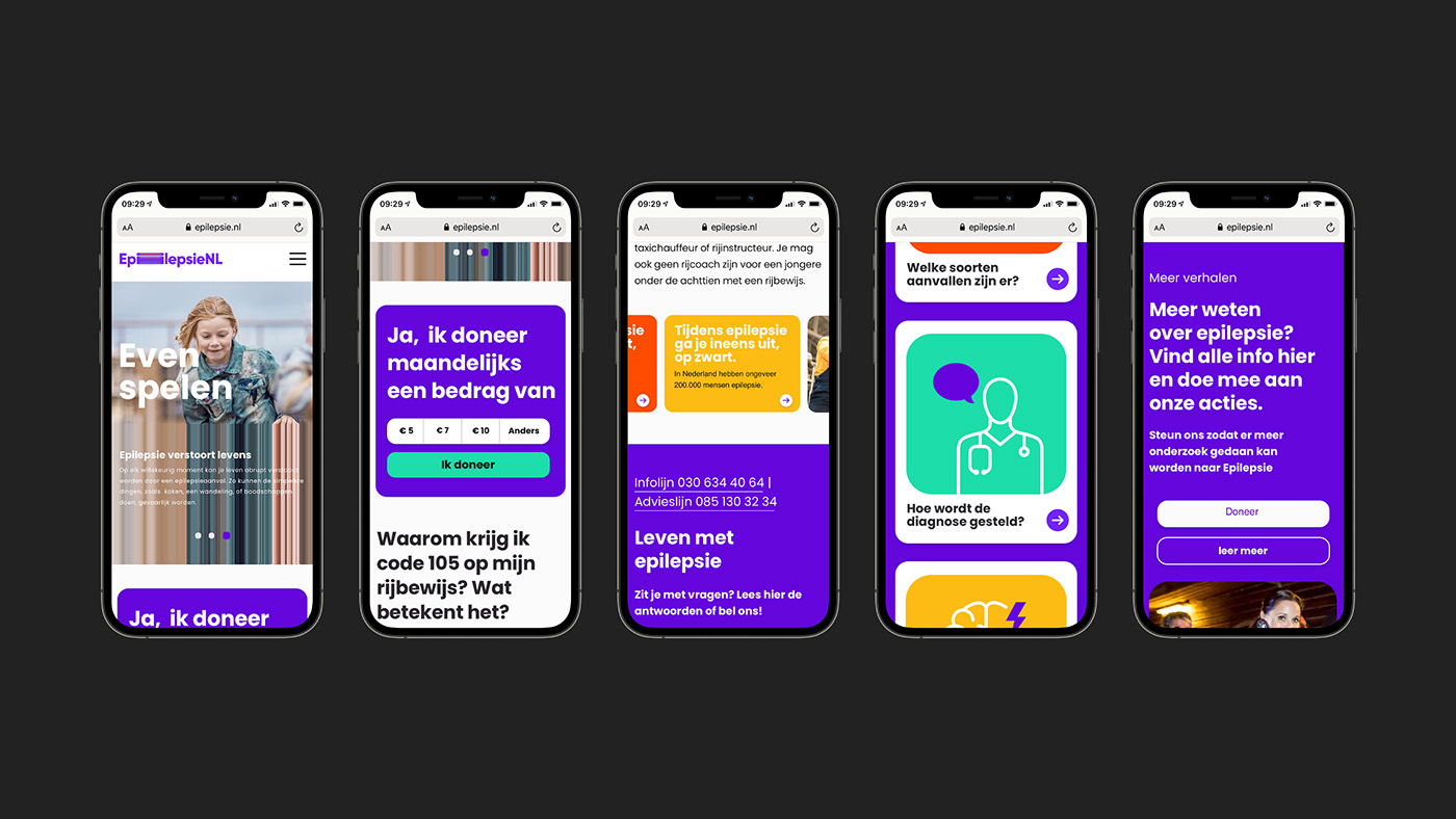
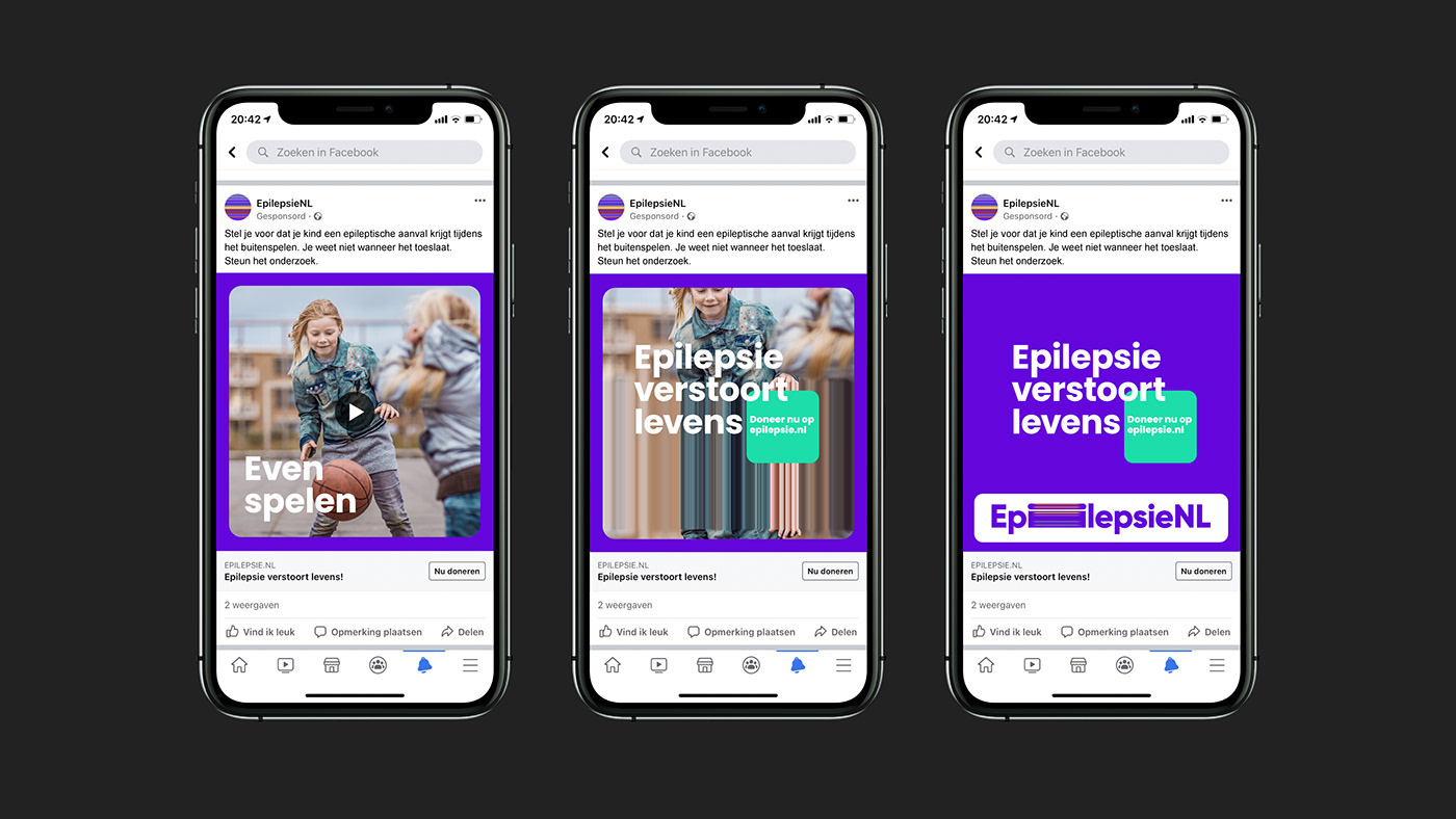
The unity of form and function
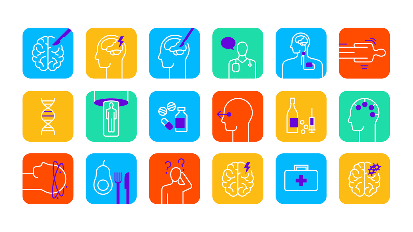
Throughout the campaign, form and function are inextricably linked. It is easy to translate this to literally any situation, both in terms of the images we use and the media. Advertisements, banners, billboards, commercials, campaign marketing – the unique graphic imagery does its work everywhere. And even without campaign images, the logo shows exactly what the impact of epilepsy is. The choice of the main colour purple is also very important, providing a direct reference to Purple Day on 26 March, the International Epilepsy Day. It is the colour of lavender, which research has shown to have a positive e ect on people with epilepsy. Each element contributes to a deepening and widening of the message: epilepsy disrupts lives.


Facts
Client: EpilepsieNL
Project: Campaign, Strategy, Brand, Identity, Activation, Motion, Website, Illustration
Agency: Total Design
Agency: Total Design
Credits
Head of Branding: Henriette Verkerk
Creative Directors: Edwin van Praet, Martijn van den Brakel
Designers: Adam Lane, Timon Weerstand, Rosan Gleijsteen, Edwin van Praet
Art Director: Robin Poelmann,
Creative Copywriter: Ervin Ramrattan
Creative Directors: Edwin van Praet, Martijn van den Brakel
Designers: Adam Lane, Timon Weerstand, Rosan Gleijsteen, Edwin van Praet
Art Director: Robin Poelmann,
Creative Copywriter: Ervin Ramrattan
Head of Digital Impact: Joppe Andriessen
Motion Graphics: Adam Lane
Frontend Developer: Lex van Hees, Rosyl Budike
Client manager: Etienne Wolfs, Marloes Pijning
Implementation Designer: Arjen Firet
Client manager: Etienne Wolfs, Marloes Pijning
Implementation Designer: Arjen Firet
Awards
International Design Awards (IDA), Bronze, MultimediaInternational Design Awards (IDA), Honorable Mention, Corporate Identity
International Design Awards (IDA), Honorable Mention, Logos
Thanks for watching


