Emerson's Capstone provides students with the opportunity to evaluate and develop a comprehensive marketing communication plan and creative execution for a local client. My Capstone took place May 22 - June 28 2012, I served as Creative Director and Project Manager.
The Bay State Banner is a free newspaper for the African American Community in the Boston Metro area and parts of Western Mass. We developed a marketing planning illustrating how a re-launch paired with a light rebranding online and in print could help increase The Bay State Banner's awareness and use by their demographic.
If you're interested in learning more about our marketing plan please contact me.The Bay State Banner is a free newspaper for the African American Community in the Boston Metro area and parts of Western Mass. We developed a marketing planning illustrating how a re-launch paired with a light rebranding online and in print could help increase The Bay State Banner's awareness and use by their demographic.
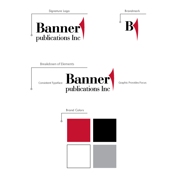
As Creative Director I updated The Bay State Banner logo by updating the text in the word mark to be the same typeface, adding a tag line to help the reader understand The Bay State Banner's focus, and applying a brand mark to help draw attention to the logo when it is surrounded by other text and graphical elements. The typeface of the word mark is Bondoni in black. The brand mark is a simplistic graphic of a page turning in the brand's signature red. The brand mark is designed to produce a quick association with the act of reading.
If you're interested in learning more about our marketing plan please contact me.
The Bay State Banner is a free newspaper for the African American Community in the Boston Metro area and parts of Western Mass. We developed a marketing planning illustrating how a re-launch paired with a light rebranding online and in print could help increase The Bay State Banner's awareness and use by their demographic.As Creative Director I updated The Bay State Banner logo by updating the text in the word mark to be the same typeface, adding a tag line to help the reader understand The Bay State Banner's focus, and applying a brand mark to help draw attention to the logo when it is surrounded by other text and graphical elements. The typeface of the word mark is Bondoni in black. The brand mark is a simplistic graphic of a page turning in the brand's signature red. The brand mark is designed to produce a quick association with the act of reading.
If you're interested in learning more about our marketing plan please contact me.

As Creative Director I updated The Bay State Banner logo by updating the text in the word mark to be the same typeface, adding a tag line to help the reader understand The Bay State Banner's focus, and applying a brand mark to help draw attention to the logo when it is surrounded by other text and graphical elements. The typeface of the word mark is Bondoni in black. The brand mark is a simplistic graphic of a page turning, in the brand's signature red. The brand mark is designed to produce a quick association with the act of reading.