ABBYY is a global leading Digital Intelligence company that helps people imagine a better way to work and accelerate business. After the announcement of a new product portfolio in 2020, ABBYY needed to to build a brand that brings this new Digital Intelligence vision to life.
The swirling figure is change itself. Its movement begins on the left, where it has a dark blue colour, and then transforms into graphics with a gradient and pattern. The gleam of light is the turning point between the past and the future, felt by a human — that is why it’s exciting.
The swirling figure is change itself. Its movement begins on the left, where it has a dark blue colour, and then transforms into graphics with a gradient and pattern. The gleam of light is the turning point between the past and the future, felt by a human — that is why it’s exciting.
#shukadesign 2021

The shape can transform in different ways and several times: each new twist is accompanied by a change in the pattern and colour.
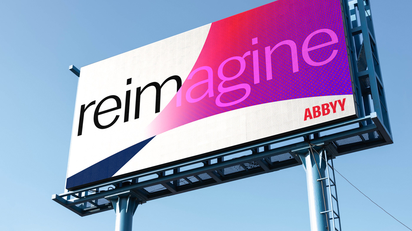

The new ABBYY brand unleashes what ABBYY represents: the visionary, innovative, trusted, high-energy, and creative thinking expert who helps to reimagine and accelerate organizations globally.



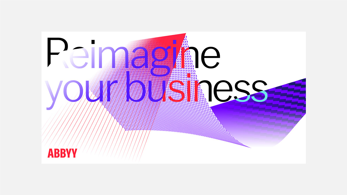
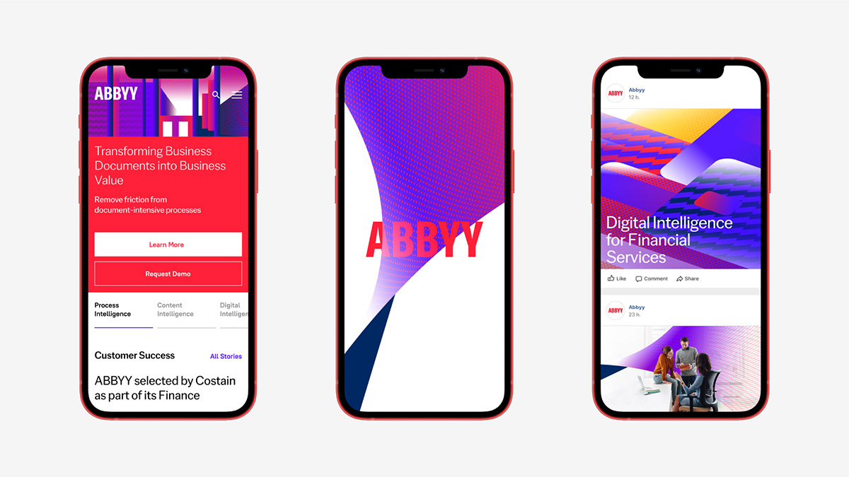
The style incorporates isometric illustrations, a set of icons, infographics, factoids, and photos with custom gradients and patterns that can adapt to any digital or physical communication.




SHUKA
art director → ivan velichko
digital art director → victor akifiev
lead designer → konstantin frolov
lead motion designer → dmitry kozlyaev
motion designer → dmitry okulich-kazarin
creative directors → ivan vasin, ivan velichko
designed by shuka ®
© all rights reserved
© all rights reserved


