


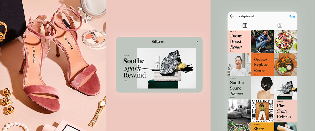
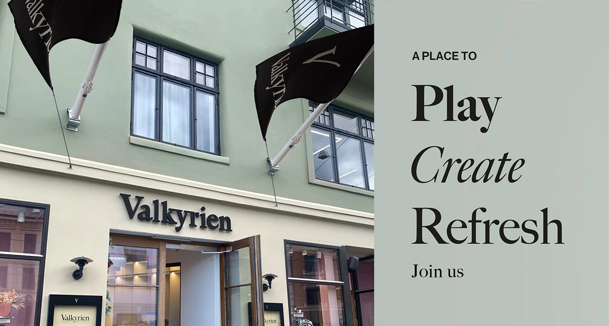
Welcome to Valkyrien, a completely new shopping experience at Majorstuen Oslo. Valkyrien is a treasure chest filled with great experiences, good tastes and inspiring fashion.
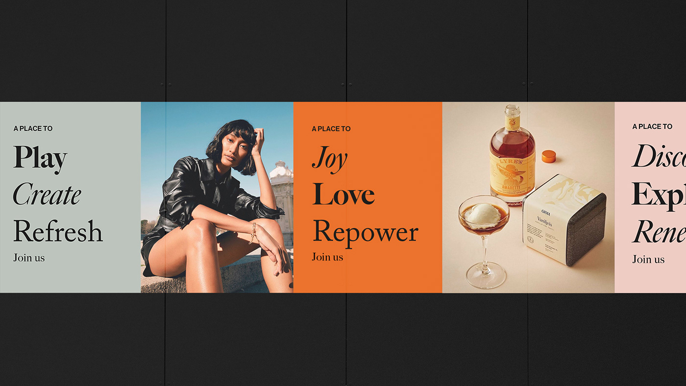
The communication challenge with this project was to make a concept that was inspiring, appealing and commucative in digital as well as print and to represent the different shops. The identity is simplified with black neutral as a base and colours in system to be used with different style and expressions.
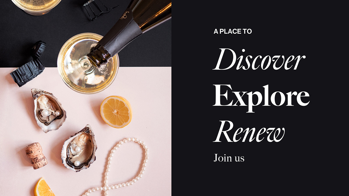
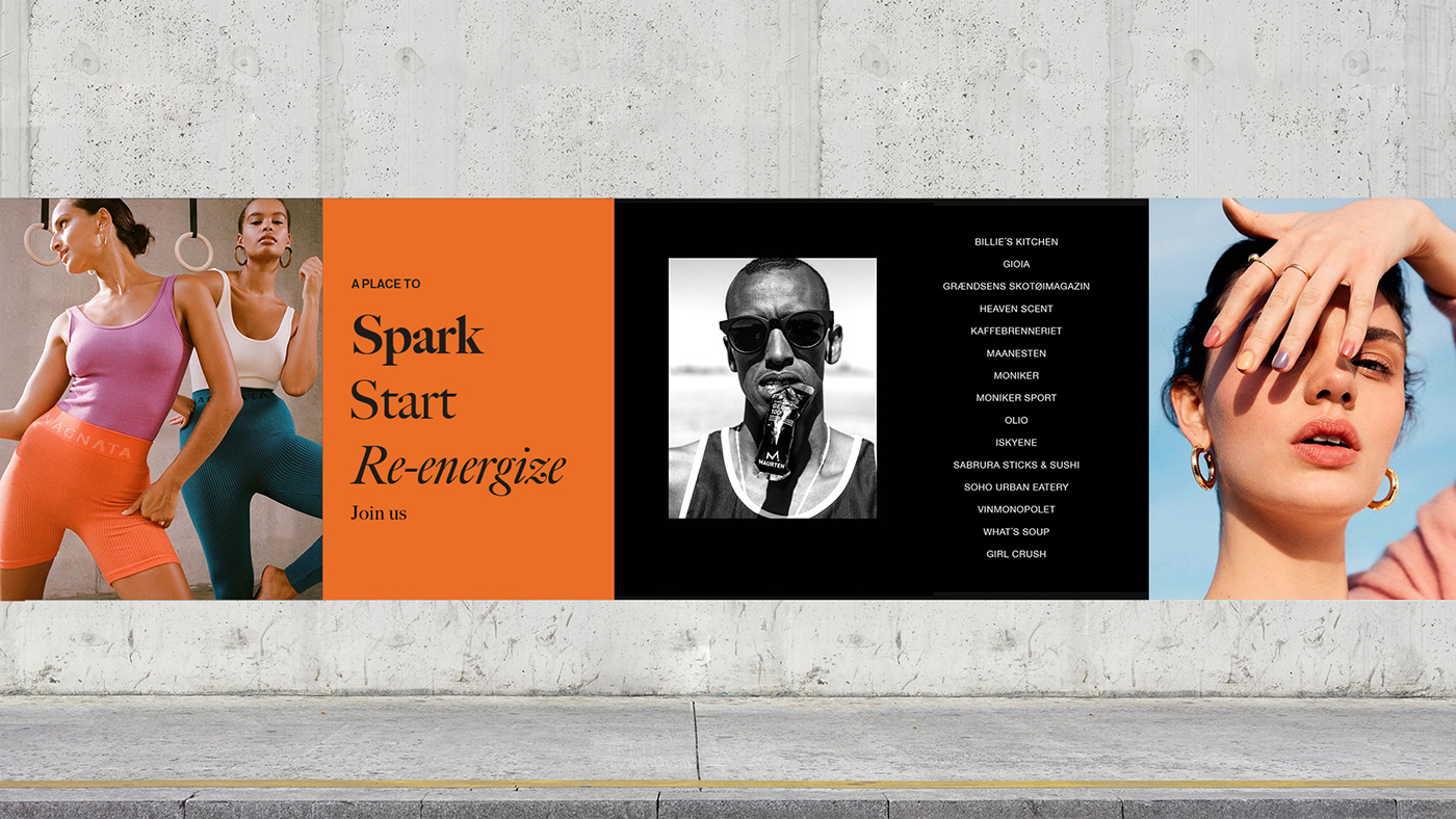
This is an environment that speaks to the emotions, a place of discovery, where people want to hang out and drop by. Where they come for fun and entertainment, to be surprised. Supporting this forward-facing retail aspiration, the architectural style of Valkyrien combines elements old and new to create a unique experience for discerning shoppers.
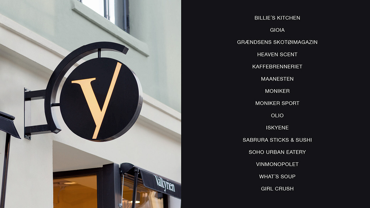
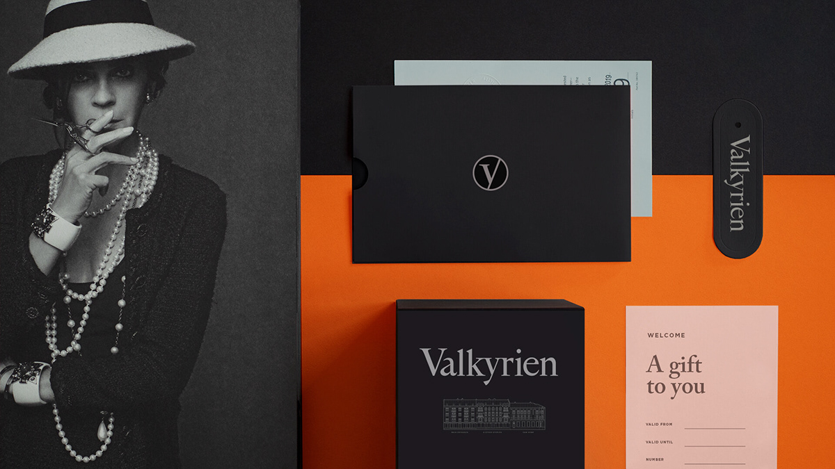
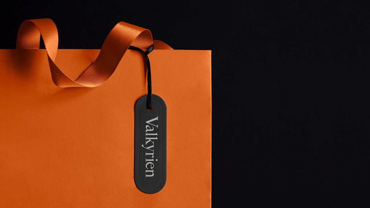
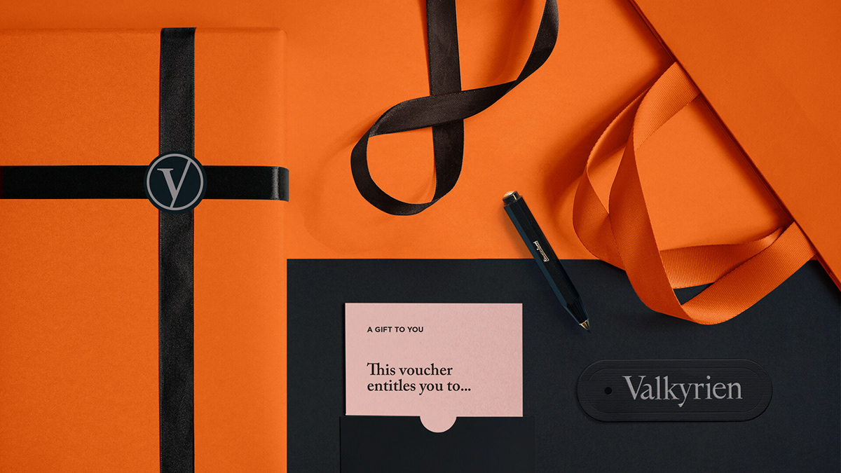
The name Valkyrien comes from a subway station that is closed. The buildings are located next to a large Y (V) shape and this is the main inspiration for the logo symbol. The identity is built on classic craftsmanship in typography with a colour palette that in combination creates a bridge between, reverence and fashion lifestyle.

Thanks to:
Fram Eiendom
Mellbye Arkitektur Interiør AS
Moon international who has participated
in the development of the concept.
Fram Eiendom
Mellbye Arkitektur Interiør AS
Moon international who has participated
in the development of the concept.
Thanks for Watching!


