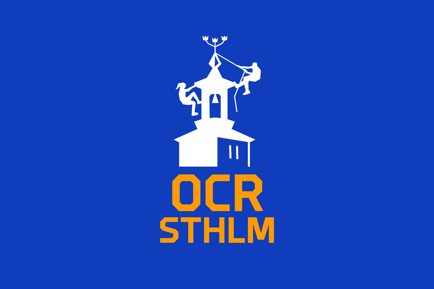
OCR Sthlm
Obstacle course racing is a sport that has been growing in popularity in the last few years. It has gone from being as a sport with a lot of military references to a sport where everyone is welcome.
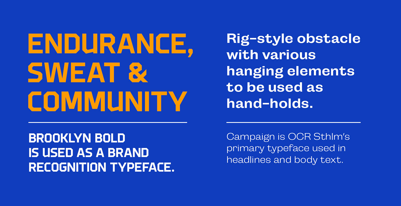
The club OCR Sthlm asked me to update their logo, colors and typography. I wanted to visualise that shift in the sport by removing the military element in the typography and make it feel sporty, welcoming and fun. The symbol in the logo is the Stockholm City Hall which they wanted to keep – it's a reference to the city of the club.


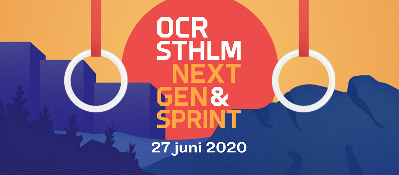
In addition to the updated identity, I was asked to create a look for their own OCR race called OCR 24 Sthlm —
a race where team members take turn to complete laps over 24 hours and OCR Next Gen — a 3-6 km race for people at the ages 10-18.
a race where team members take turn to complete laps over 24 hours and OCR Next Gen — a 3-6 km race for people at the ages 10-18.
The illustrations in blue and red represent the 24 hours, the nature and a set of gymnastic rings – commonly used in the OCR world.
Due to covid-19, the race was postponed to 2022.