We are a creative agency based in Kraków in Poland and we’ve been in the business for over 15 years. Last year we decided to update our brand image and this presentation will tell you all about it. We hope you’ll enjoy it!
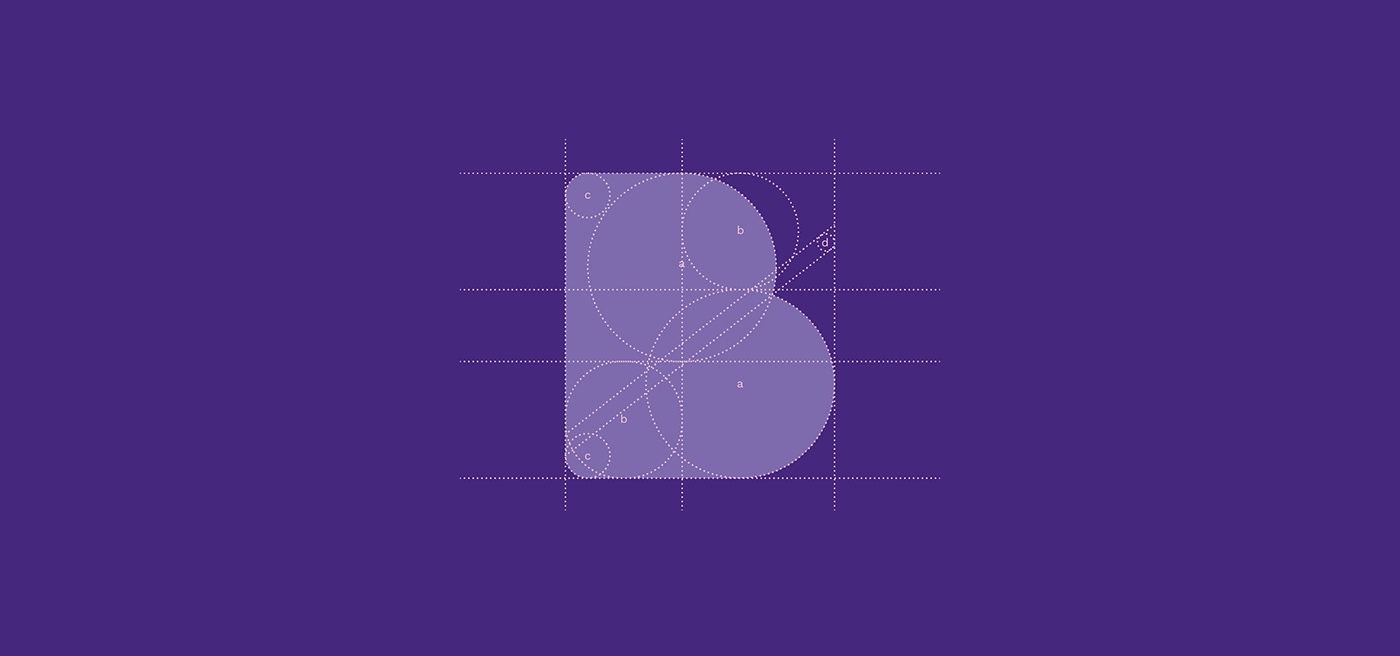
The concept behind our logo was to show the unity, simplicity and balance of Brand Backup's image. That's how the logomark of two B's which complement each other in one symbol was born.


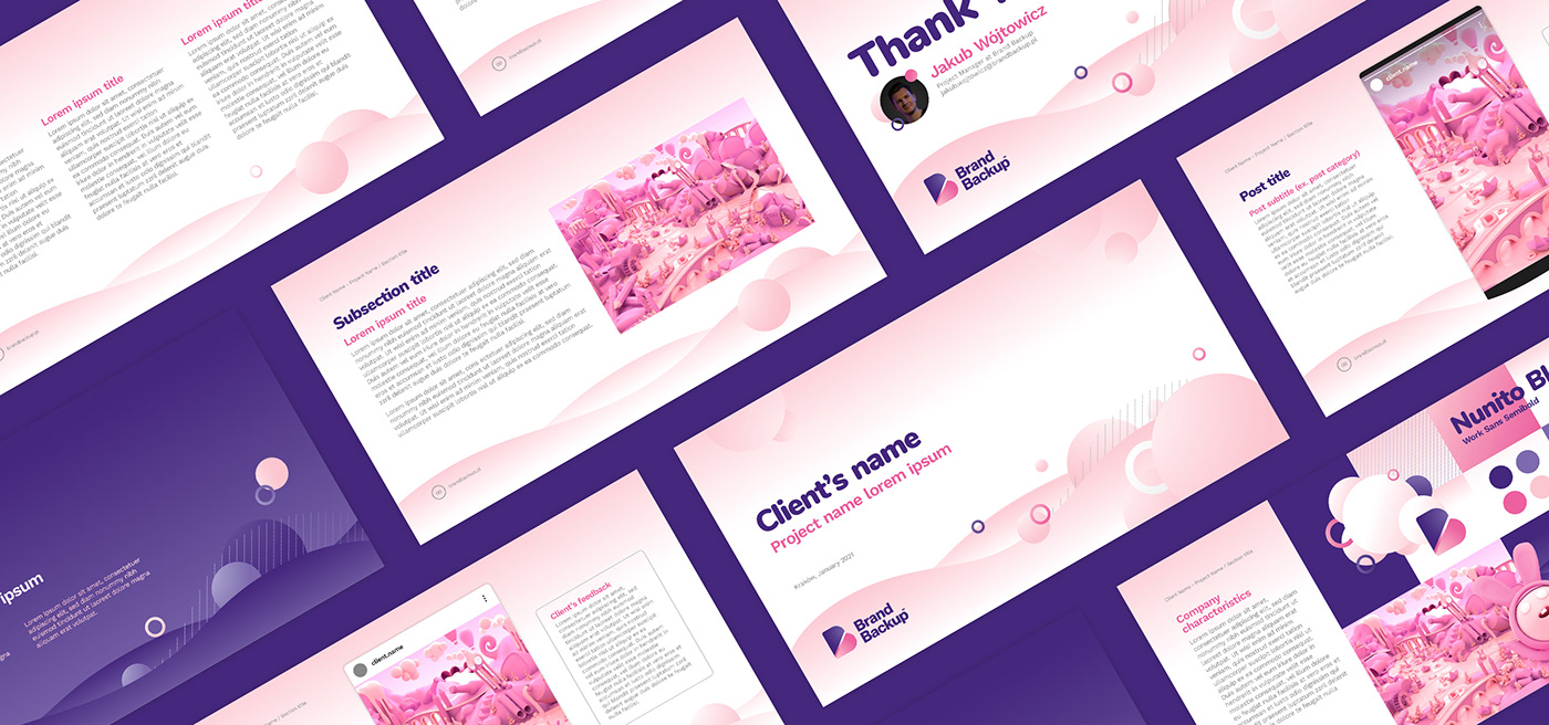
We wholeheartedly believe that a well made project presentation is crucial in the creative process. Even if the final design is absolutely immaculate, a bad presentation can make it look mediocre, which will eventually affect
the client's perception.
the client's perception.


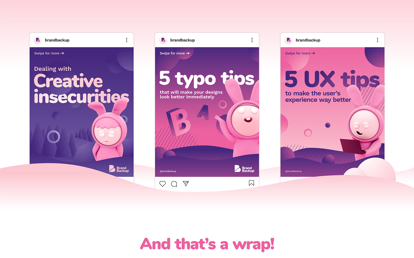
Because we have a team of experts in different fields of design, our communication includes educational posts in which we share our knowledge. They're aimed mainly at young and aspiring designers who want to learn something useful quickly.