Goudy Old Style
As part of a classroom project we had to choose one out of certain given typefaces and create posters containing a little information about the font, its designer, distinguishing characteristics and its history. I chose to work with Goudy Old Style.
The text in the poster reads as follows,
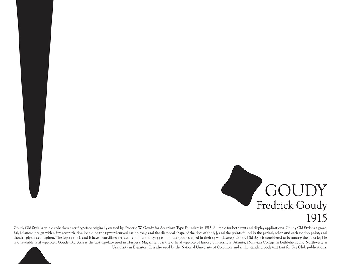
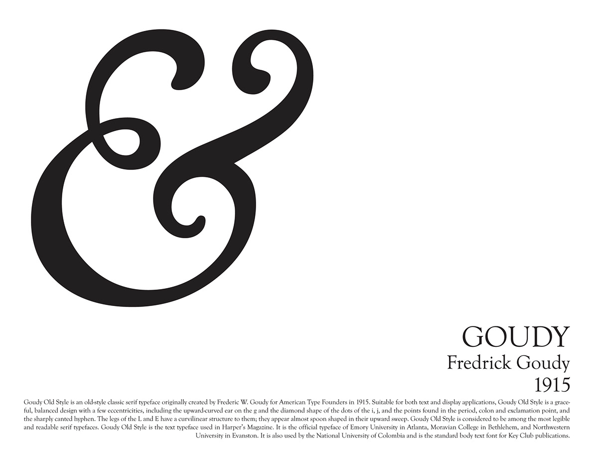
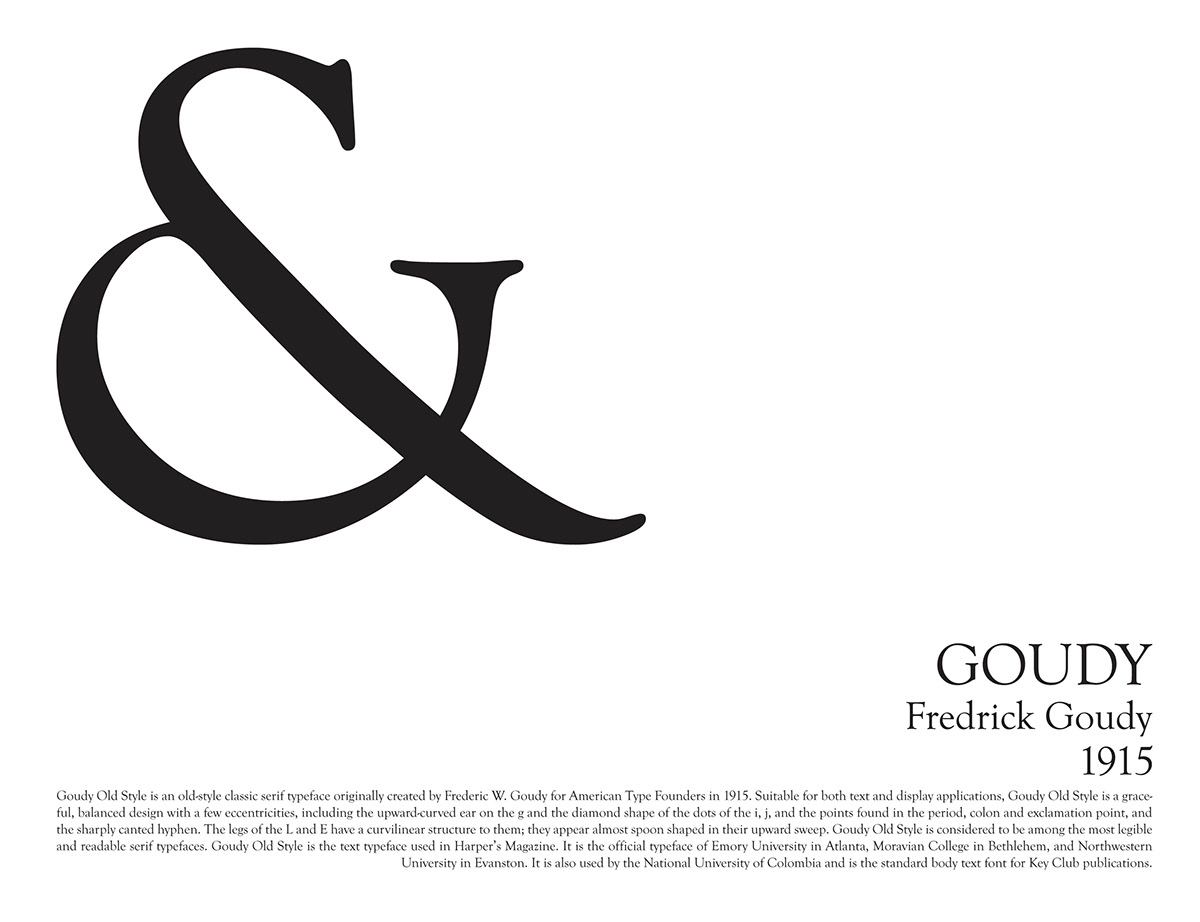
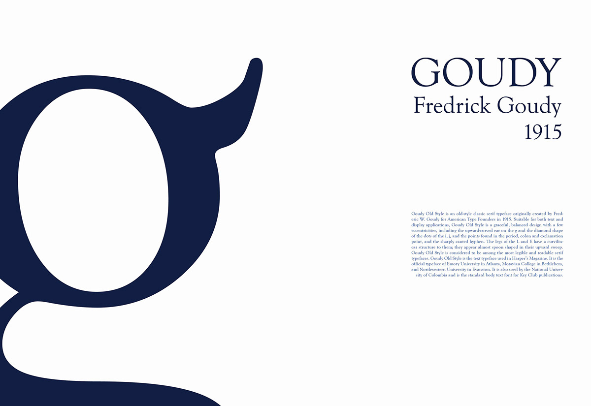
Goudy Old Style is an old - style classic serif typeface originally created by Fredric W, Goudy for American Type Founders in 1915. Suitable for both text and display applications. Goudy Old Style is a graceful, balanced design with a few eccentricities, including the upward - curved ear on the 'g' and the diamond shaped dots of the 'i', 'j' and the points found in the period, colon, exclamation mark and the sharply canted hyphen. The legs of the 'L' and 'E' have a curvilinear structure to them; they appear almost spoon shaped in their upward sweep. Goudy Old Style is considered to be among the most legible and readable typefaces. It os the text typeface used in Harpers' Magazine and the official typeface of Emory University in Atlanta, Moravian College in Bethlehem, and Northwestern University in Evanston. It is also used by the National University of Columbia and is the standard book text for Key Club Publications.
The text in the poster reads as follows,
Goudy Old Style is an old - style classic serif typeface originally created by Fredric W, Goudy for American Type Founders in 1915. Suitable for both text and display applications. Goudy Old Style is a graceful, balanced design with a few eccentricities, including the upward - curved ear on the 'g' and the diamond shaped dots of the 'i', 'j' and the points found in the period, colon, exclamation mark and the sharply canted hyphen. The legs of the 'L' and 'E' have a curvilinear structure to them; they appear almost spoon shaped in their upward sweep. Goudy Old Style is considered to be among the most legible and readable typefaces. It os the text typeface used in Harpers' Magazine and the official typeface of Emory University in Atlanta, Moravian College in Bethlehem, and Northwestern University in Evanston. It is also used by the National University of Columbia and is the standard book text for Key Club Publications.