


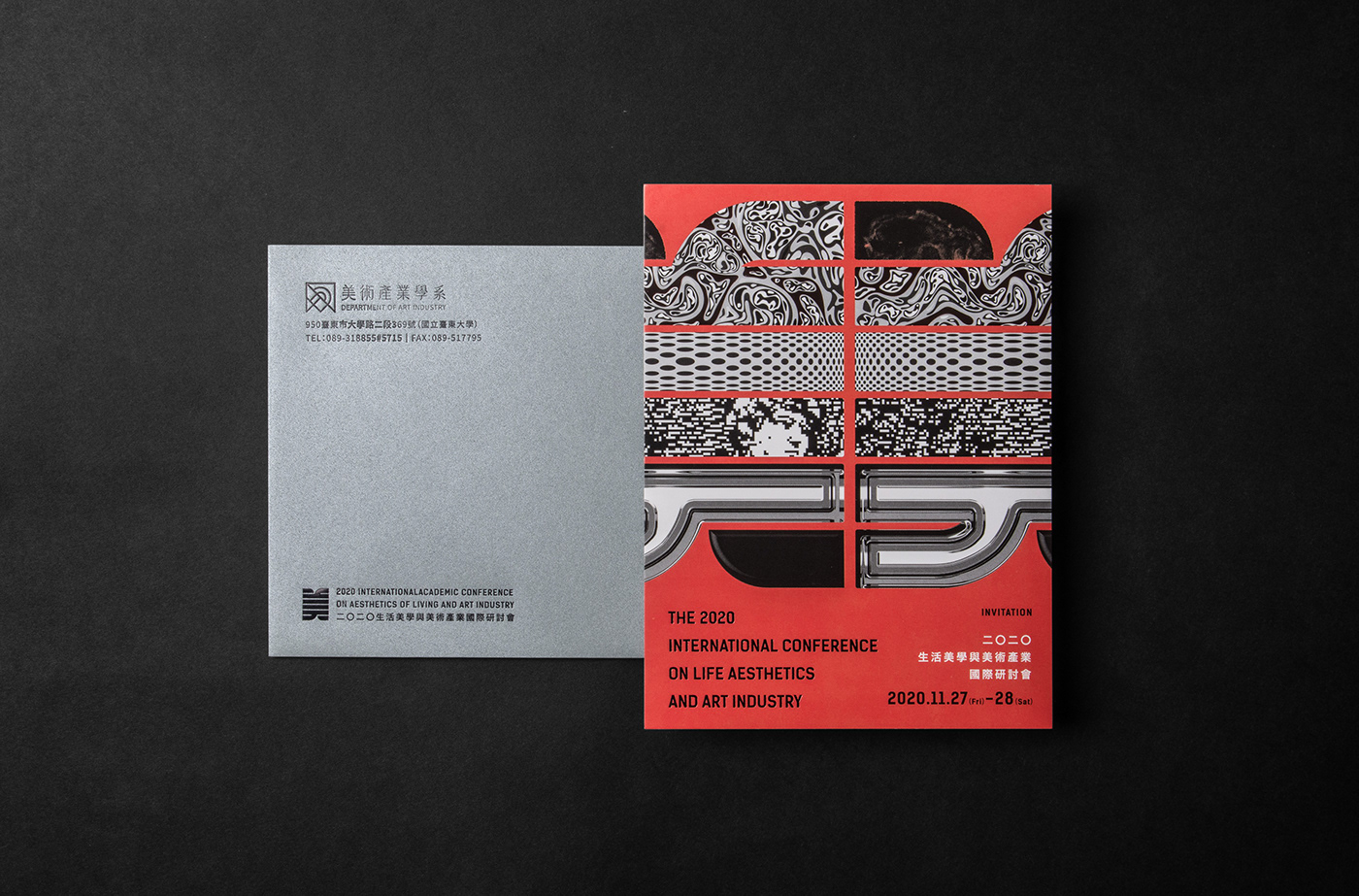
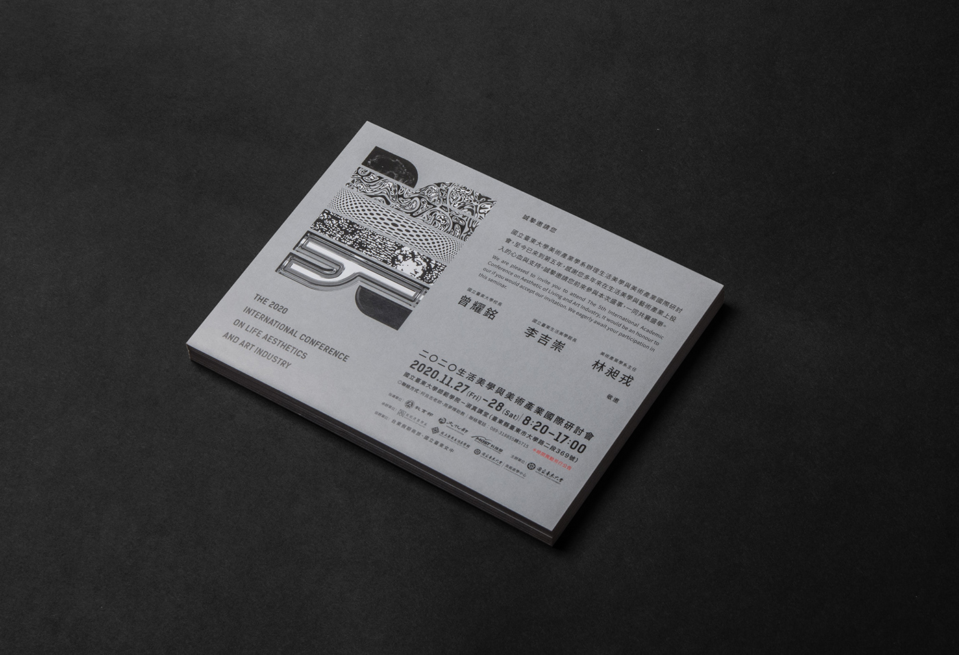
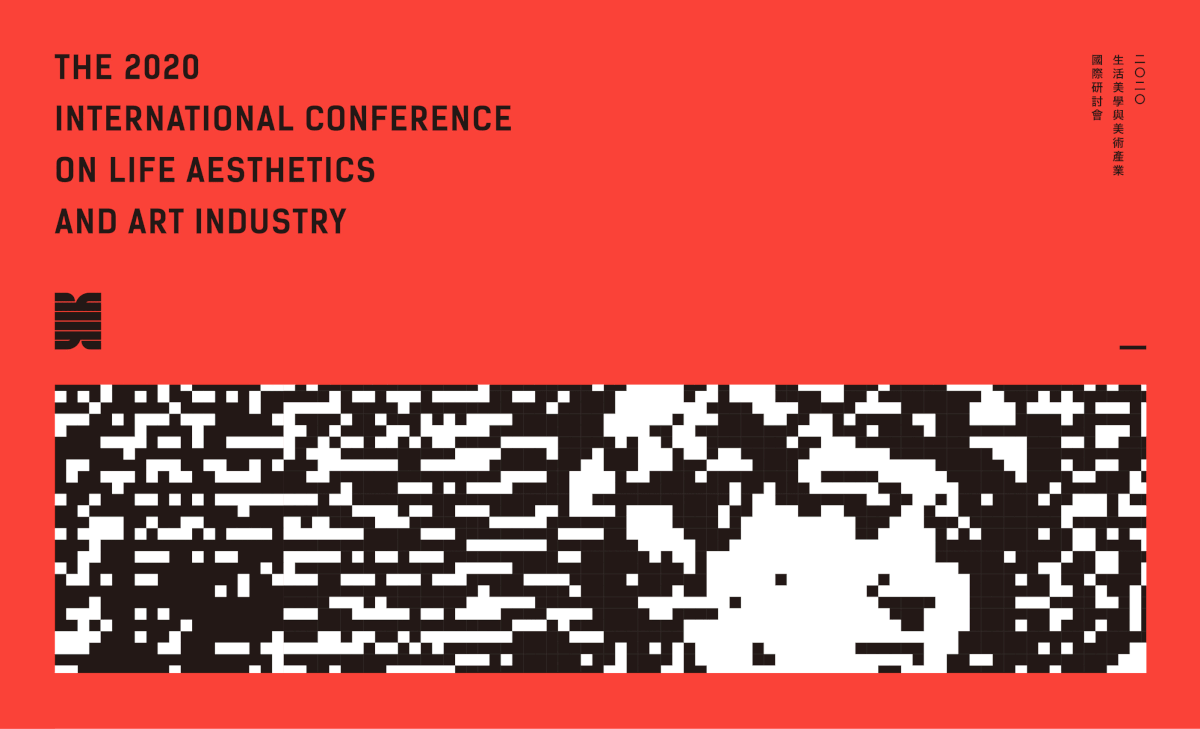
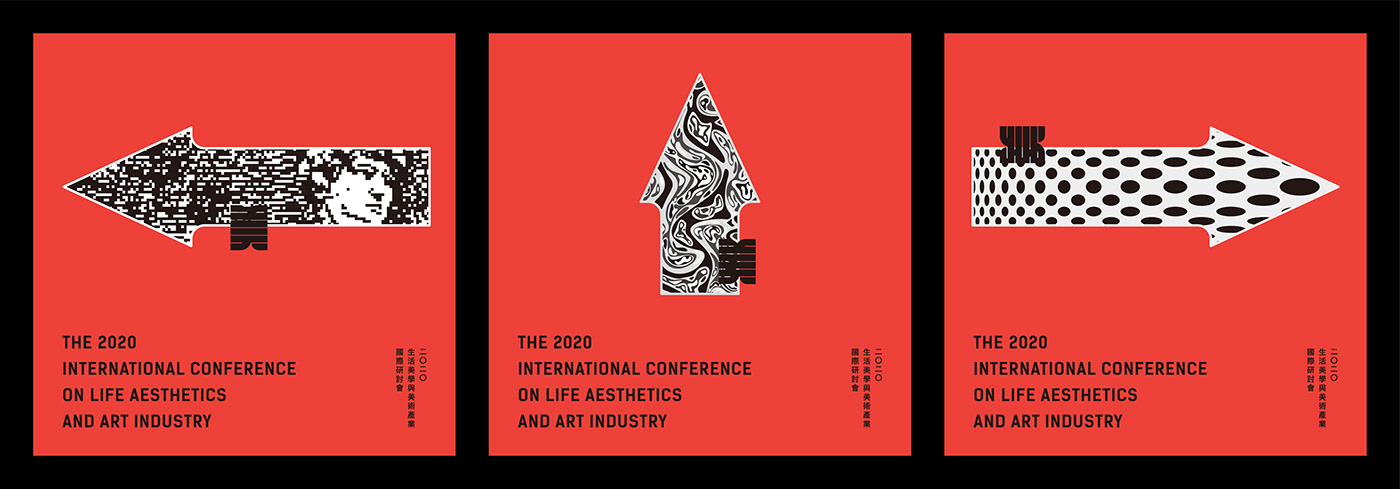
The key vision employs the simplified Chinese character “美” (“beauty”) as the main component, and integrates Chinese ink painting, the traditional skills, digital art, 3D design, and etc. into different strokes of the character to showing the diversified aesthetic presentation. The strokes’ colors are black and white, which symbolize leaving colors to the creators and researchers that attend the seminar.
主視覺以簡化的漢字「美」字作主要元素,並將水墨繪畫 傳統技法、數位藝術、立體造型等元素融入至不同的筆畫,體現多元的美學的展現;筆畫部件色彩使用黑白呈現,象徵把色彩留給參與研討會的創作者和發表研究者。


指導單位:教育部、文化部、科技部
主辦單位:國立臺東大學
協辦單位:臺東假期商旅、國立臺東女中
承辦單位:國立臺東大學美術產業學系、國立臺東生活美學館、國立臺東大學美術產學中心
Client:國立臺東大學 美術產業學系主辦單位:國立臺東大學
協辦單位:臺東假期商旅、國立臺東女中
承辦單位:國立臺東大學美術產業學系、國立臺東生活美學館、國立臺東大學美術產學中心
Design:王柏偉 Wang, Bo-Wei
Design Agency:SIANG SINN DESIGN 相森設計
Year:2020
Year:2020


