Disney California Adventure Rebrand and Identity System
Class: Communication Design 4
Teacher: Sean Adams
Project: Rebrand a new or existing company.
Term 4, Spring 2013
Class: Communication Design 4
Teacher: Sean Adams
Project: Rebrand a new or existing company.
Term 4, Spring 2013

BACKGROUND
Disney California Adventure is a theme park located in Anaheim, California, it is owned and operated by The Walt Disney Company through its Parks and Resorts division. The 67-acre park is themed after the history and culture of California. When it comes to Disney, it is always about the customer experience, the fantasy and the magic.
PROBLEM
California Adventure was expected to draw large crowds when it opened on February 8, 2001. The actual attendance that year was substantially less than expected. California Adventure’s brand is successful in utilizing new technology and being innovative. They always stay current with new technology and incorporate it into shows and rides at the park. People also like the fact that they are able to consume alcohol in the park, unlike at Disneyland. California Adventure has been said to be the "adult alternative to Disneyland". Where they lack is the ability to provide the same “magic” and ambience that Disneyland does. Fans say the rides at California Adventure lack themes and integration of Disney characters. The park has not lived up to Disney’s standards and expectations. For the price people pay, they expect more from the park.
SOLUTION
I wanted to rebrand California Adventure and give them a new voice and look. Before, California Adventure seemed redundant. The entrance literally looked like the front of a postcard and the park itself felt very touristy. Now the park has been transformed from a veritable spoof of modern California culture to a romanticized, idealized version of the state, exploring specific time periods and historic settings. I wanted to focus on the culture of California and pulled inspiration from the new facade (inspired by how Los Angeles looked to Walt Disney in the 1920's-1930's) and also the idea of adventure in California.

California Adventure’s previous logo seemed too childish for the brand, especially since they have changed their brand personality. I re-designed their logo to be more modern and themed, pulling inspiration from the 1920’s-30’s, like Buena Vista Street inside the park. I added the compass in the “o” to show the concept of adventure, which seemed appropriate for the theme park.

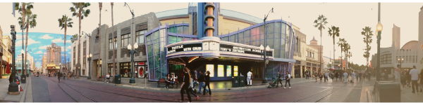
Logo in Context.

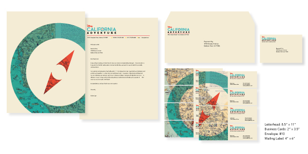

For the series of posters, I wanted to focus on actual adventure instead of the touristy aspect of California, so I used old maps of California, some with more character than others, and used them in the background of my posters. Each map I chose was interesting in their own way, which is why I picked them. For two of the posters, I added hand-lettered typography of the word “Adventure” on top of the poster, which brings focus to what California Adventure should really be about–your very own adventure.


Because guests like the fact that they can drink inside California Adventure, I thought creating a beer glass featuring the "Adventure" typography would be fitting. I also created wooden coasters to go with the cup, each with a different design.

The posters would be put up throughout both parks, as well as Downtown Disney. It would be ideal to put to posters inside Disneyland to attract and persuade more guests to visit California Adventure after their visit at Disneyland.


