

Oberland Agriscience Brand Identity Design
Oberland uses advanced, patented microbial processes to reclaim organic waste and repurpose it to fuel industrial farming of animal feed.


Their Challenge
This team was positioned to take on the world's looming protein shortage with advanced agritech - but they needed a brand to rally around as they took on closing of the carbon loop.
Our Solution
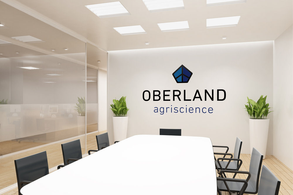
This project presented the perfect opportunity to create a cohesive brand from the ground up. We built a knowledge base and presented a naming strategy to the team. Oberland loosely translates to ‘upper land’, which for us, means an aspirational green place worth getting to. The name lent itself beautifully to a visual brand strategy; Oberland’s optimistic mark gives a nod to the longstanding towers of Oberland in Liechtenstein where the company's CEO/Founder has family roots - but with modern sensibility and detail. This strong mark signals Oberland’s forward-thinking and underpins its agriscience focus.

“People think it’s easy to come up with a name but it’s surprisingly difficult and that’s where it was nice to get help. What R&G really brought to the table was guidance through that process which helped narrow the focus so we weren’t completely all over the map. The name is a really important part of a company... there’s a heritage that goes along with the name, people really do resonate with that. Oberland has that feel of a strong company that’s been around forever even though we’ve only been in existence for about a year. ”
— GREG WANGER, CEO, OBERLAND AGRISCIENCE
See more of our sustainable brand work at www.rgstrategic.com


