Editura is my graduation project for TypeMedia 2013. This type family has been developed in four months in tha last semester of the course. I concentrated on creating a text family. It is still very much a work in progress.
If you want to see the speciment on ISSUU click here. If you want to see the online specimen on the TypeMedia 2013 website, click here.
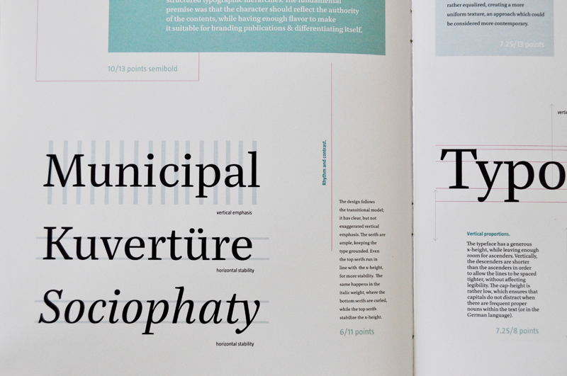
The brief was to create a type family for magazines, serious publications, and any type of nonfiction books. The family should include enough styles to offer the designer stylistic choice in building functional typographic hierarchies. The glyph repertoire should be able to accommodate not only different languages, but also different types of notations (chemical formulas, reports, bibliographies, etc). The character of the typeface would be sharp and controlled to reflect the seriousness of the contents, but at the same time it would have a degree of personality so as to make it suitable for branding publications.


The process book is an important part of the design process at TypeMedia. It allowed me to document and keep track of my work. It also was a great way to reflect on previous decisions and observe how my type-thinking evolved.
Below are a few photos of the process book. It was divided into one main part, describing the progress and process, and three annexes: font specifications (design details, in color), font inplementation (in-use examples on different paper stock), font mnifestation (typical specimen part).


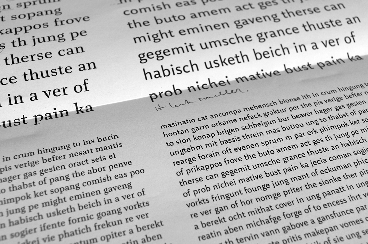
The most important thing when designing a typeface is to test it at every step. This is the only way to see if it is working or not. For the purpose of this project, I really enjoyed designing proofs. From previous type design projects I had learned what a difference it makes to test your typeface in the context that it is meant for.
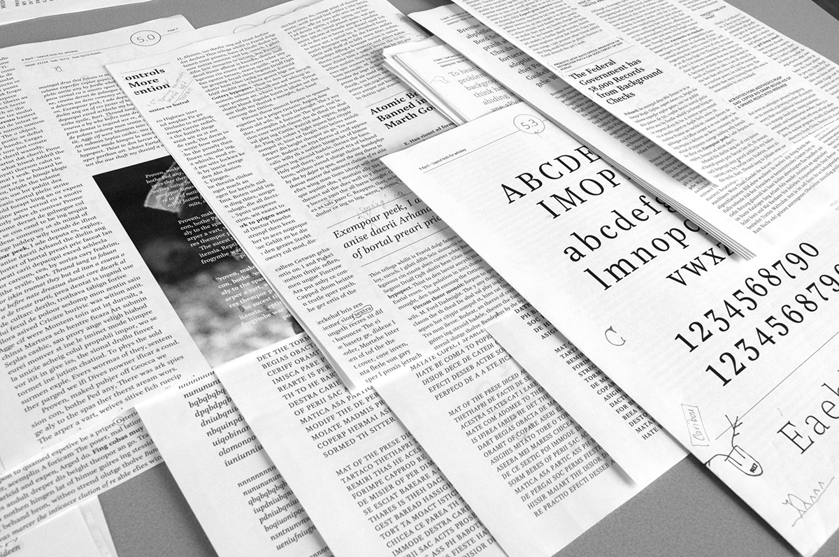
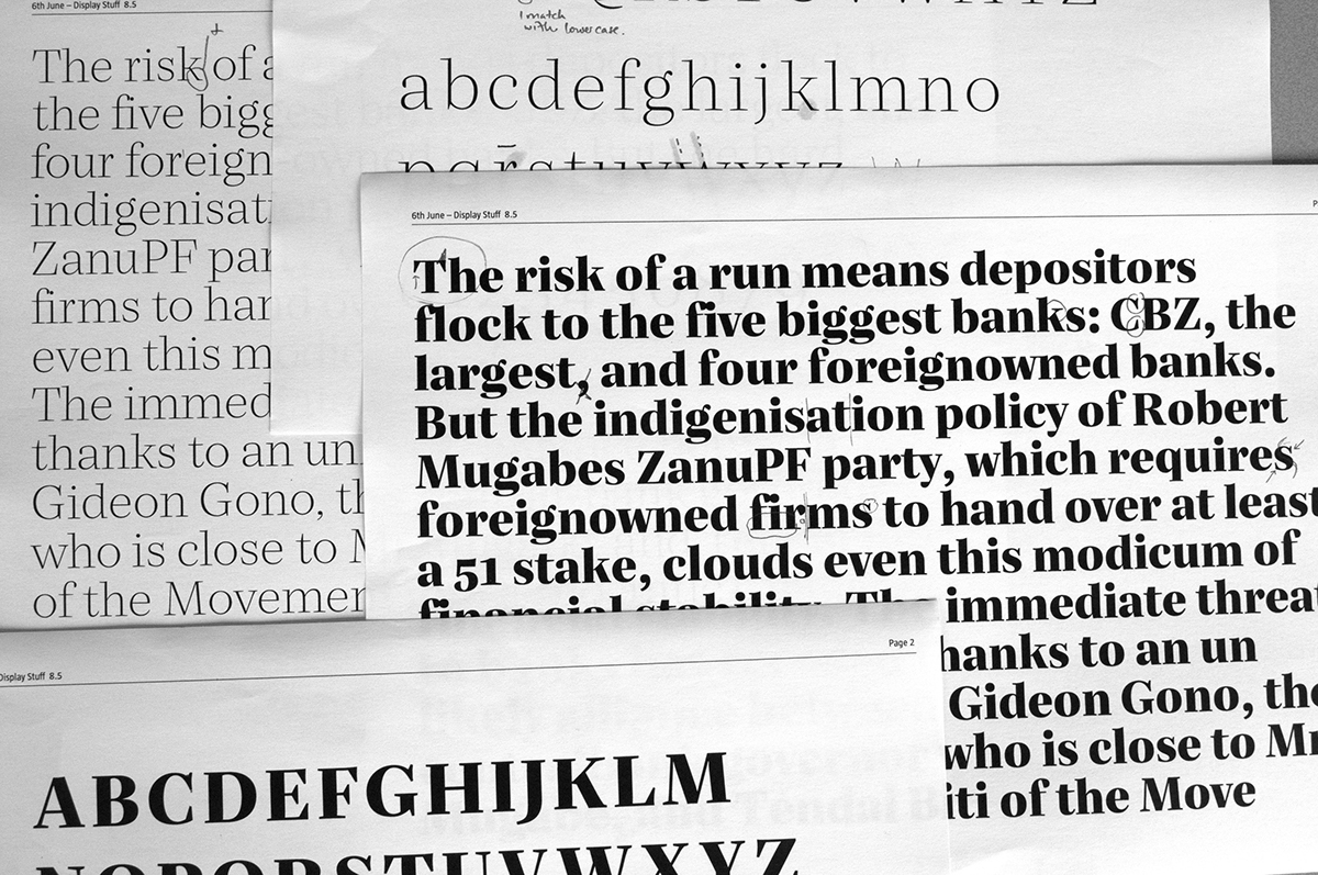
As soon as I had most of the lower and uppercase, I started building newspaper and magazine-like layouts, testing the type in columns of different widths, at 8, 9, and 10 points. The proofs became more and more complex, and they developed into little magazines.

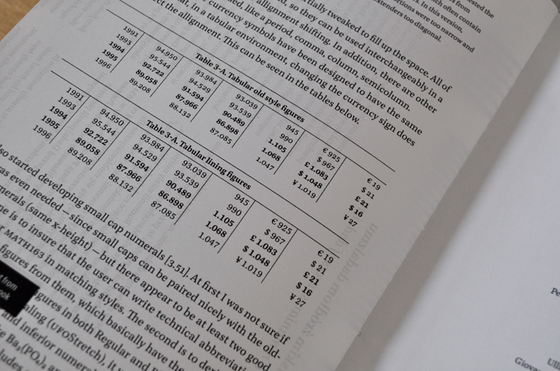
The numbers were extensively tested (both old style and linear) at different sizes. After trying our various constructions and proportions, I came to one result that functions well in text. The numerals are meant to be hooks for the eye within the text.

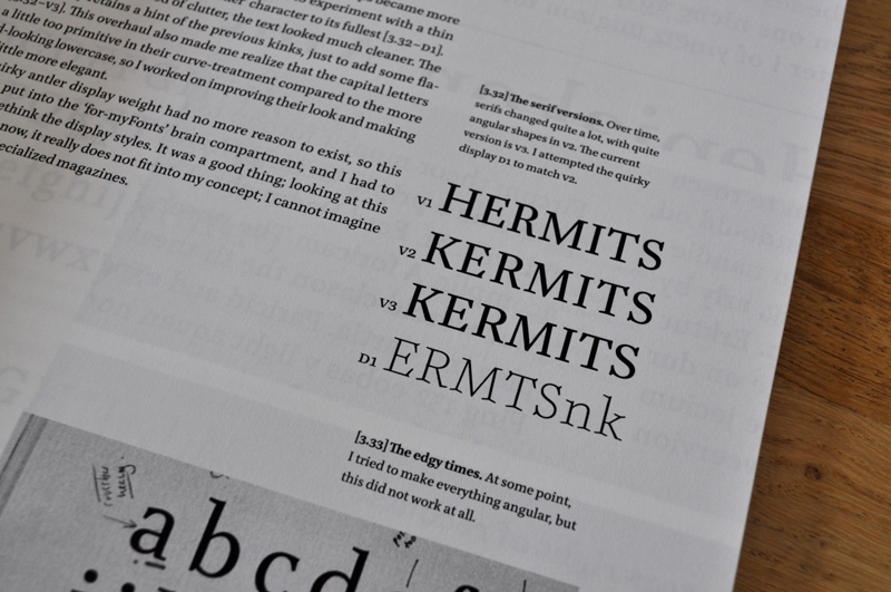
My greatest concern in the first weeks was that my typeface should not be too generic. I attempted to infuse my design with some character by sketching, but my sketches were quite useless. I was just trying to play with crazy ink-traps, change serifs, and terminals on the same skeleton structure, basically trying to make everything that a text face should not have. After a week of this, I learned an important lesson: fumbling with serifs and inktraps is not type design.
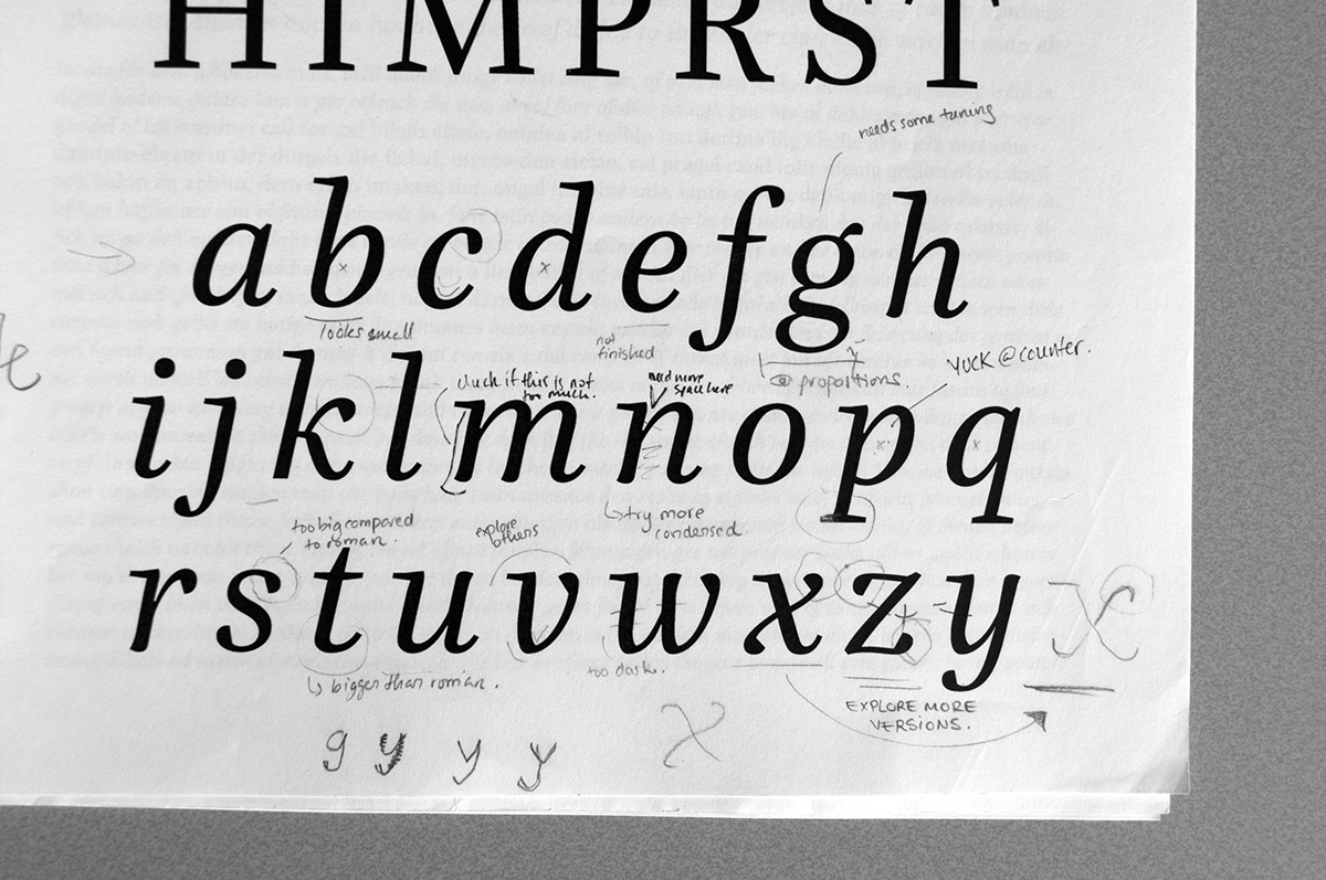
Making print-outs and corrections is extremely important. Together with m colleagues and mentors, I made many adjustments to the typefaec through the weeks. As my eyes and knowledge improved, I could observe more nad more mistakes.

I even atemped to design a sans-serif companion to the serif Editura, but I decided not to continue with it because it looked too "generic." Hence, my typeface family could be better paired with an existing sans-serif family.
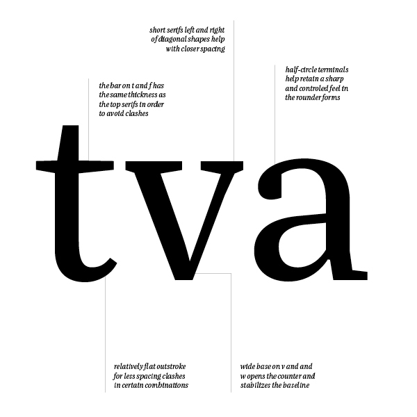
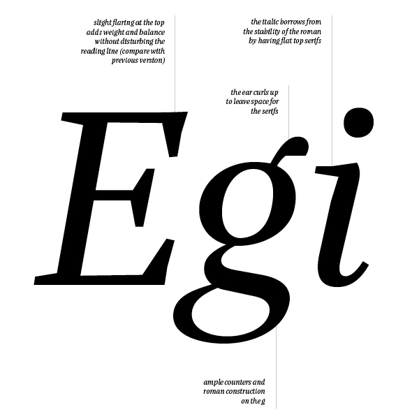
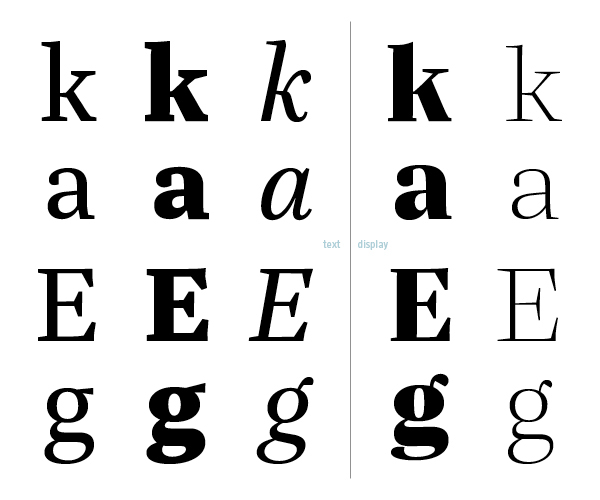
If you still want to see more, below are some more details about the design of individual letter shapes. Most design decisions were influenced by function. For a text typeface, I decided it should have some character, but no quirkiness.