


from(*designer's community) branding project | oct.2019~6month

01
from' is centered around the seminar, "from designer" focusing on hearing the stories about various occupations.
It includes numerous programs such as UI lab, which translates and studies foreign articles, community groups, which strive to find what it means by a better life, and travel groups, which share their experiences and insight. However, since each of the programs were being operated independently, building a unique image of 'from' was necessary to encompass and integrate the different programs within the brand. Therefore, we renewed and redefined from's image by blending all programs based on the unique story of 'from', in order to deliver a more meaningful brand experience to the members of 'from'.
-- 프롬은 다양한 직군의 이야기를 들을 수 있는 세미나, '프롬 디자이너'를 중심으로 해외 아티클을 번역,스터디하는 모임인 UI LAB, 보다 나은 삶을 이야기하는 취미/독서모임, 함께 여행을 다니며 인사이트를 얻는 여행모임까지 다양한 프로그램을 지닌 커뮤니티 그룹입니다. 하지만 각 프로그램들이 독립적으로 운영되고 있어 브랜드 내 프로그램의 일관성 유지와 통합, 프롬 고유의 이미지 구축이 필요한 상황이었습니다. 이에 모든 프로그램을 아우름과 동시에 차별화된 스토리텔링을 바탕으로 프롬만의 이미지를 정립하고 구성원들에게 더욱 의미있는 브랜드 경험을 전달하고자 브랜딩 프로젝트를 진행하였습니다.
overview
02
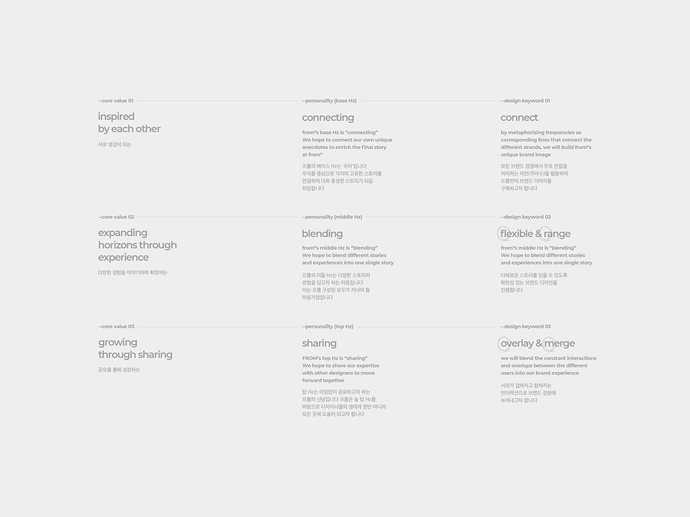
Core Value refers to the mindset that every member in the brand should have and be aware of.
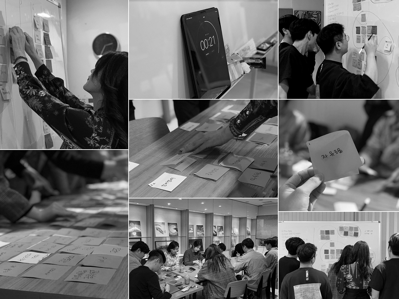
At from, we have defined the Core Value through the workshops and discussions in order to evaluate and define what it means to be 'from'
At from, we have defined the Core Value through the workshops and discussions in order to evaluate and define what it means to be 'from'
-- 코어벨류는 브랜드의 구성원 모두가 지니고 있어야 할 정신을 말합니다. 구성원들이 모여 프롬만의 핵심가치를 도출하는 워크샵을 진행하고 프롬의 가치를 관통할 수 있는 코어벨류를 정의하였습니다.
-- workshop : oct. 27. 2019 / seoul / member 11
brand core value
03
Brand personality refers to the individuality of a brand.
Based on from's philosophy and Core Value, we have carefully set the brand personality as the basis to guide us towards the right path.
Design principles are promises that must be kept for consistent/reliable brand experience both online and offline.
-- 브랜드 퍼스널리티란, 브랜드가 가진 고유한 개성을 말합니다. 프롬이 가진 철학, 코어벨류를 중심으로 퍼스널리티를 세심히 설정하여 지속적으로 나아가야 할 방향의 기준이 될 수 있도록 하였습니다.
또한 이를 바탕으로 온/오프라인에서 일관성 있는 디자인을 전개할 수 있도록 디자인원칙을 정립하였습니다. -- core value > personality > design keyword (F/R/O/M)
brand personality / design keyword
04
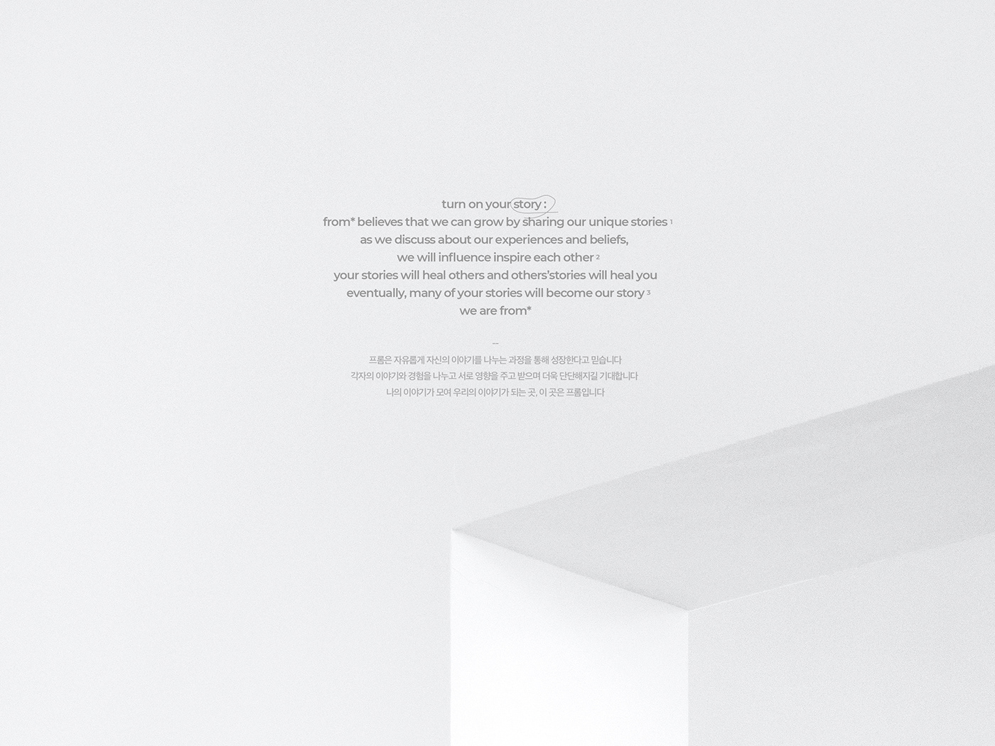
A slogan conveys the brand’s tone of voice with its core value and the vision.
It engraves the brand’s image and the philosophy into people’s mind both internally and externally. Thus, from would like to say, “turn on your story,” to you.
-- 슬로건은 핵심 가치와 비전을 함축적으로 담아 브랜드의 tone of voice를 전달하는 문장입니다. 브랜드가 가지고 있는 철학과 지향점을 대내외적으로 전달하여 브랜드 이미지와 정체성을 각인시키는 역할을 합니다. 프롬은 'turn on your story: 당신의 이야기를 켜라'라는 슬로건을 더해 차별화된 가치를 전달하고자 하였습니다.
brand manifesto / slogan
05
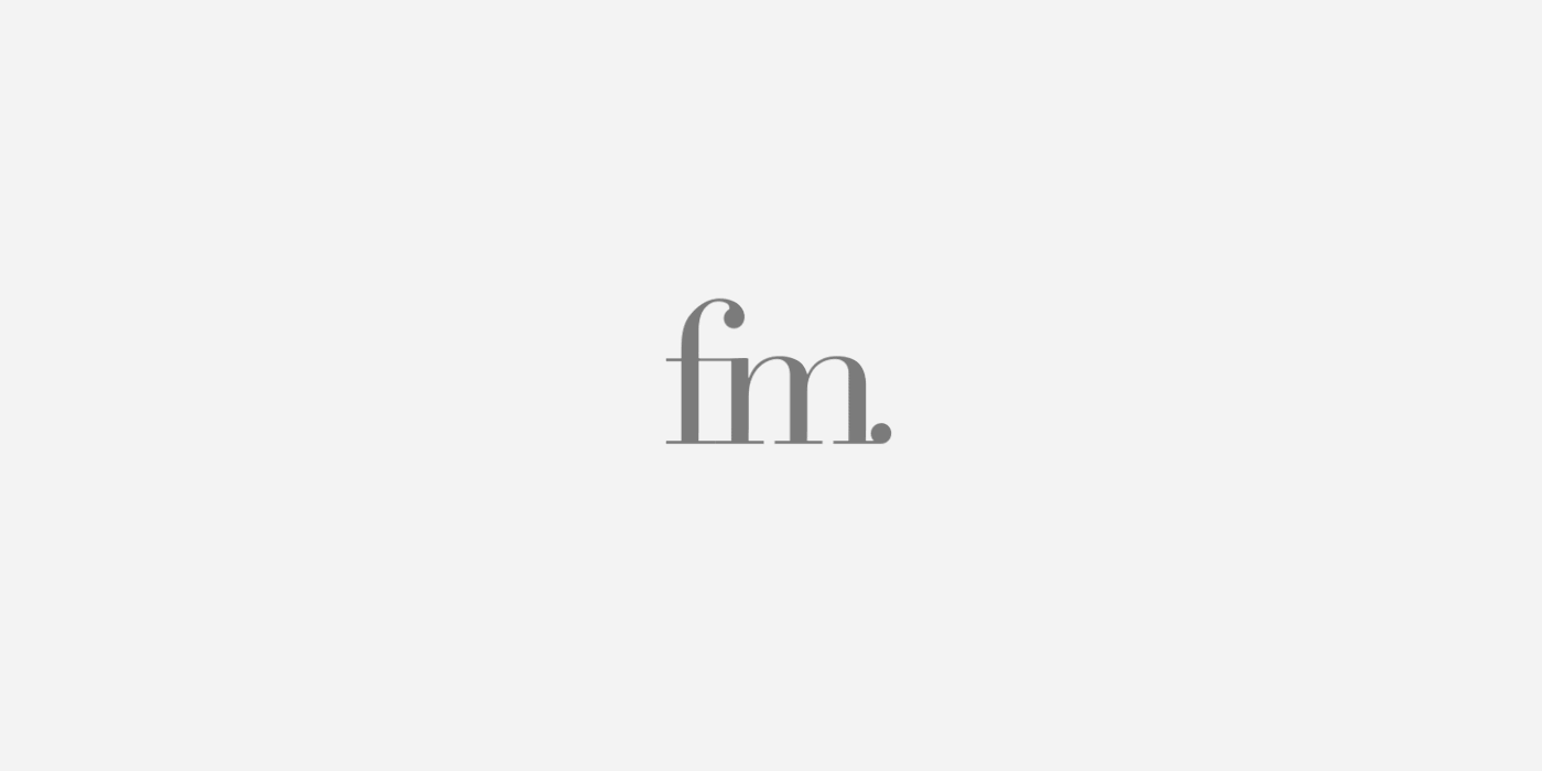
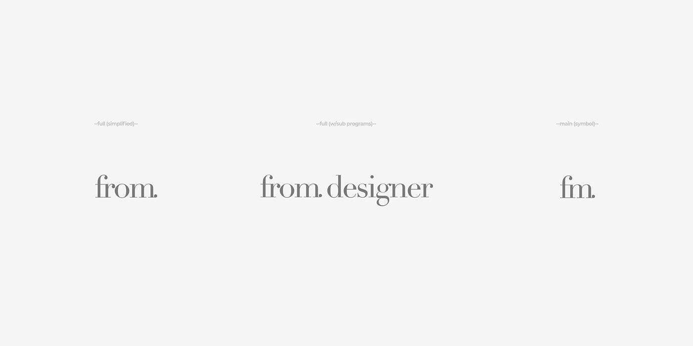
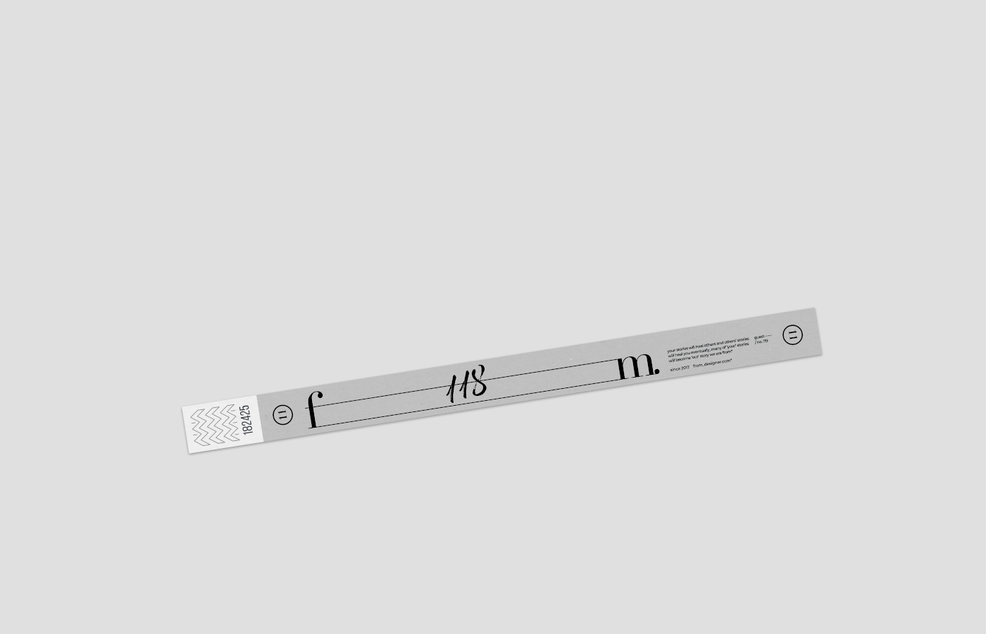
We have designed from's unique identity that can define and portray wide range of professions and colorful stories by removing/emptying previously used R, O, and the terminology "Designer." Newly reformed through emptying and filling, 'from' would like to narrate our story based on our new slogan: "turn on your story." We will focus on your own unique stories by tuning our FM.
-- R과 O, 그리고 기존에 함께 쓰이던 '디자이너'를 의도적으로 삭제(비움)하여 모든 직군과 다채로운 스토리를 포괄하는(채움) 프롬만의 아이덴티티를 디자인하였습니다.
비움과 채움으로 새로워진 프롬은 'FM(주파수)'의 의미를 더해 당신 고유의 이야기에 더 귀기울여 듣겠다는 자세 (NEW Slogan : turn on your story)를 실천하며 우리의 이야기를 채워나가는 '채움'의 내러티브를 표현하고자 합니다.
brand identity design
06
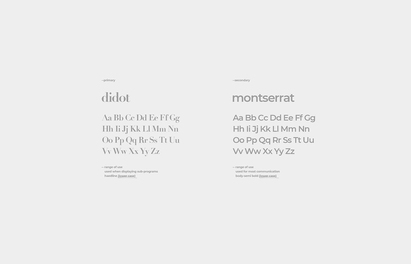
With its sharp lines with high contrast, yet delicate curves, Didot is a modern sophisticated typeface, even though it is a serif-type. Based on this, we wanted to convey from's strongness and softness, just like the frequencies that can tune itself to make different sounds. Montserrat is a sans-serif typeface inspired by the city. Designed to embrace work, life, skin color, contrast, light and darkness, day and night, it matches from's idealogy: to combine different professions and stories. Thus, we have chosen Montserrat to be our secondary typeface that can be used widely.
-- 획의 대비가 뚜렷한 직선과 섬세한 곡선으로 이루어져 있는 서체인 didot는 세리프 서체임에도 현대적인 세련됨을 가지고 있습니다. 이를 베이스로 다양한 소리를 내는 주파수처럼 부드러우면서도 강한 프롬의 느낌을 전달하고자 했습니다. 세컨더리 서체인 montserrat은 도시에서 영감을 받아 제작된 서체입니다. 일과 삶, 피부색, 대비, 빛과 어두움, 낮과 밤을 모두 아우를 수 있도록 제작된 montserrat은 모든 직군과 이야기를 아우르는 프롬의 지향점과도 일치합니다. 따라서 다양한 매체에서 활용이 가능하도록 하였습니다.
-- 획의 대비가 뚜렷한 직선과 섬세한 곡선으로 이루어져 있는 서체인 didot는 세리프 서체임에도 현대적인 세련됨을 가지고 있습니다. 이를 베이스로 다양한 소리를 내는 주파수처럼 부드러우면서도 강한 프롬의 느낌을 전달하고자 했습니다. 세컨더리 서체인 montserrat은 도시에서 영감을 받아 제작된 서체입니다. 일과 삶, 피부색, 대비, 빛과 어두움, 낮과 밤을 모두 아우를 수 있도록 제작된 montserrat은 모든 직군과 이야기를 아우르는 프롬의 지향점과도 일치합니다. 따라서 다양한 매체에서 활용이 가능하도록 하였습니다.
typography
07
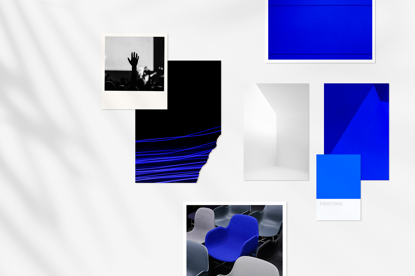
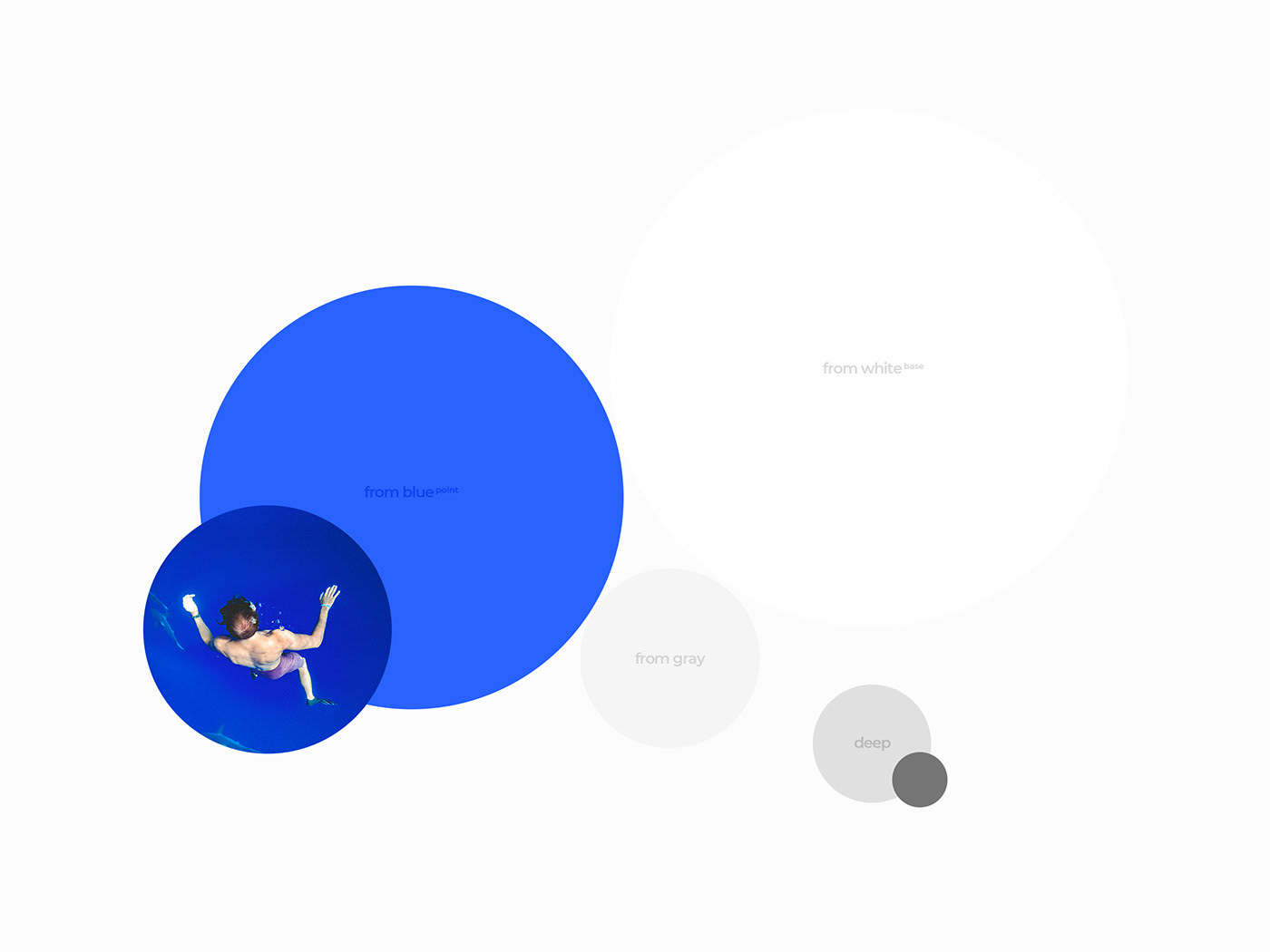
The color "blue" conveys "growth."
Although the base color will be black and white, we have developed "blue" as the point color of 'from' to demonstrate different periods in life, from youth to senior.
Although the base color will be black and white, we have developed "blue" as the point color of 'from' to demonstrate different periods in life, from youth to senior.
-- 청색(春,from blue)은 '성장하다'라는 뜻을 지닌 컬러입니다. 기본 컬러는 컬러군을 아우르는 black과 white로 사용하되 기존 프롬이 가지고 있던 블루 계열(春,from blue)를 포인트 컬러로 활용하여
주니어부터 시니어까지 다양한 청춘(靑春)을 내포하고자 했습니다. --white(50%)--blue(30%)--deep color(20%)
주니어부터 시니어까지 다양한 청춘(靑春)을 내포하고자 했습니다. --white(50%)--blue(30%)--deep color(20%)
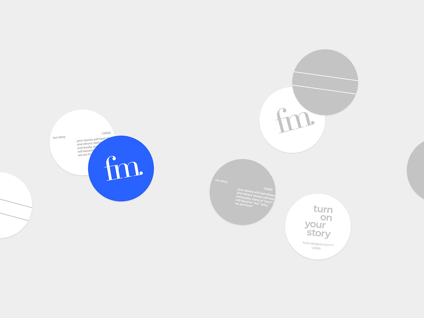
brand color
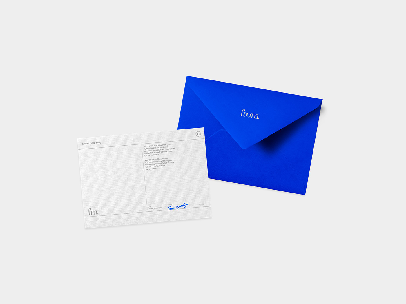
turn on your story, from*
©2020
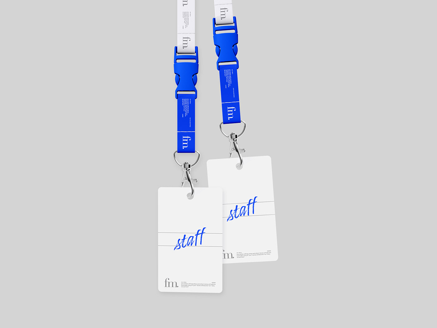
--business card(flexible/85x55mm) / staff id-card
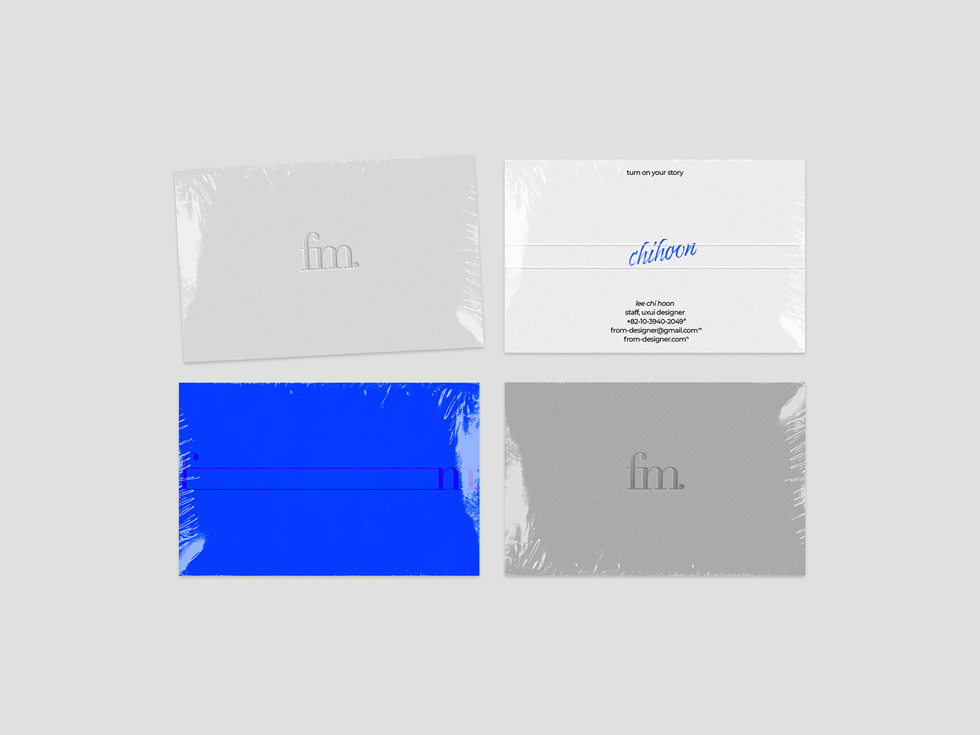
--name tag sticker (you can write your name)

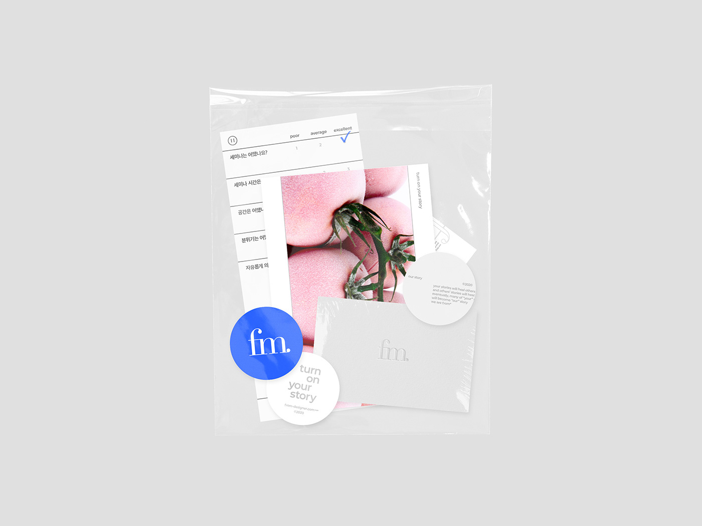
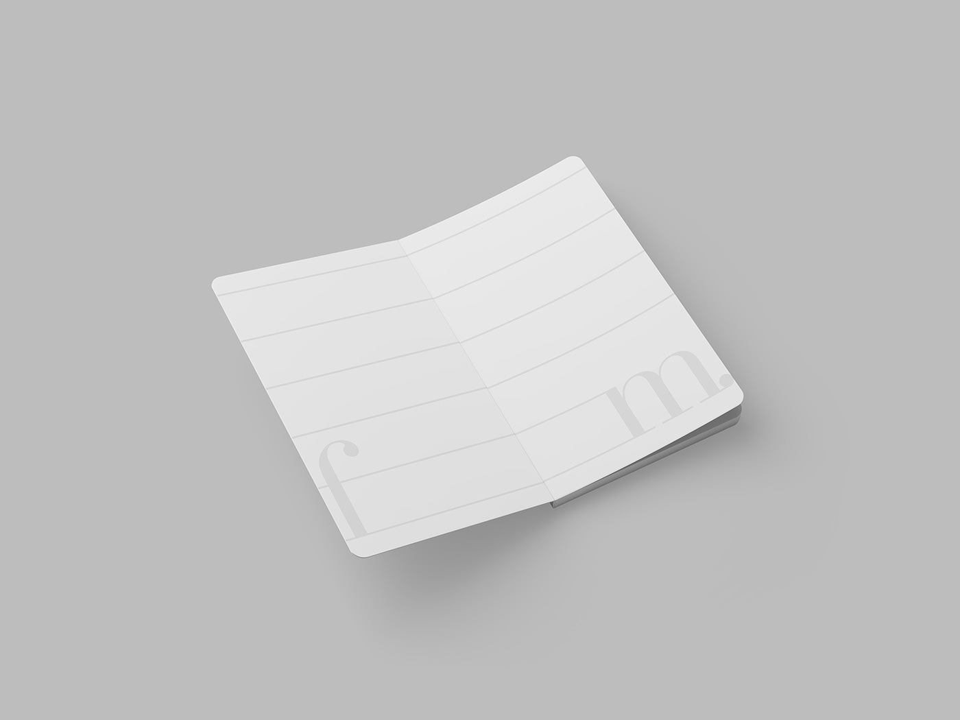
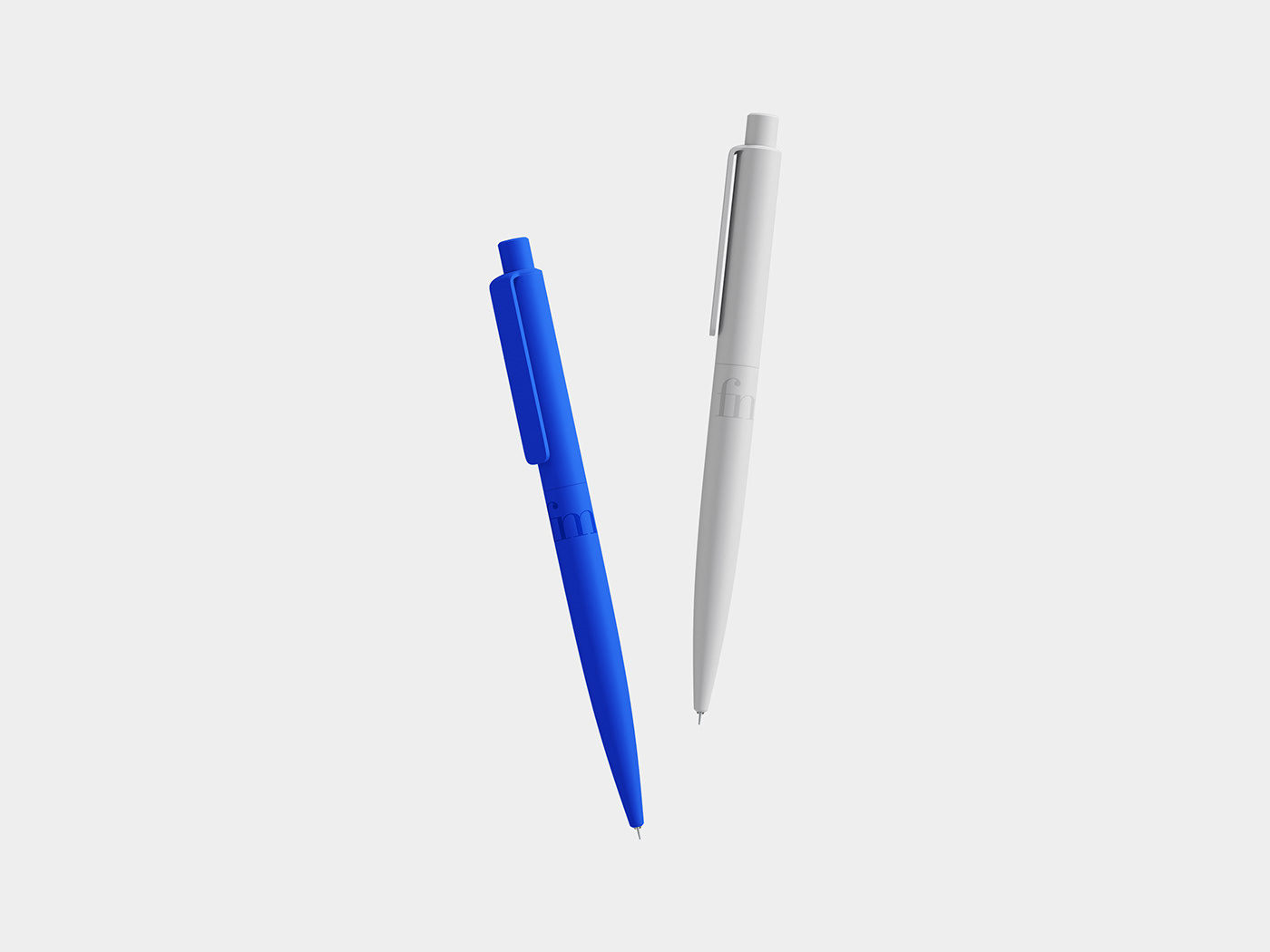
--note / pen / sticky note (review to speaker)

--seminar's feedback paper

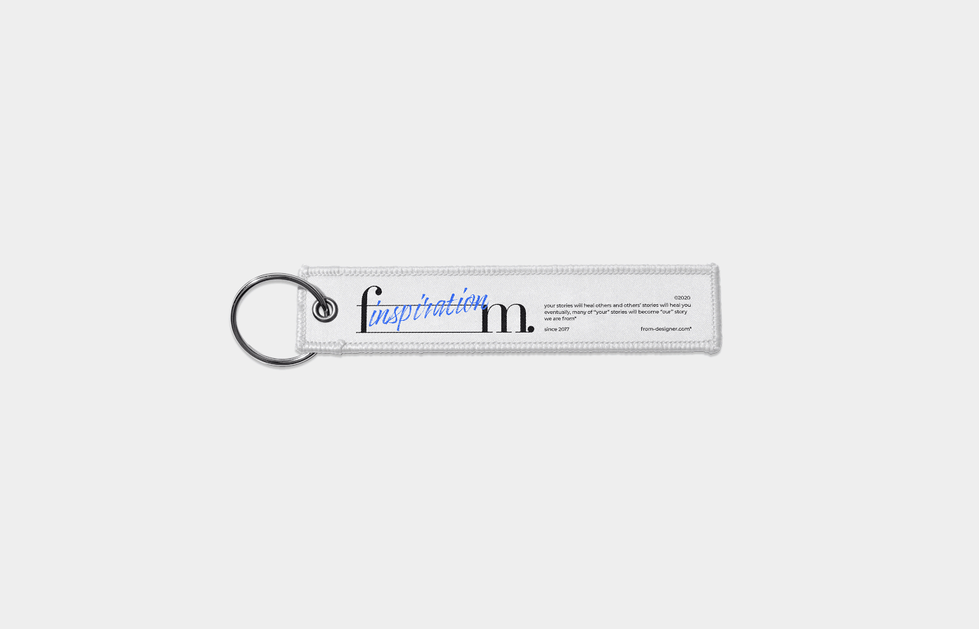
--fabric goods(bag / tag [tshirts(soon)] / keyring


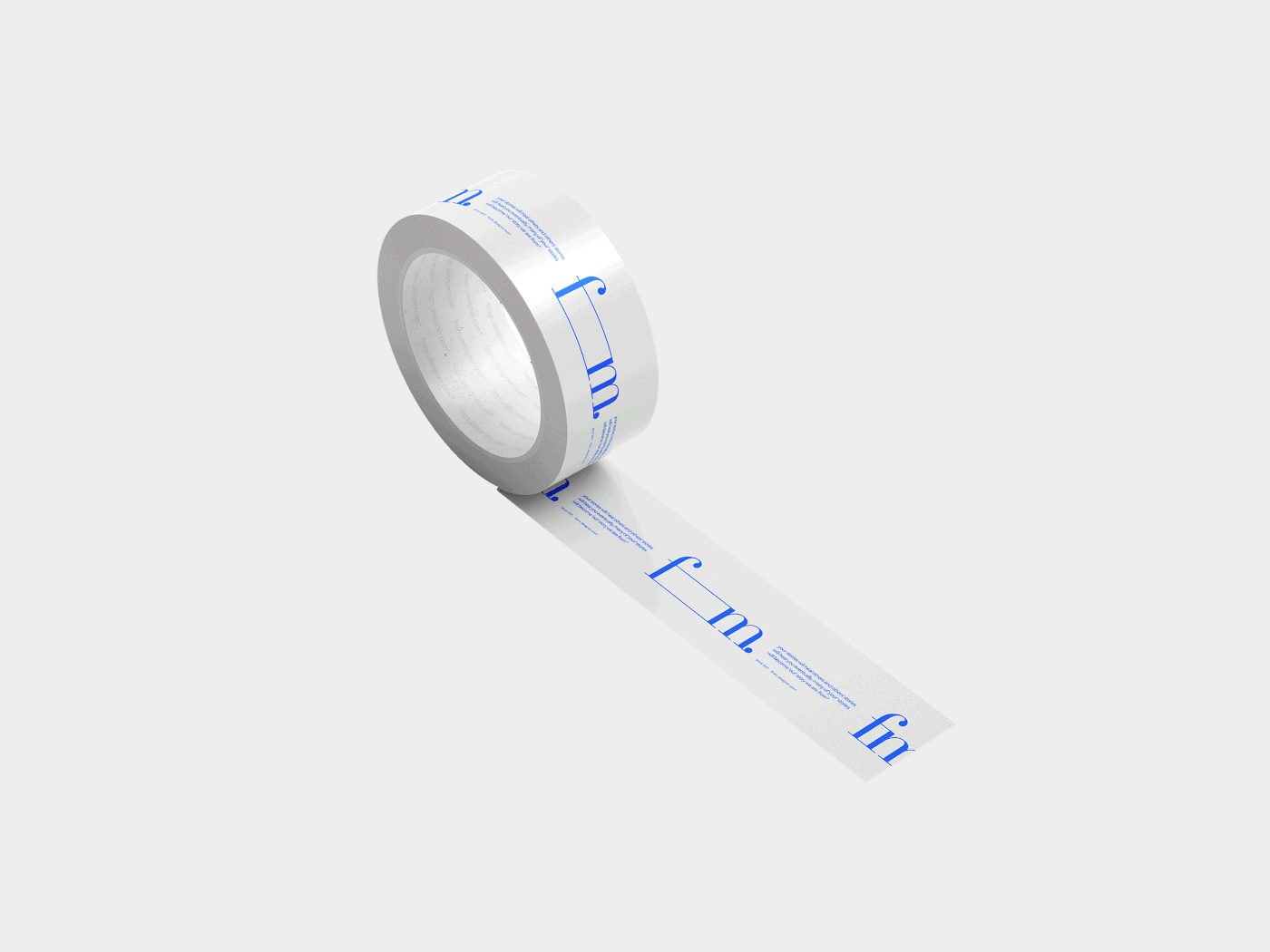
--tape
-- sticker


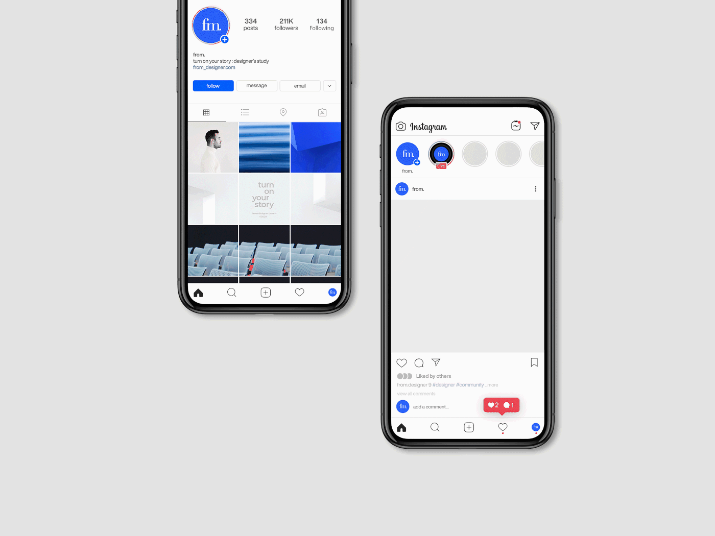
--brand contents (soon)

turn on your story, from
thank you for watching our work
-- brand unit TF
project management and director* : seo yeonju / choi youngji / shin yang-gi / kim yangyeon
brand strategy* ///all TF/// brand design & contents & uxui(page re-)*
seo yeonju / choi youngji / jo seongje / lee seunghyuk
seo yeonju / choi youngji / jo seongje / lee seunghyuk
kim yujin / kim dongyoung / kim yangyeon / lee chihoon
motion design* jo seongje
-- from. seo yeonju
-- thanks to. dew lee / tae-ho :D
©2020


