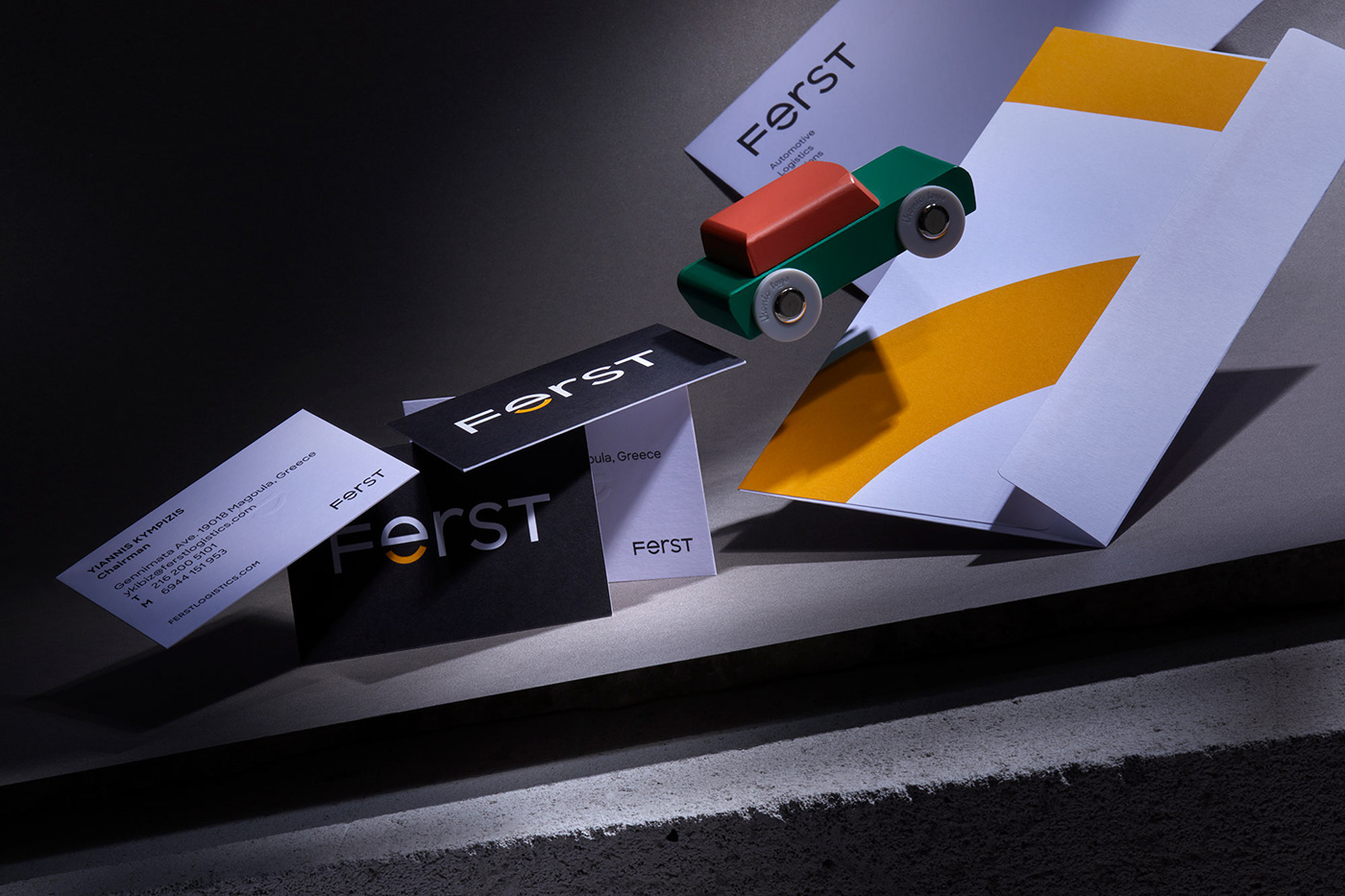
The client
Τogether, as a great team, FERST provides you with the best solutions in the field of Automotive Logistics. A family business, currently running under the second generation. Powered by more than 100 employees forming a well trained, highly efficient and super energetic team, providing excellent vertical services in two adjacent sectors: Finished Vehicles and After Market Vehicles. The company's name conveys trust, stability and reassurance. We are FERST, we lead the way.
Approach
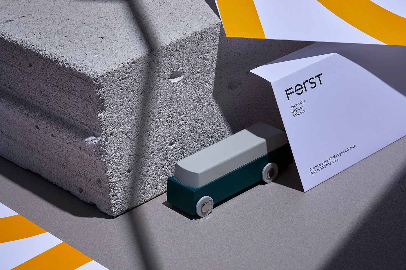
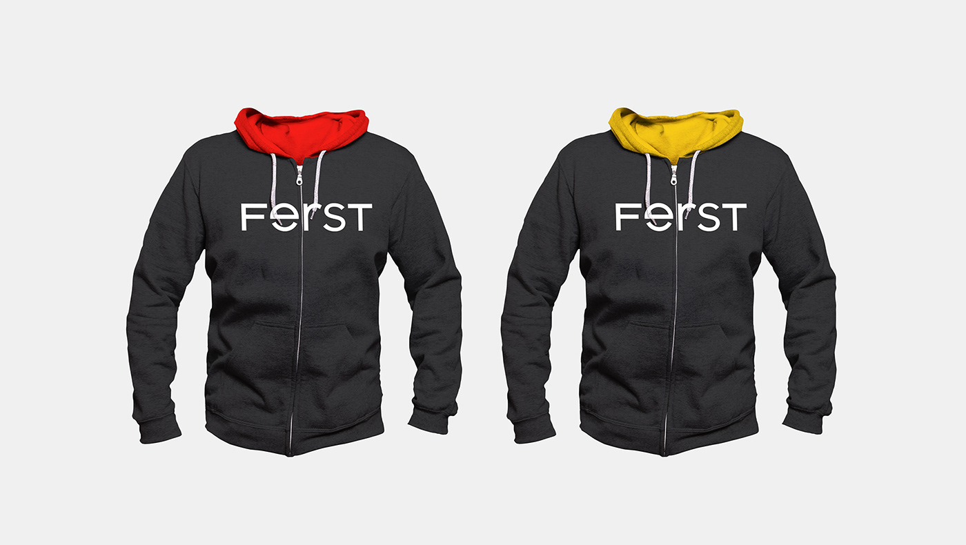
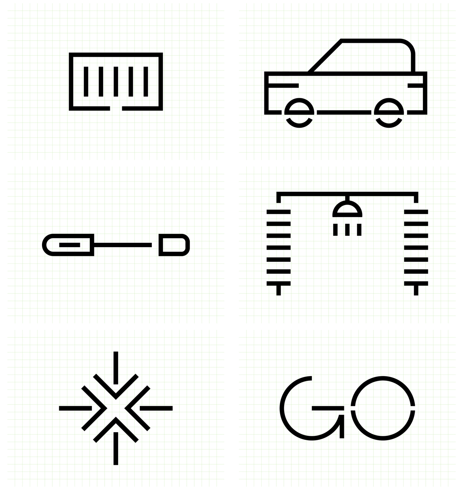
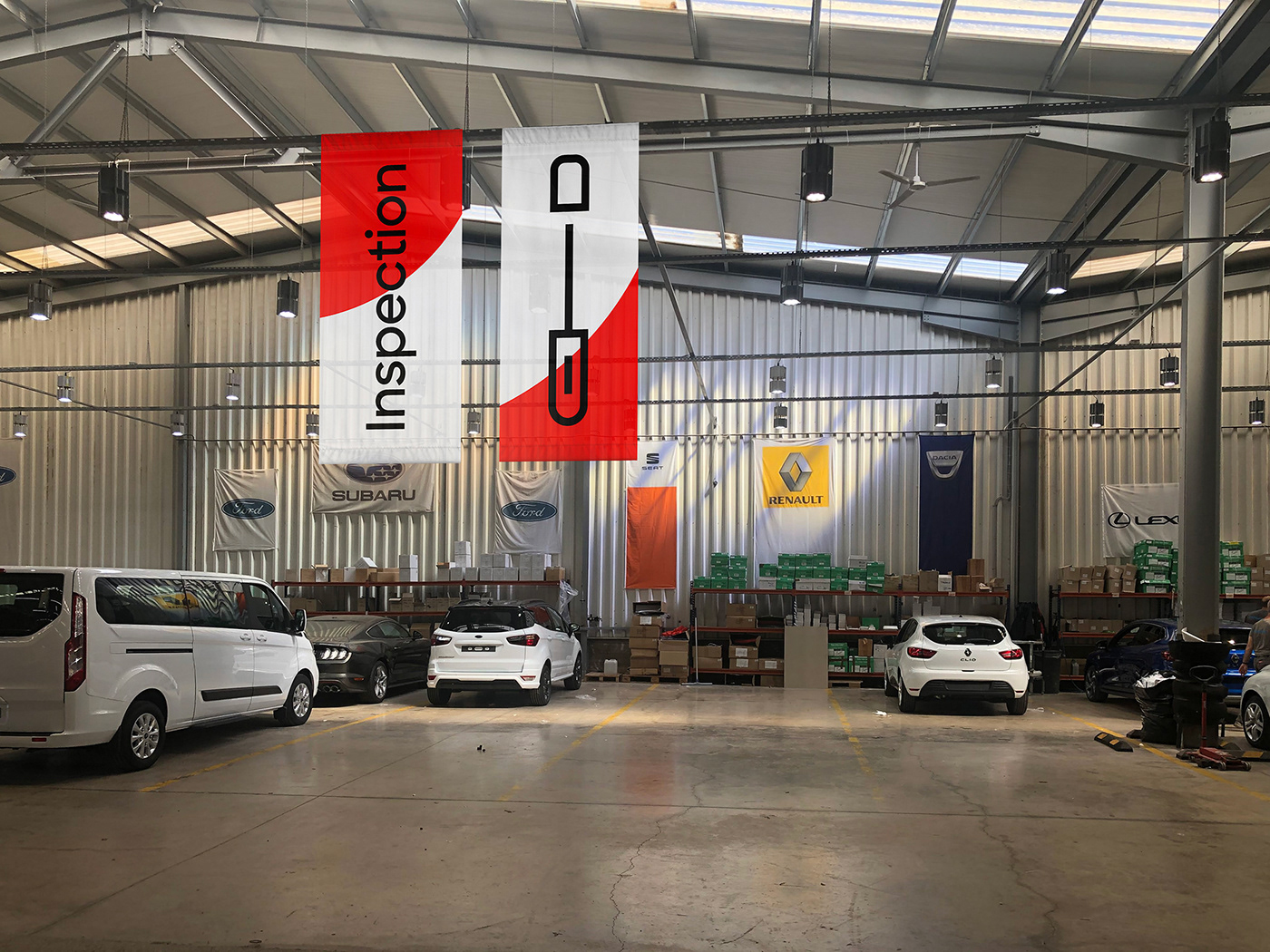
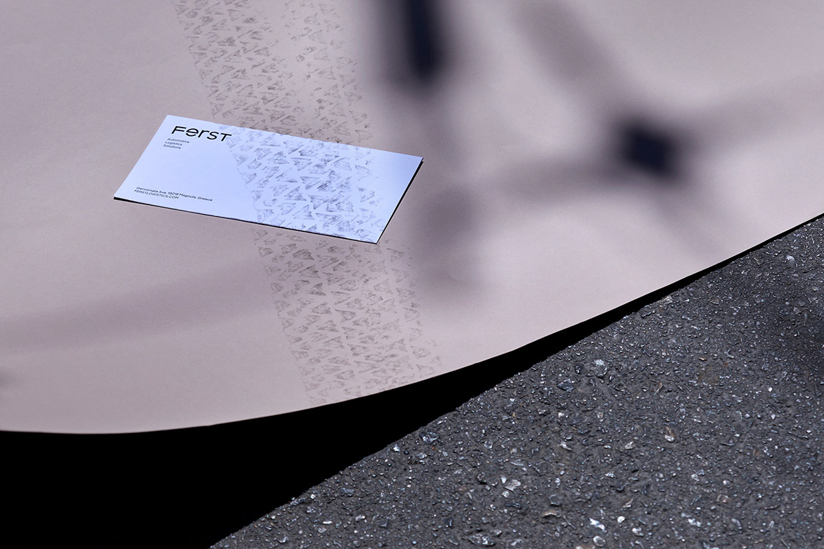
AG Design Agency studied the name and strategy, then created an identity that would stand out in a category overrun with symbols like arrows, roads and trucks.
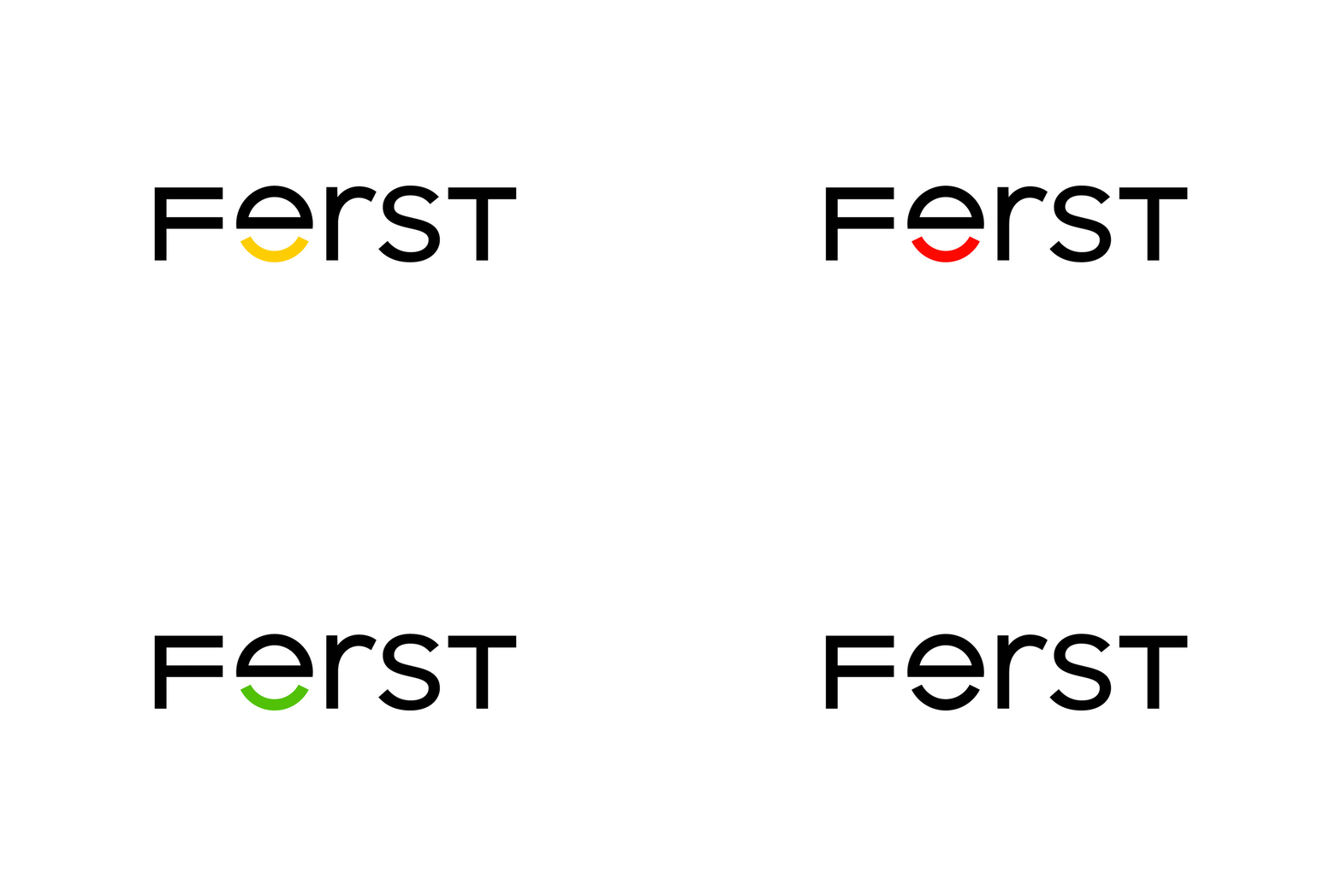
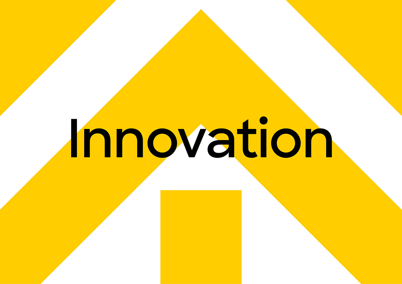
We designed a unique, bold and distinct symbol that reflects our company’s core values: 1. Customer Focus 2. Team Spirit 3. Continuous Improvement 4. Sustainability
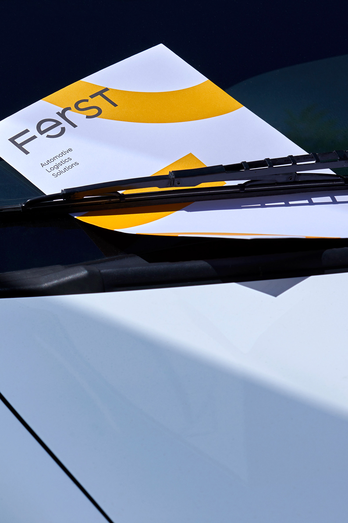
A contemporary logotype with a friendly, approachable personality that is straightforward, open and honest.
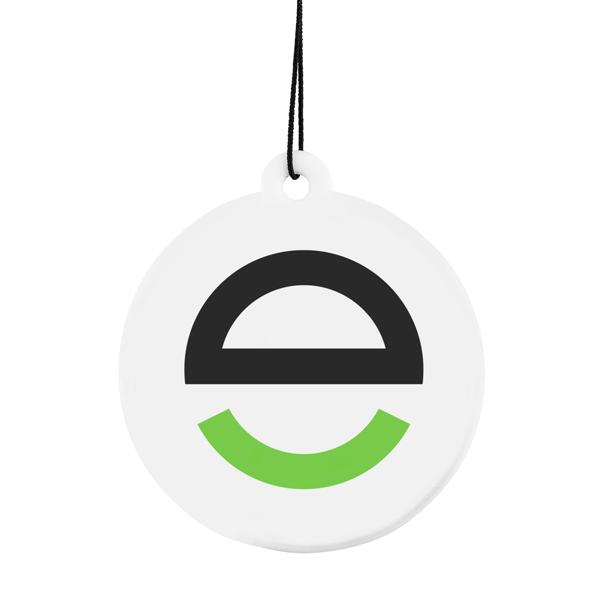
A symbol as a unique letter e, because we are Experts. A symbol as a safety hard hat, because you are safe and you can rely on us. A symbol as a steering wheel, because we lead the way. A symbol as a truck’s tyre, because we offer the best transportation solutions. A symbol as a warm smile and a welcoming face, because we truly care about our clients. A strong, clear symbol that conveys trust, stability and reassurance.


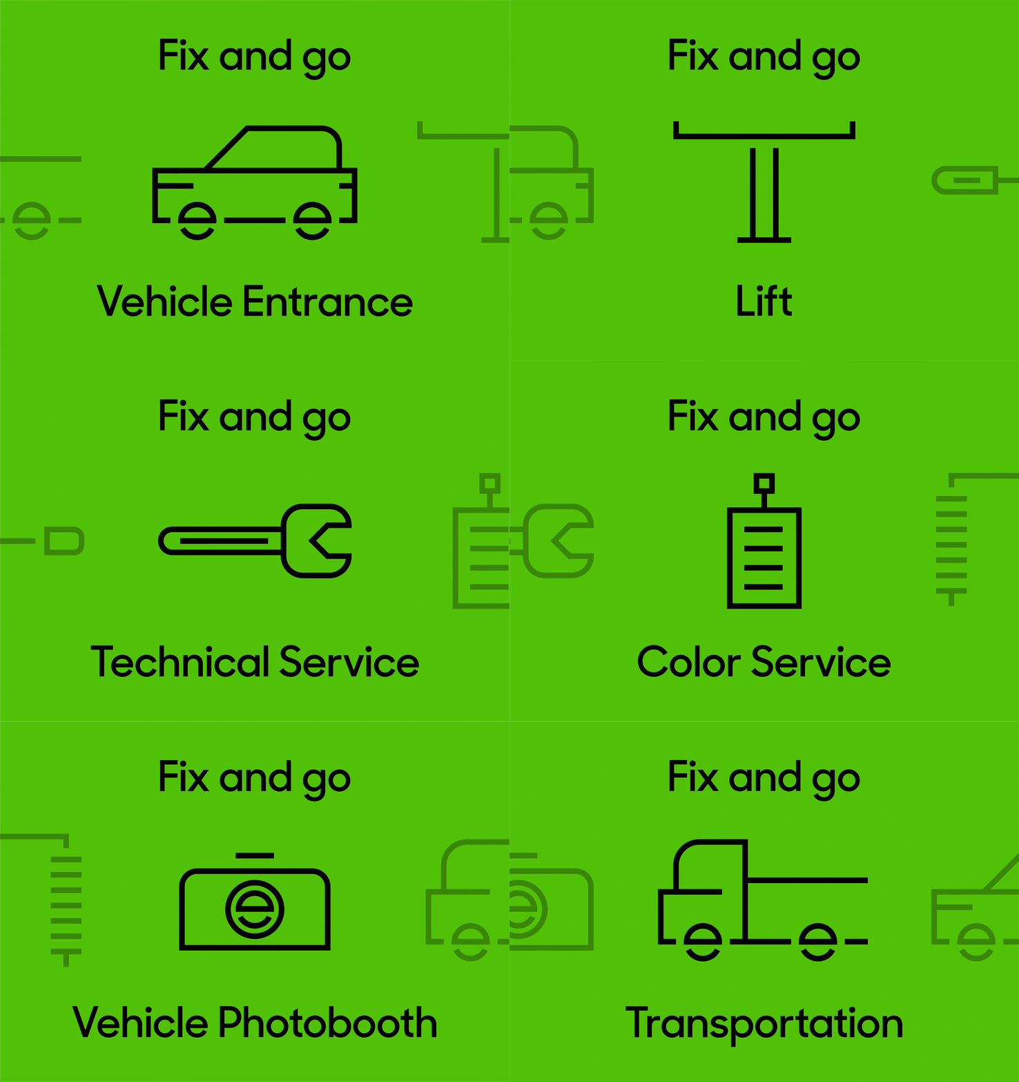


We are Flexible, we have Expertise, you can Rely on us. We embrace and truly support the Sustainable development. We are a team that you can Trust. We are FERST.

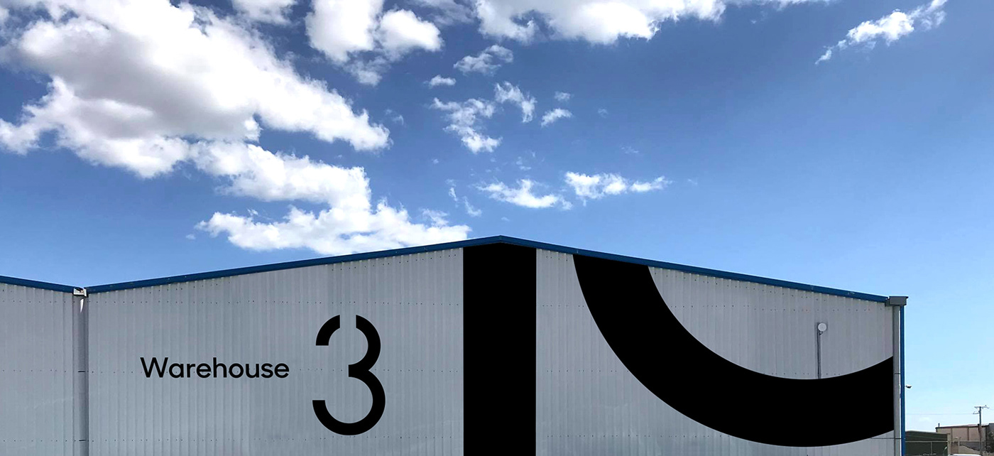

Branding: AG Design Agency, Creative Direction: Alexandros Gavrilakis, Art Direction: Anna Trympali,
Animation: Senone, Stationery Photos: Giorgos Vitsaropoulos
–––––
See more: AG's projects on Branding
