Reflecting Elegance in Rawness.
_______
Design Objective:
An identity that is molded around the rawness of its products and manifests sustainability within the collaterals. The palette and distinctive elements are created to reflect the natural flow of earth that gave birth to clay. Every aspect of this concept is as organic as how ashes melt on hot, incandescent surfaces of pots, creating its own whimsical glaze.
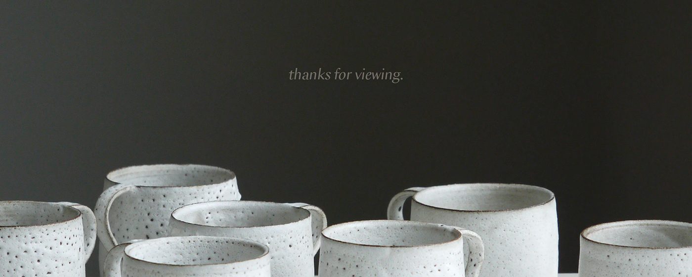
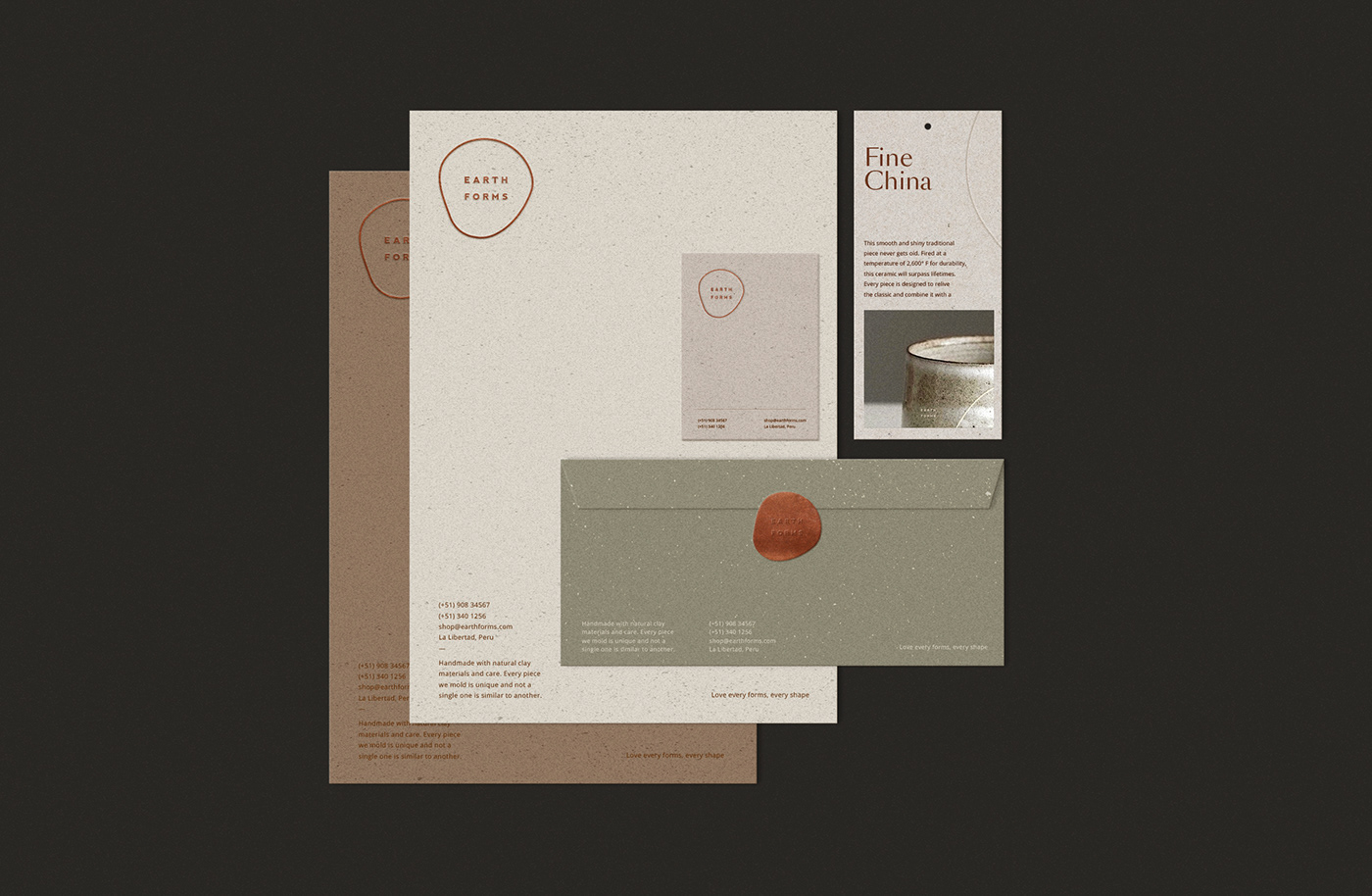
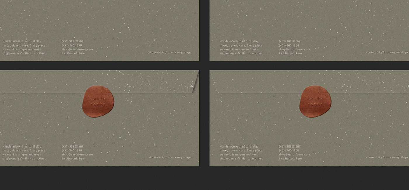
Forming earth not with machines but by bare hands, Earth Forms is a pottery studio that transforms clay into anything that other minerals cannot achieve. The identity flows with the natural color of clay while the imperfect circle surrounding the brand name is molded with inspiration from the individually unique forms of the brand’s products. Its collaterals’ textures reflect that of the pieces for continuity, molded to be as distinctive as its function creating a cohesive overall design.
Design Language:
Raw → Earthy → Sustainable → Refined
Clients: Alessa Quispe, Lorena Chavez
Photographs by: Tom Crew & Warion Taipei & Marsha Rostovskaya
Copy by: Jolau Ocampo
Designer: Ava Victoria
Photographs by: Tom Crew & Warion Taipei & Marsha Rostovskaya
Copy by: Jolau Ocampo
Designer: Ava Victoria


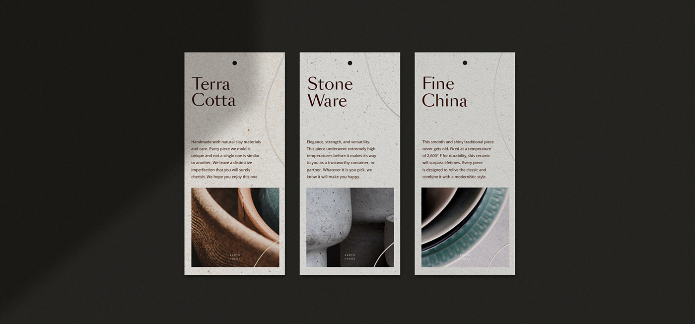


Mixing paper swatches with a purpose.
Put up transparent, metallic, and textured papers together
for Earth Forms’ product catalogue. Embraced by the textured transparent
binder is a die cut silhouette of the identity reflecting the rawness of their
pieces, followed by easy access tabs allotted to each section of the catalogue,
increasing its overall readability.
_______
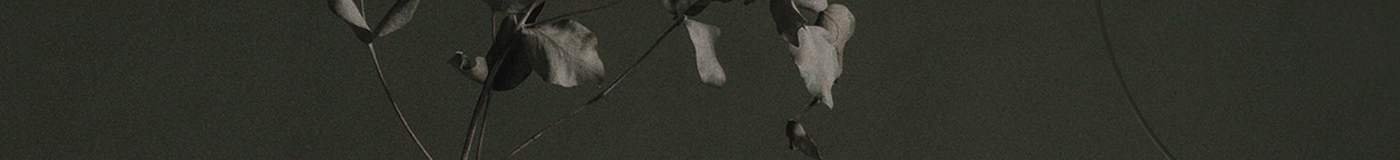
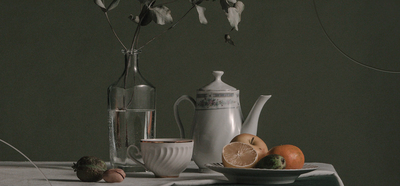
Capturing the new visual identity of Earth Forms using organic shapes and textures.
Sharing an initial look for the brand’s social media presence.
Sharing an initial look for the brand’s social media presence.