EN CARPO - ΕΝ ΚΑΡΠΩ
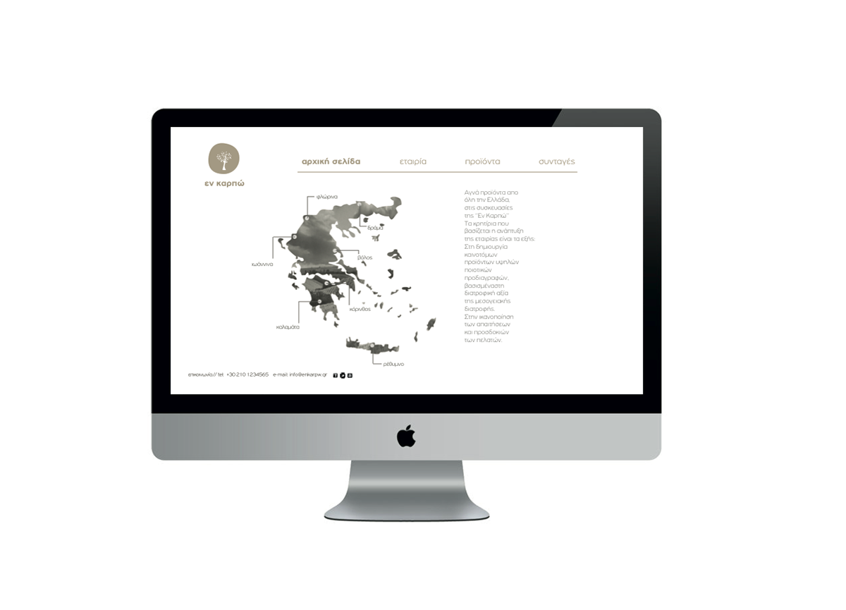
Η ''Εν Καρπώ'' είναι μια εταιρία που παράγει παραδοσιακά ελληνικά προϊόντα και στόχο έχει την προώθηση αυτών σε Ελλάδα και εξωτερικό.
''EN CARPO'' It is a company that produces traditional Greek products and aims to promote these in Greece and abroad.
Let us remember Odysseus Elytis, said:'' If decompose Greece, left, an olive, a vineyard and a boat. Which means that with so much more we can remake it.'' Of course he gave some symbolism in three elements but without them is the seed of Greece that will not die.
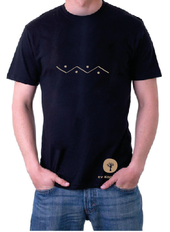
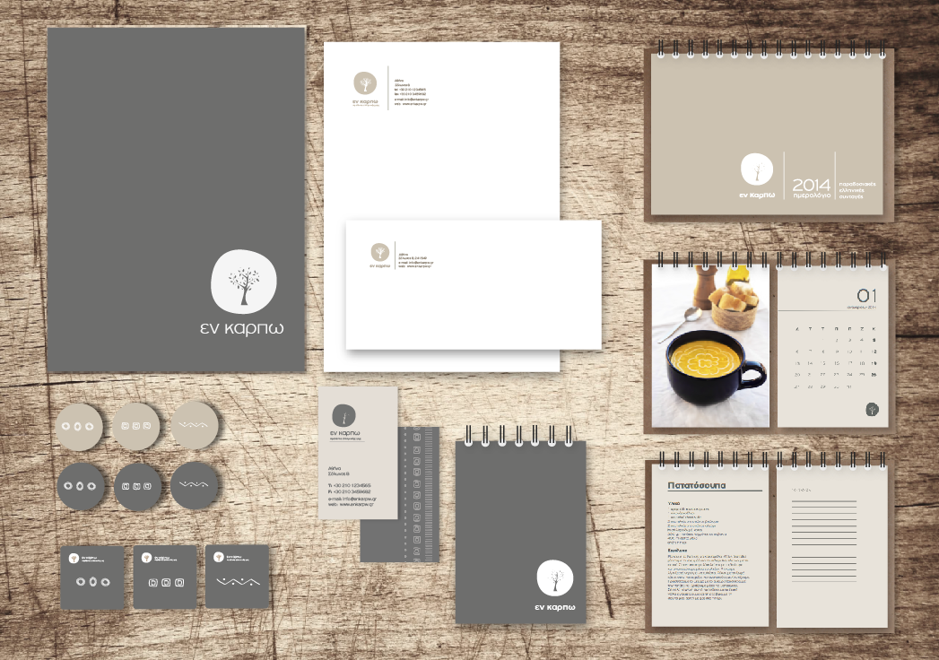
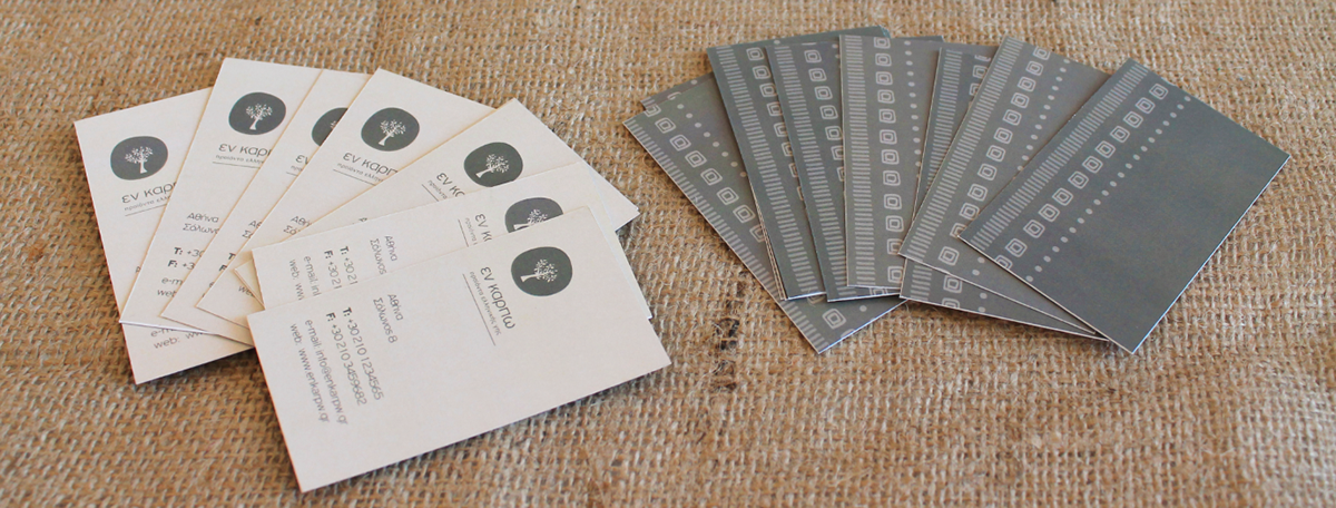
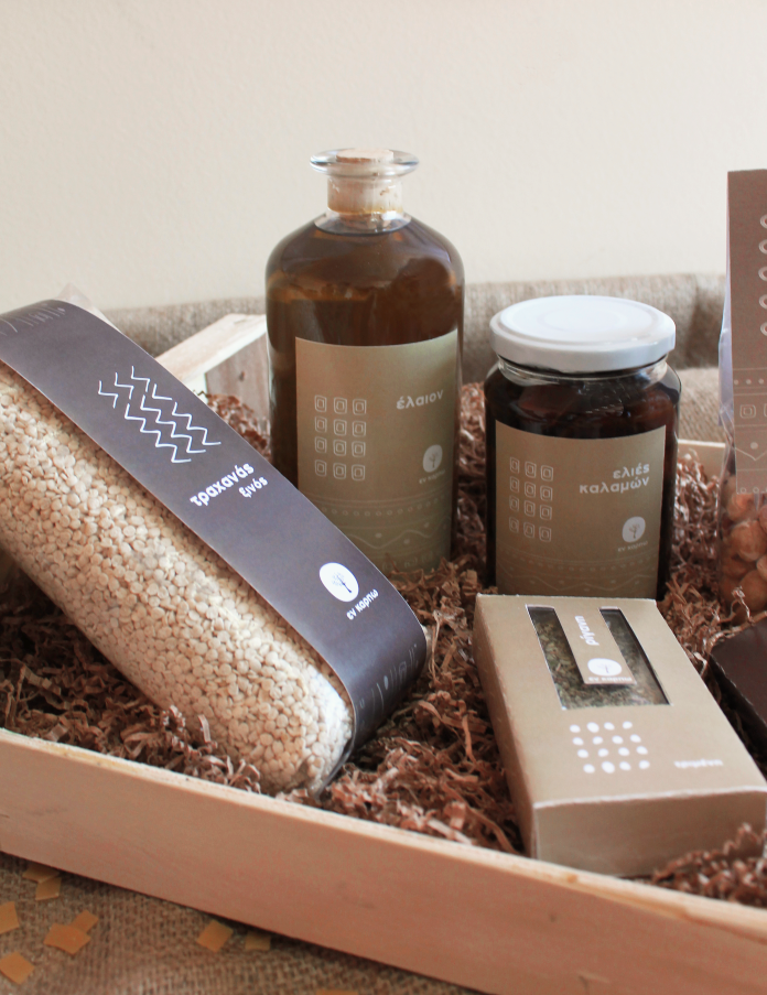
My task was to fully design every single aspect of a company’s identity. Furthermore, I was responsible for the design of its official website, its posters, diaries for the promotion of the company, informative brochures, T-shirts with the company’s logo along with colorful motives. Moreover, I extended to the design of the company’s packaging of products. A number of these products were various kinds of nuts, pickles, oil, olives, traditional kinds of pasta as well as greek country herbs. The search for the company’s name resulted in the name “en carpo”
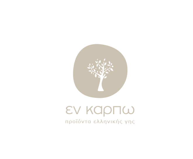
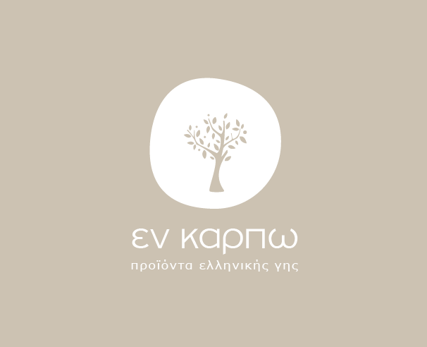
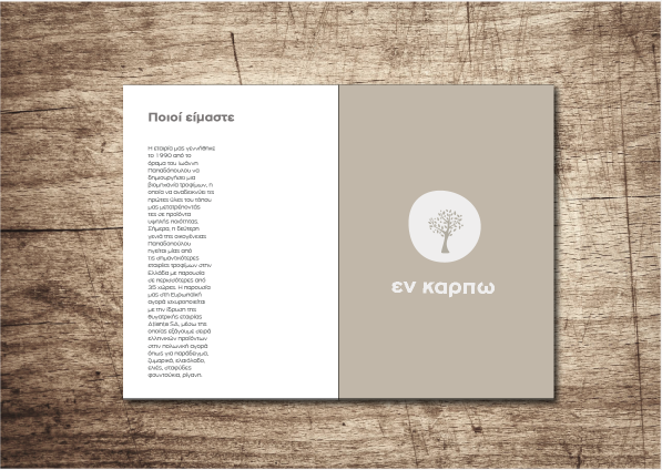
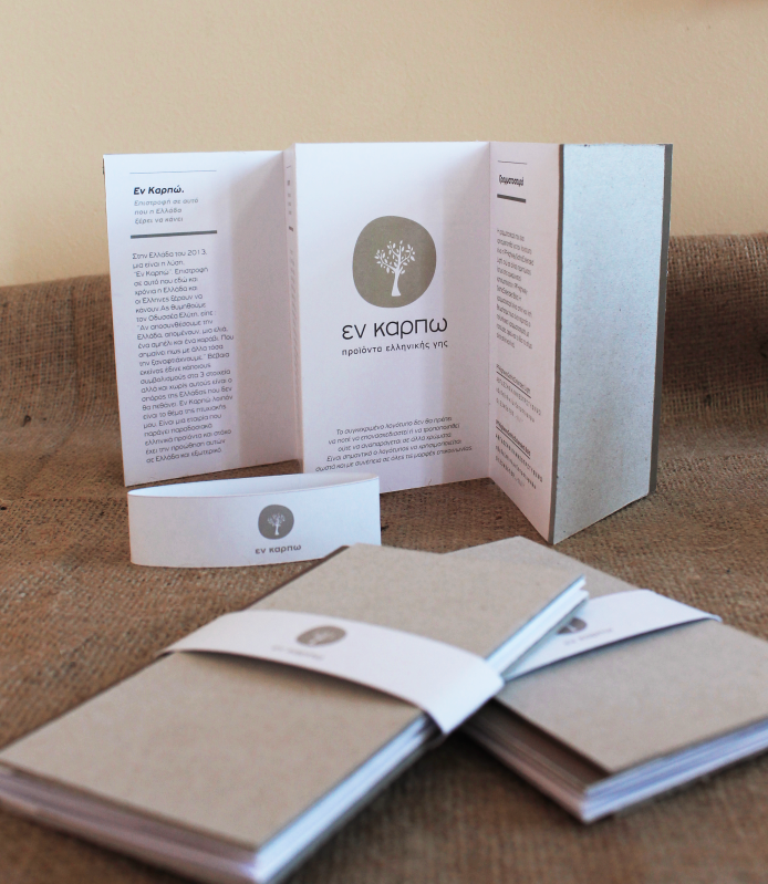
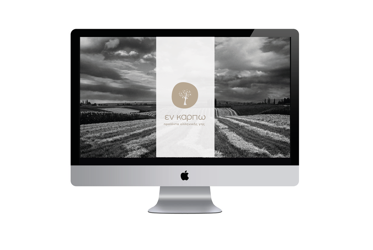
The specific logo “en carpo” resembles an ancient greek coin. Its shape is not fully round as in ancient Greece , coins were made by hammer so they could not have a completely round figure. The icon of the tree , is a widely common image found throughout all ancient greek civilizations. It constitutes a symbol of eternal re-growth and fertility. The beginning, the course as well as the final destination in life, are all notions expressed by this exact symbol. The font had to accompany as well as accentuate the simplicity and character of the company’s symbol. The color of the symbol is close to that of sand, close to being beige. Since the referred company produces pure traditional goods, I concluded in the use of earthly, natural tones of color. The logo can also be used in invert, if it needs to be processed in certain applications, like the one of packaging.The motive which appears in all packages as also in the identity of this company derives straight from the archetypical motives which were widespread on all ancient greek vessels. Those vessels were mainly used for the purpose of preserving various kinds of foods. The most popular between those were the olive oil and olives. In each separate kind of product, the color of the packaging changes from light tones of beige to darker ones. Also, different designs of the motive appear accentuated so as to differentiate their specific kind of product from the others. All the thought behind the designing of the company’s entire identity was to keep alive the natural origin, freshness of the products as well as the long tradition that precedes them.
Logotype.
Identity.
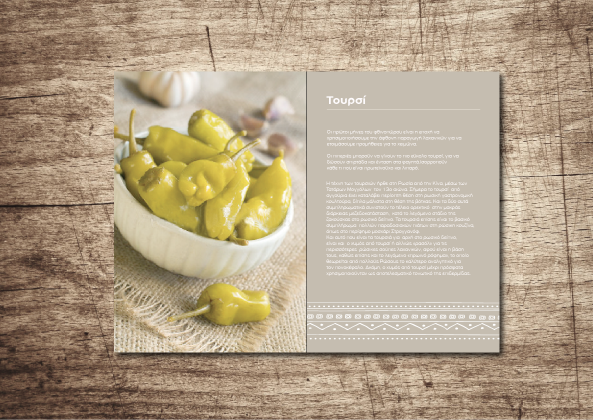
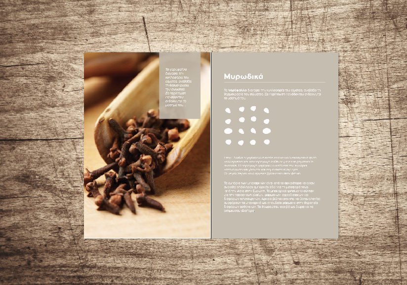
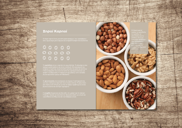
Brochure.


Photographs.


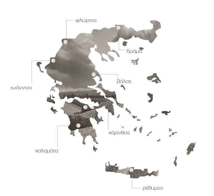
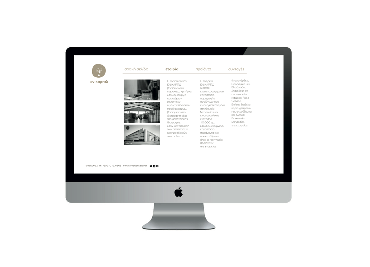
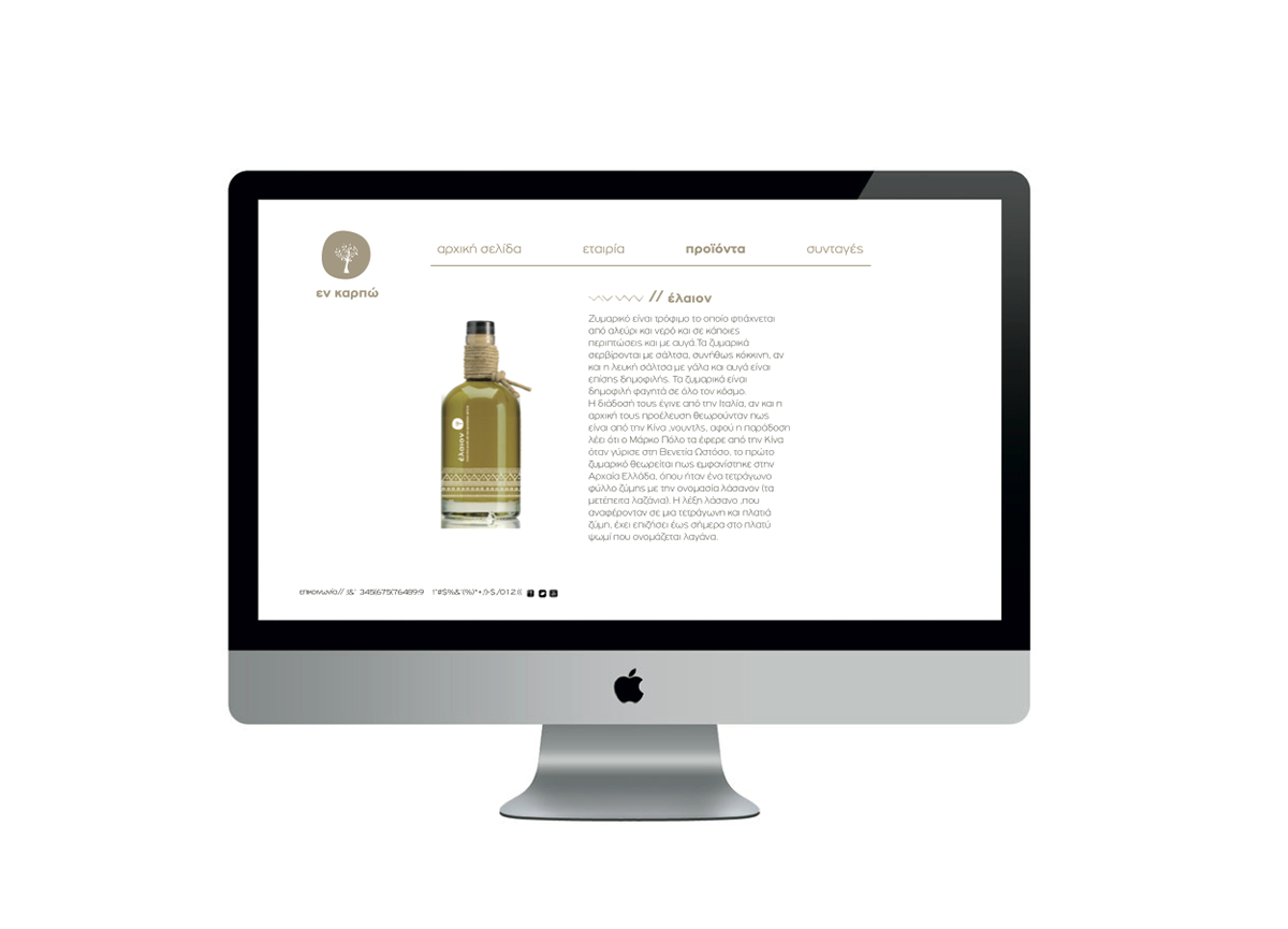
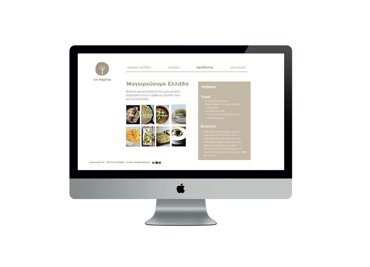
Website.
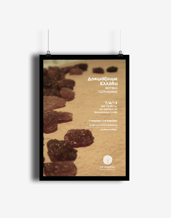
Poster.
T-shirts.