

100 Years of Paramount
International Society of Typographic Designers Project
International Society of Typographic Designers Project
This particular ISTD brief required me to choose a time in history and produce a typographic solution towards that date. I chose to produce a typographic solution to Paramount Picture's 100 Year Anniversary.
Starting in 1912, the company has made a huge impact in the film industry for the past century, producing and distributing world renowned films such as Forrest Gump, Titanic and The Godfather. Companies like Paramount are often taken for granted by the average film-goer, but avid film buffs understand the importance of these companies.
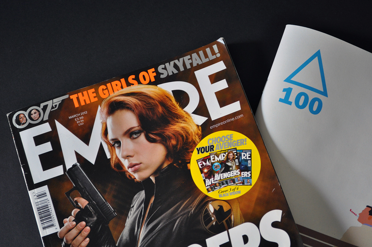
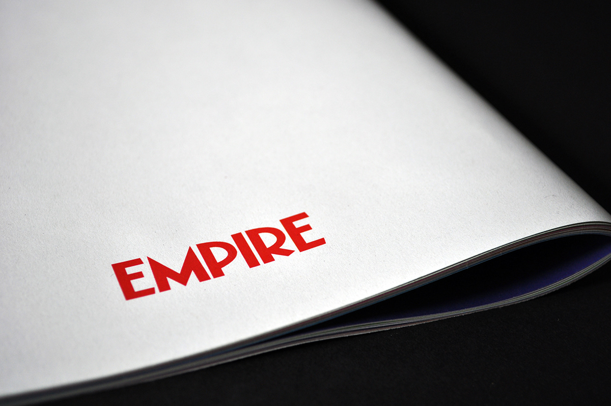
During research stages, I realised that avid film fanatics are the perfect target audience for a project celebrating the films of Paramount. I decided to produce an insert for Empire Magazine – a popular British monthly film magazine. The people who buy this magazine every month clearly love film more than the average cinema-goer, and would appreciate Paramount’s 100-year anniversary more than anyone.
The inserts would be included in 10 issues of Empire Magazine for 10 months – each insert contains a decade worth of films, 1912-1922 and so on. The main problem I faced was that these film fanatics have seen most of these hugely popular films many times before, what will this insert do to keep them engaged and cause a emotional response?
Starting in 1912, the company has made a huge impact in the film industry for the past century, producing and distributing world renowned films such as Forrest Gump, Titanic and The Godfather. Companies like Paramount are often taken for granted by the average film-goer, but avid film buffs understand the importance of these companies.
During research stages, I realised that avid film fanatics are the perfect target audience for a project celebrating the films of Paramount. I decided to produce an insert for Empire Magazine – a popular British monthly film magazine. The people who buy this magazine every month clearly love film more than the average cinema-goer, and would appreciate Paramount’s 100-year anniversary more than anyone.
The inserts would be included in 10 issues of Empire Magazine for 10 months – each insert contains a decade worth of films, 1912-1922 and so on. The main problem I faced was that these film fanatics have seen most of these hugely popular films many times before, what will this insert do to keep them engaged and cause a emotional response?

I decided to show the reader information they may not know about some of their favourite films – for example, a buyer of Empire Magazine may have seen Titanic hundreds of times, but they may not know what happened behind the scenes, the story behind the score, the real story behind the film etc. The idea is to engage the reader with ‘the insider scoop’ on the film. The problem now, is to create a grid system to control all of this information.
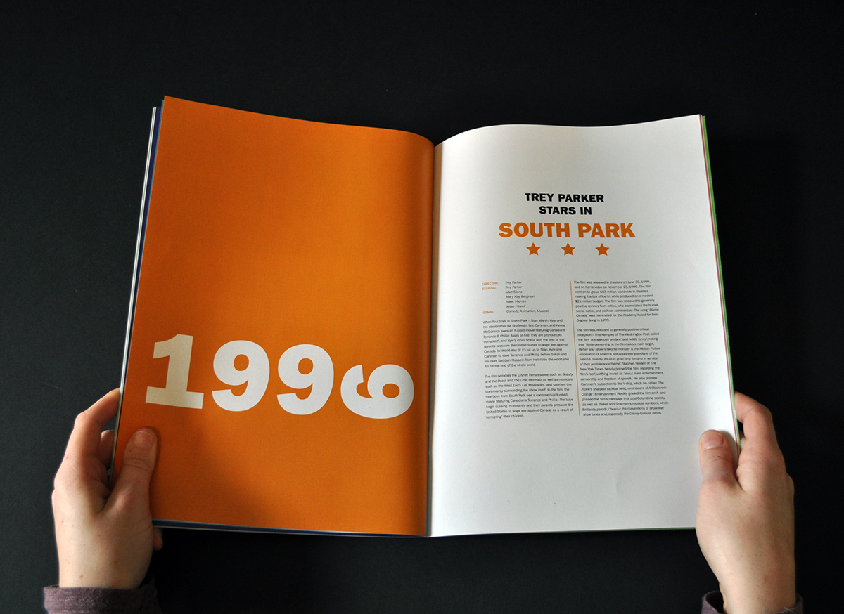
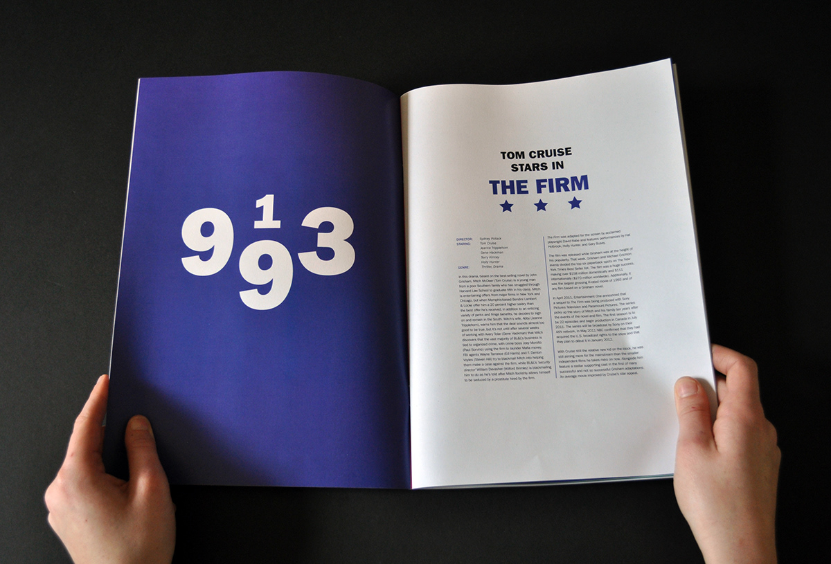
When looking at the booklet spreads, the first thing that engages the reader is the bright, deep, bold colours which are related to the genre of that particular film – for example, drama is blue, war is green and comedy is orange. The colour also works very well with my type choice. The idea I pushed forward was the idea of splitting these ‘100 films in 100 years’ in 3 eras across the 10 issues. The ‘Black and White Era’ from 1912-1951, ‘Colour Era’ from 1952-1981 and ‘Modern Era’ from 1981 upward. Each era has a number of inserts each and differentiates from each other while keeping some consistencies.
When looking at the booklet spreads, the first thing that engages the reader is the bright, deep, bold colours which are related to the genre of that particular film – for example, drama is blue, war is green and comedy is orange. The colour also works very well with my type choice. The idea I pushed forward was the idea of splitting these ‘100 films in 100 years’ in 3 eras across the 10 issues. The ‘Black and White Era’ from 1912-1951, ‘Colour Era’ from 1952-1981 and ‘Modern Era’ from 1981 upward. Each era has a number of inserts each and differentiates from each other while keeping some consistencies.


The grid layout of the information is a relatively simple one – to display this kind of informative text, the grid system doesn’t have to be complicated in order to work. The simple 6x10 grid works well with the typographic illustrations opposite the film introduction page, the spread as a whole works well together rather than one page showing up the other.
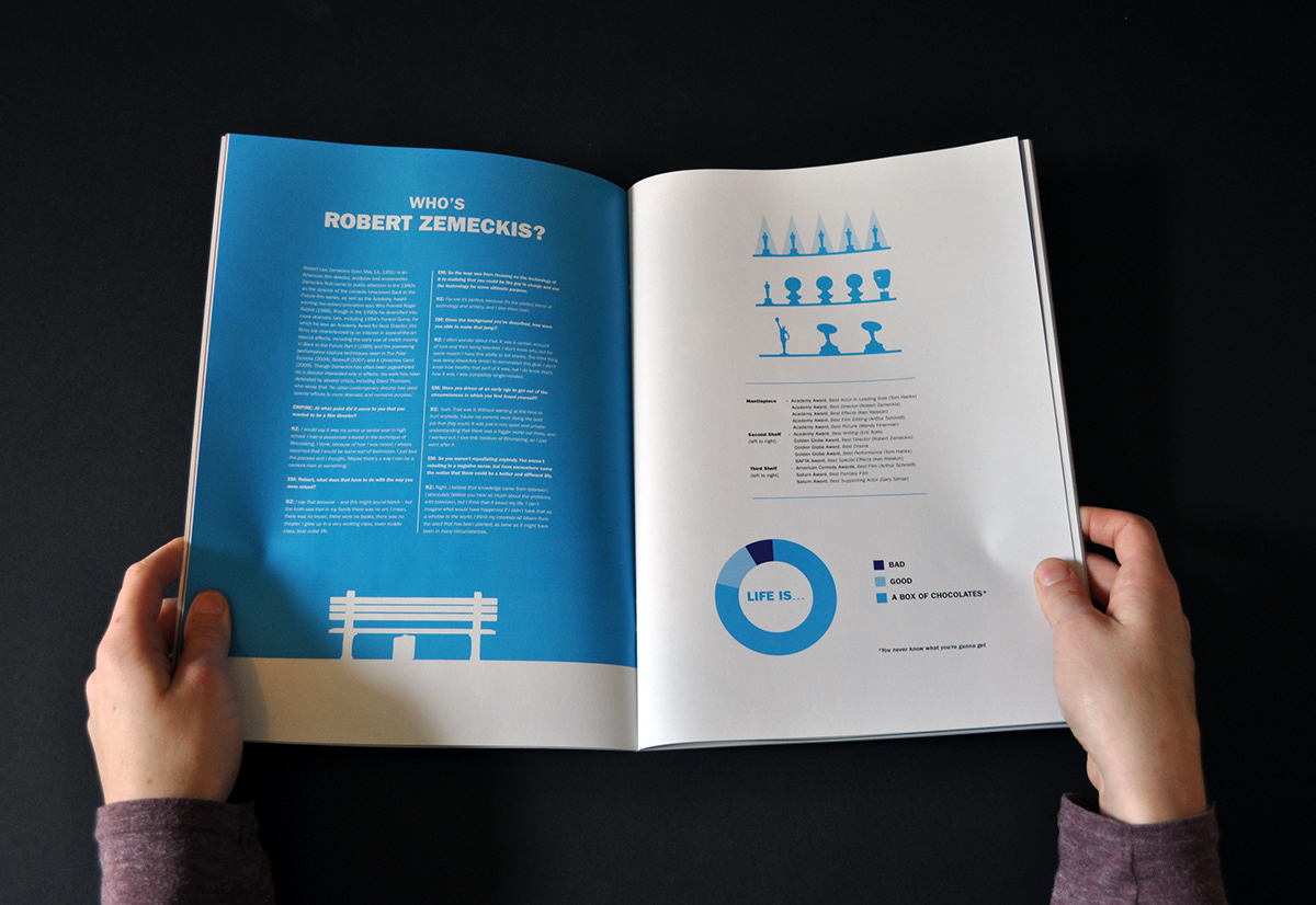
The typographic illustrations relate to emotions or iconic scenes from that particular film while using the date the film was released, for example, the Titanic illustration is of the final scene when the ship sinks – and the Forrest Gump spread is the date small in the corner of the page, showing the simple nature of the main character in the film. These typographic illustrations serve as a fresh alternative to high res images and engage the reader further, wanting to see how the next spread looks.
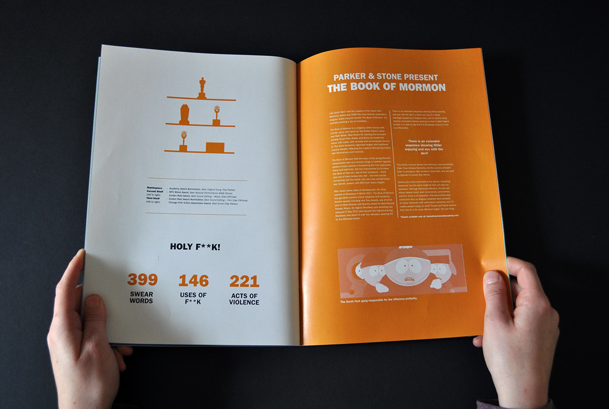
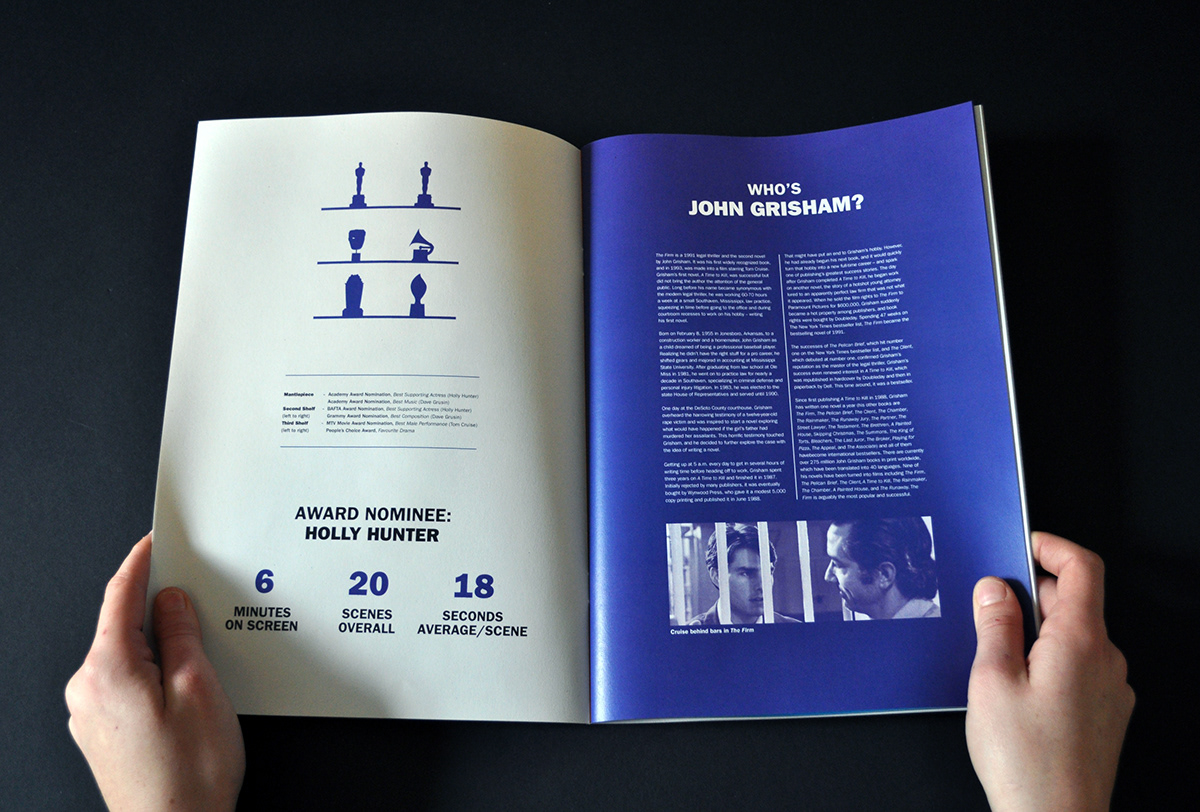
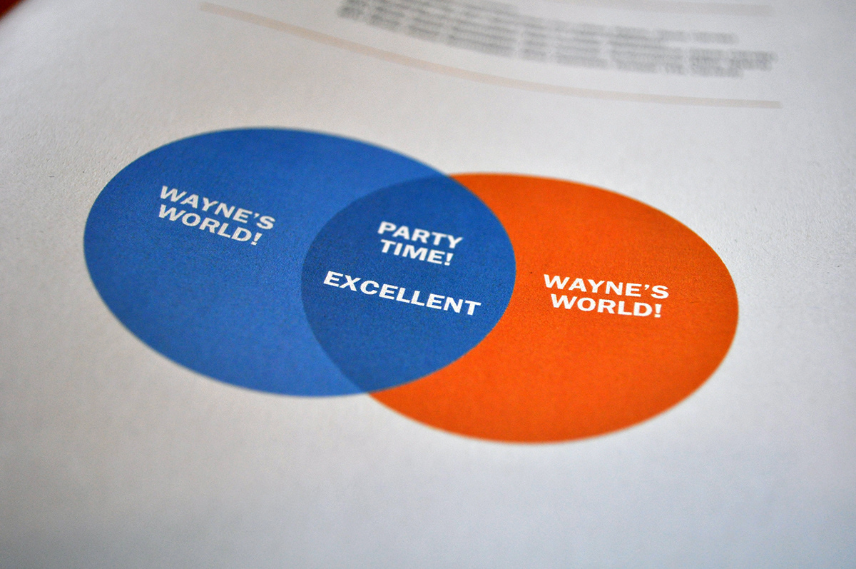
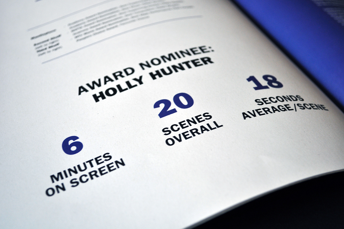
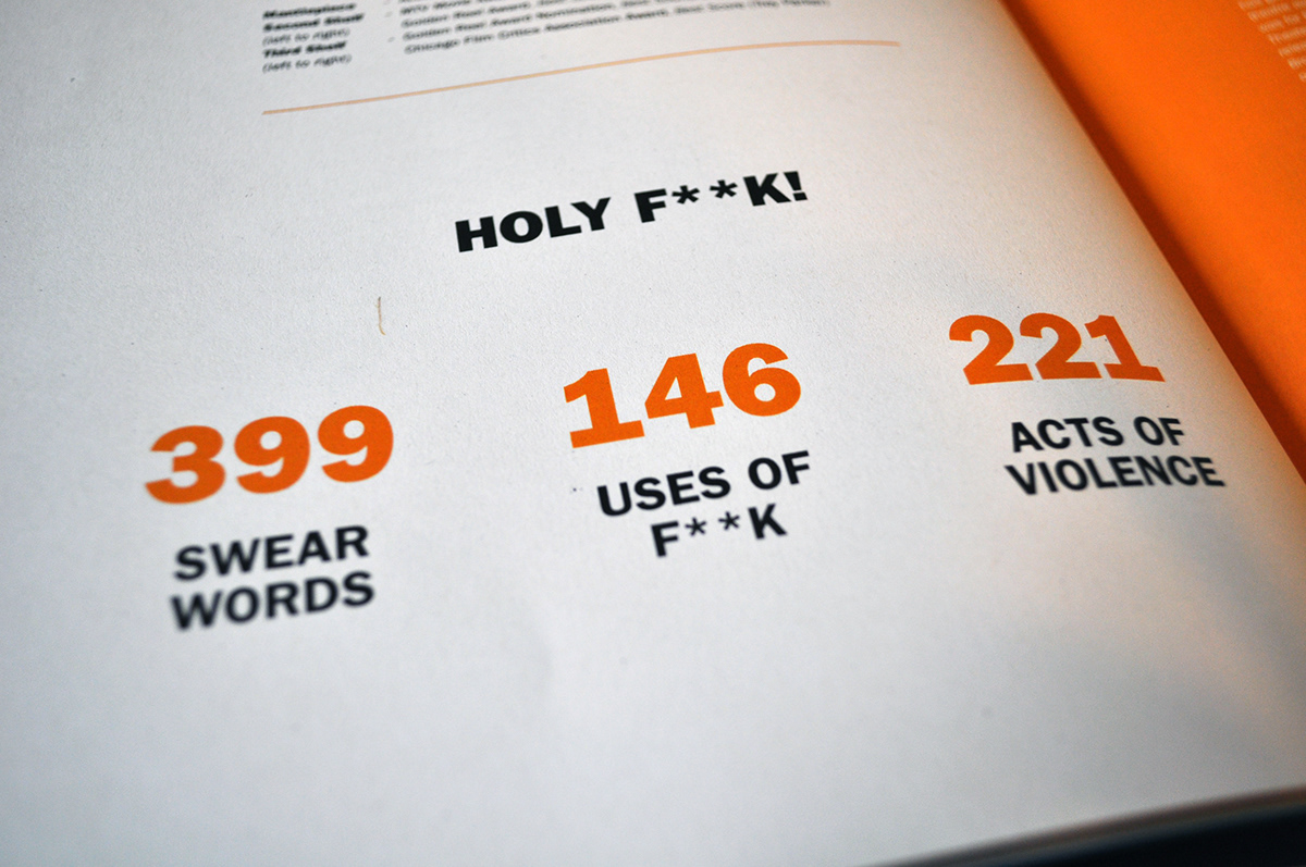
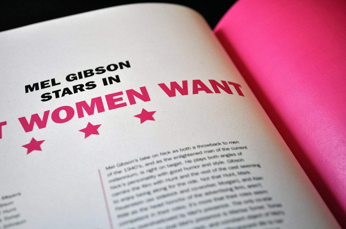
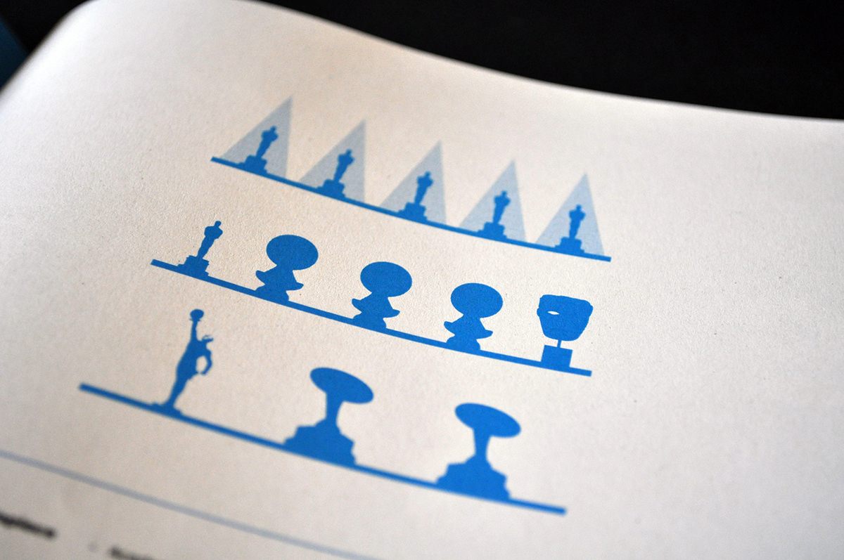
Each film has 2 spreads, the first – containing the film introduction, cast, rating (from Empire Magazine) and the typographic illustration. The second spread contains a page allowing the reader to engage with information they may not have read about the film before, such as an interview with the leading actor, the real story behind the film or information about the book the film was based on. This page also contains a small letterbox duo-tone style image to work with the colour on the spreads. The second page contains a trophy shelf illustration of what the film won/got nominated for, and a few small statistics or infographic about the film – some serve to inform the reader, while others are there simply to raise a smile.
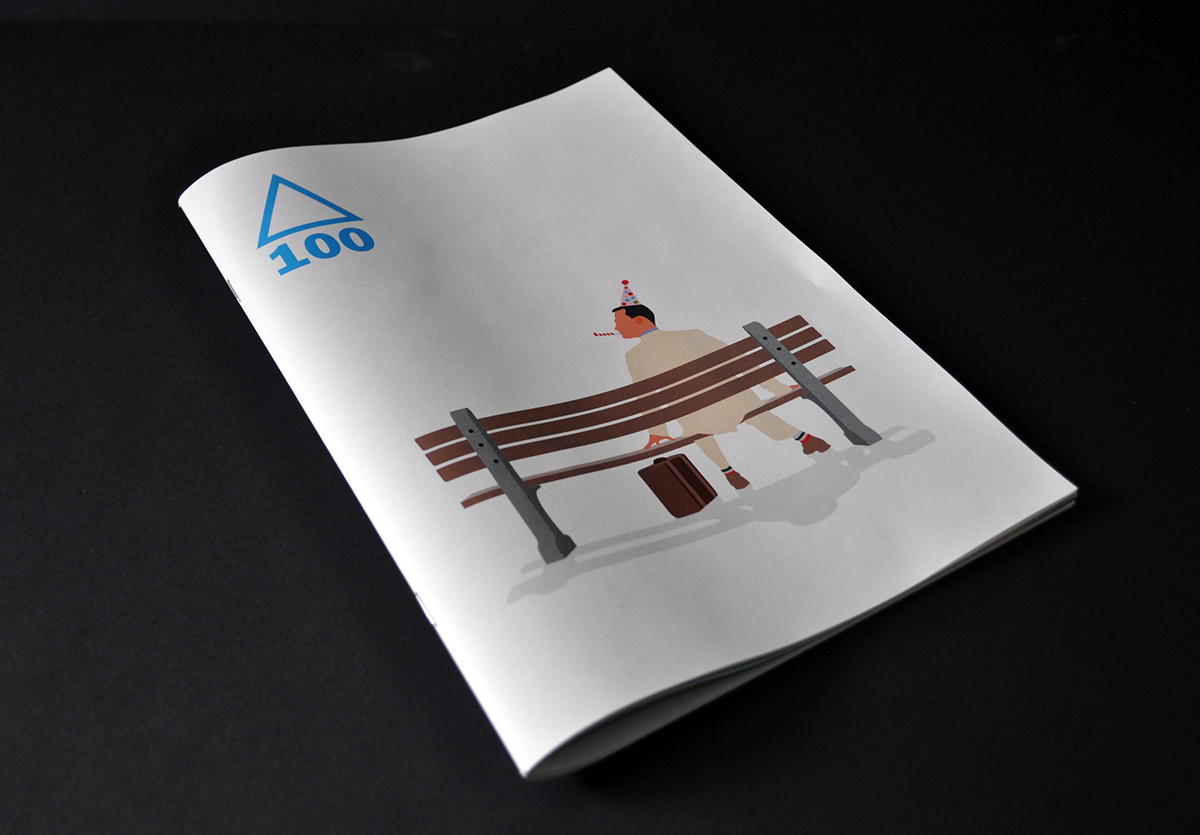
When branding the insert, I didn’t want to use the paramount logo itself because I felt it wouldn’t fit well with the simplicity of the booklet. I called the insert ‘100’ relating to the 100 years the company has existed with a simplified paramount mountain. This simple logo also works well with the illustration on the cover. The concept behind the vector illustration on the cover was the idea that all the characters from Paramount’s most successful films are all getting ready for a big party to celebrate Paramount’s 100 year birthday. Indiana Jones stealing a present from the Temple of Doom, Maverick from Top Gun preparing the cake and Forrest Gump waiting on the bench with his best suit and party hat on. This illustration sets the tone of the insert and entices the empire reader to look inside – instead of ignoring it. The various covers also makes the insert feel like a collectors item, having all 10 would mean you’re a real film fanatic.
The typographic illustrations relate to emotions or iconic scenes from that particular film while using the date the film was released, for example, the Titanic illustration is of the final scene when the ship sinks – and the Forrest Gump spread is the date small in the corner of the page, showing the simple nature of the main character in the film. These typographic illustrations serve as a fresh alternative to high res images and engage the reader further, wanting to see how the next spread looks.
Each film has 2 spreads, the first – containing the film introduction, cast, rating (from Empire Magazine) and the typographic illustration. The second spread contains a page allowing the reader to engage with information they may not have read about the film before, such as an interview with the leading actor, the real story behind the film or information about the book the film was based on. This page also contains a small letterbox duo-tone style image to work with the colour on the spreads. The second page contains a trophy shelf illustration of what the film won/got nominated for, and a few small statistics or infographic about the film – some serve to inform the reader, while others are there simply to raise a smile.
When branding the insert, I didn’t want to use the paramount logo itself because I felt it wouldn’t fit well with the simplicity of the booklet. I called the insert ‘100’ relating to the 100 years the company has existed with a simplified paramount mountain. This simple logo also works well with the illustration on the cover. The concept behind the vector illustration on the cover was the idea that all the characters from Paramount’s most successful films are all getting ready for a big party to celebrate Paramount’s 100 year birthday. Indiana Jones stealing a present from the Temple of Doom, Maverick from Top Gun preparing the cake and Forrest Gump waiting on the bench with his best suit and party hat on. This illustration sets the tone of the insert and entices the empire reader to look inside – instead of ignoring it. The various covers also makes the insert feel like a collectors item, having all 10 would mean you’re a real film fanatic.